carat

Prompt Gallery

/

Infographic Design

Login
Sign Up

Infographic Design

AI prompts for creating visually compelling infographics and data-driven information design.

2026.07.01

·
Example image of Human Skeletal System Infographic generated with Nano Banana Pro

Human Skeletal System Infographic

Nano Banana Pro· Image
Make a realistic infographic of the human skeletal system with labels
@HBCoop_
AI-generated Earbuds E-Commerce Infographic made with GPT Image 2

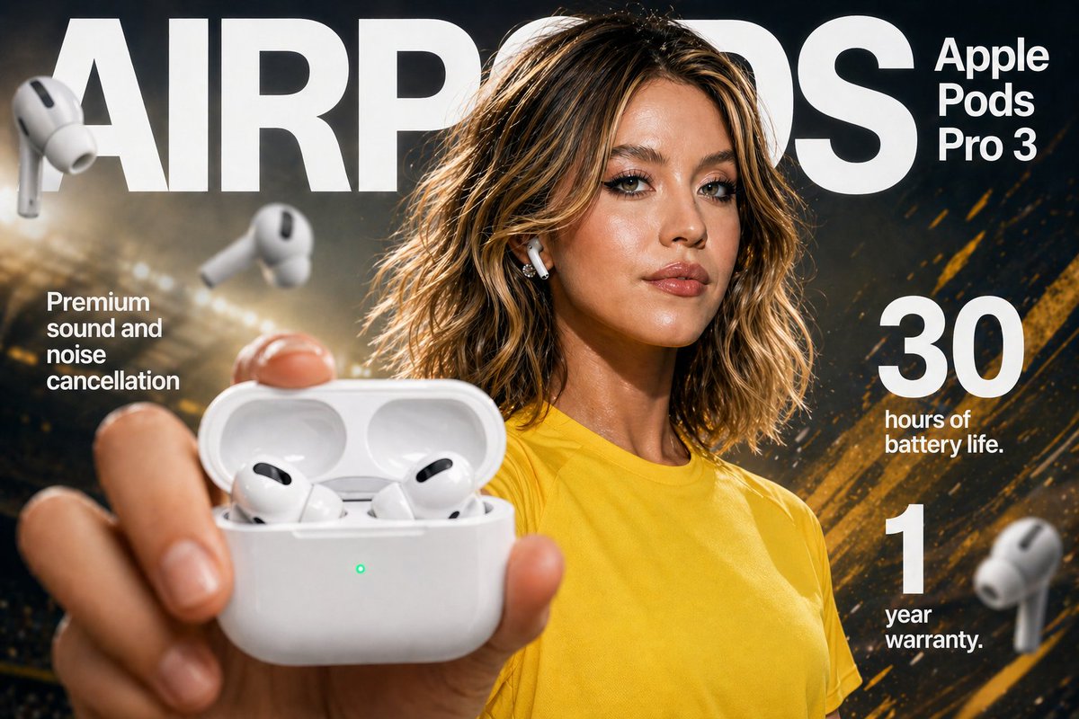
Earbuds E-Commerce Infographic

GPT Image 2· Image
High-impact e-commerce infographic for "{argument name="product" default="Apple Pods Pro 3"}" wireless earbuds. Foreground: An extreme close-up of a hand holding an open glossy white wireless earbud charging case toward the camera. Inside the case are two sleek white earbuds with black speaker accents. A small glowing green LED indicator is visible on the front of the case. The hand and case have slight macro-lens depth blur for realism. Mid-ground: A {argument name="model" default="confident young woman"} with tan skin, brown eyes, and dark hair tied in a messy bun. She has natural makeup with a dewy glow. She is wearing a plain {argument name="clothing" default="yellow athletic t-shirt"} (no logos). One white earbud is in her ear. She is looking directly at the camera with a subtle, confident expression. Background: Clean soft gray gradient studio backdrop with shallow depth of field. Diagonal rainbow prism lens flares and soft light leaks across the scene. Several blurred floating white earbuds in the background for depth and motion. Lighting: Soft professional studio lighting with glossy highlights on the product, subtle rim light on the model, high dynamic range. Typography (modern sans-serif, white): Top center (behind model): Large bold text “AIRPODS” Top right: “Apple Pods Pro 3” Mid-left: “Premium sound and noise cancellation” Mid-right: Large bold “30” with “hours of battery life” Bottom-right: Large bold “1” with “year warranty” Style: Ultra-realistic, commercial product photography, 8k resolution, sharp focus on product case, shallow depth of field, vibrant yet clean color palette, premium advertising aesthetic.
@SPEEDAI07
AI-generated Washing Machine Technical Infographic made with GPT Image 2
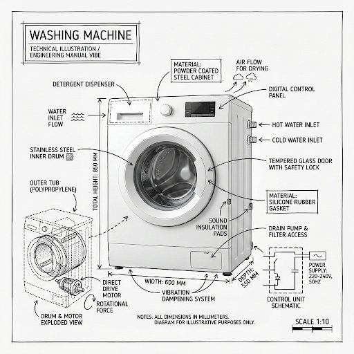
Washing Machine Technical Infographic

GPT Image 2· Image
Create an infographic image of [washing machine], combining a realistic photograph or photoreal render of the object with technical annotation overlays placed directly on top. Use black ink–style line drawings and text (technical pen / architectural sketch look) on a pure white studio background, including: •Key component labels •Internal cutaway or exploded-view outlines •Measurements, dimensions, and scale markers •Material callouts and quantities •Arrows indicating function, force, or flow (air, sound, power, pressure) •Simple schematic or sectional diagrams where relevant Place the title [PRODUCT] inside a hand-drawn technical annotation box in one corner. Style & layout rules: •The real object remains clearly visible beneath the annotations •Annotations feel sketched, technical, and architectural •Clean composition with balanced negative space •Educational, museum-exhibit / engineering-manual vibe Visual style: Minimal technical illustration aesthetic, black linework over realistic imagery, precise but slightly hand-drawn feel. Color palette: White background, black annotation lines and text only. No colors. Output: 1080×1080, ultra-crisp, social-feed optimized, no watermark.
@Naiknelofar788
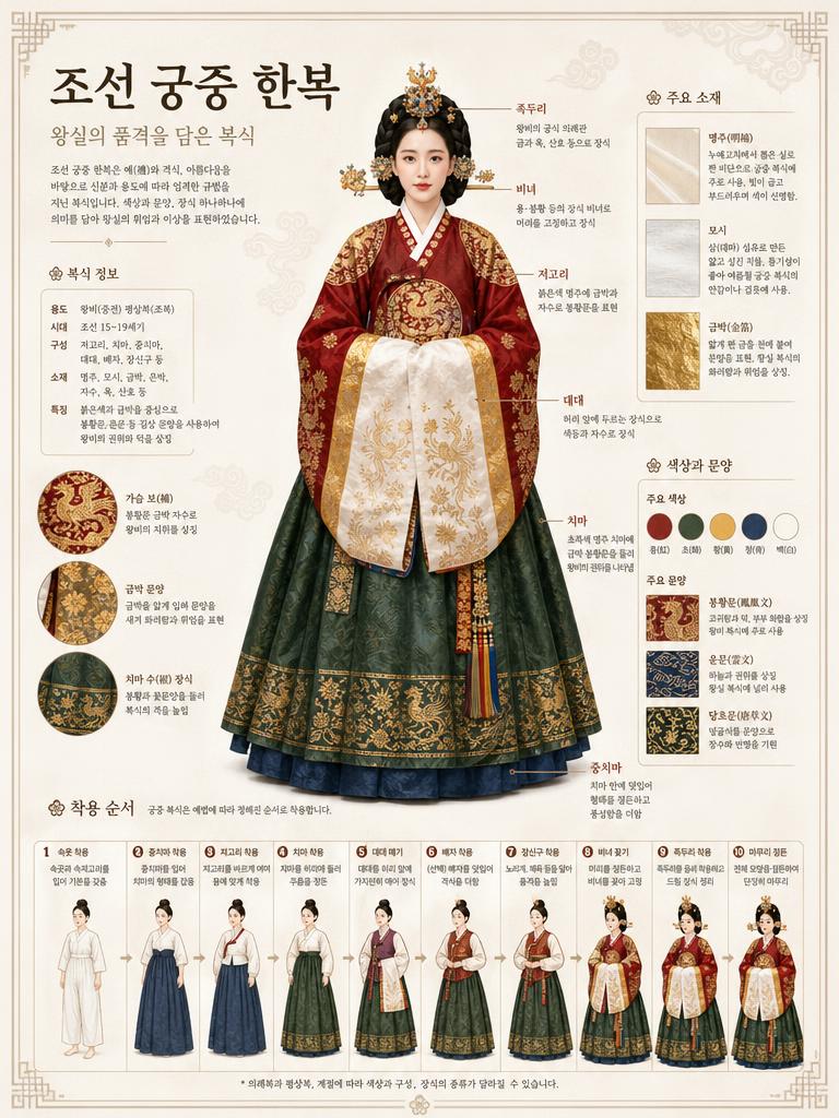
AI-generated Museum Atlas-style Korean Detailed Infographic About Joseon Court Dress ( ) made with GPT Image 2
Museum Atlas-style Korean Detailed Infographic About Joseon Court Dress ( )

GPT Image 2· Image
Museum atlas-style Korean detailed infographic about Joseon court dress (조선 궁중 한복). Main full-body illustration of Korean court lady, structural breakdown annotations in Korean, fabric/material callouts (명주, 모시, 금박), color palette with Korean pattern names (봉황문, 운문), dressing sequence flowchart. Off-white background, refined Korean museum display board aesthetic. All text in Korean.
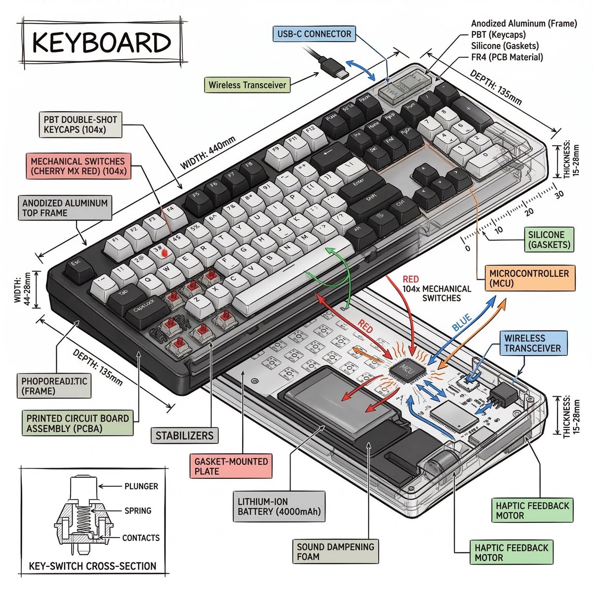
Example image of Isometric Technical Infographic generated with Nano Banana 2

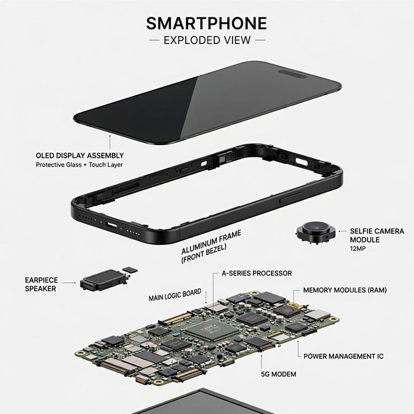
Isometric Technical Infographic

Nano Banana 2· Image
Create a technical infographic of [OBJECT] with a 45-degree isometric 3D perspective showing the device slightly tilted to reveal depth and dimension. Combine a realistic photoreal render with black ink technical annotations on pure white background. Include: Key component labels with color-coded callout boxes Internal component visibility through transparent/cutaway sections Measurements, dimensions, and precise scale markers Material callouts and quantities Color-coded arrows for function/flow: RED (power/battery), BLUE (data/connectivity), ORANGE (thermal/processor), GREEN (sensors/haptics) Simple schematics or cross-sectional diagrams where relevant Place “OBJECT” title in a hand-drawn technical box (top-left corner). Style: Black linework (technical pen/architectural), sketched but precise. Object remains clearly visible. Educational museum-exhibit vibe. Clean composition, balanced negative space. Perspective: Isometric 3D angle—tilted to show depth, dimension, and internal architecture dramatically. Like a professional product teardown or engineering manual. Colors: ~10-15% accent density. Black dominant. White background. Output: 1080×1080, ultra-crisp, social-feed optimized.
@heymarmot_ai
Example image of How to Make Matcha Infographic generated with Nano Banana Pro

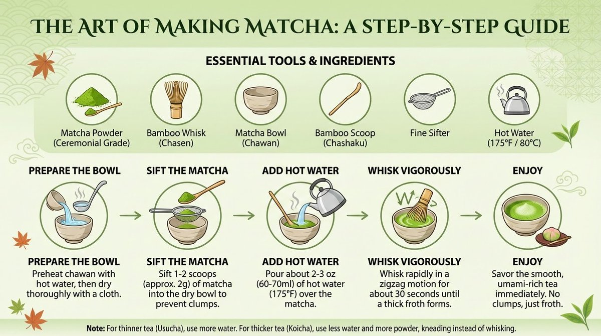
How to Make Matcha Infographic

Nano Banana Pro· Image
Create an infographic that shows how to make Matcha.
@CodeByPoonam
AI-generated Apple Pods Pro 3 Earbuds Infographic made with GPT Image 2

Apple Pods Pro 3 Earbuds Infographic

GPT Image 2· Image
High-impact e-commerce infographic for "Apple Pods Pro 3" wireless earbuds.
@rovvmut_
GPT 이미지 2로 생성한 영양 균형 가이드 인포그래픽

영양 균형 가이드 인포그래픽

GPT Image 2· Image
A nutrition balance infographic design. Clean white background with green and orange accent colors. Title text '영양 균형 가이드' in Korean. Show a balanced plate diagram divided into food groups (채소 30%, 단백질 25%, 탄수화물 25%, 지방 20%), daily intake recommendation icons, and a simple weekly meal chart. Modern health infographic with clean flat icons and organized data layout.
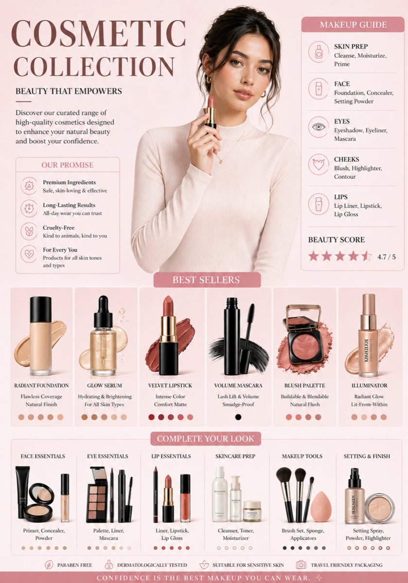
AI-generated Luxury Cosmetic Brand Infographic made with Nano Banana Pro

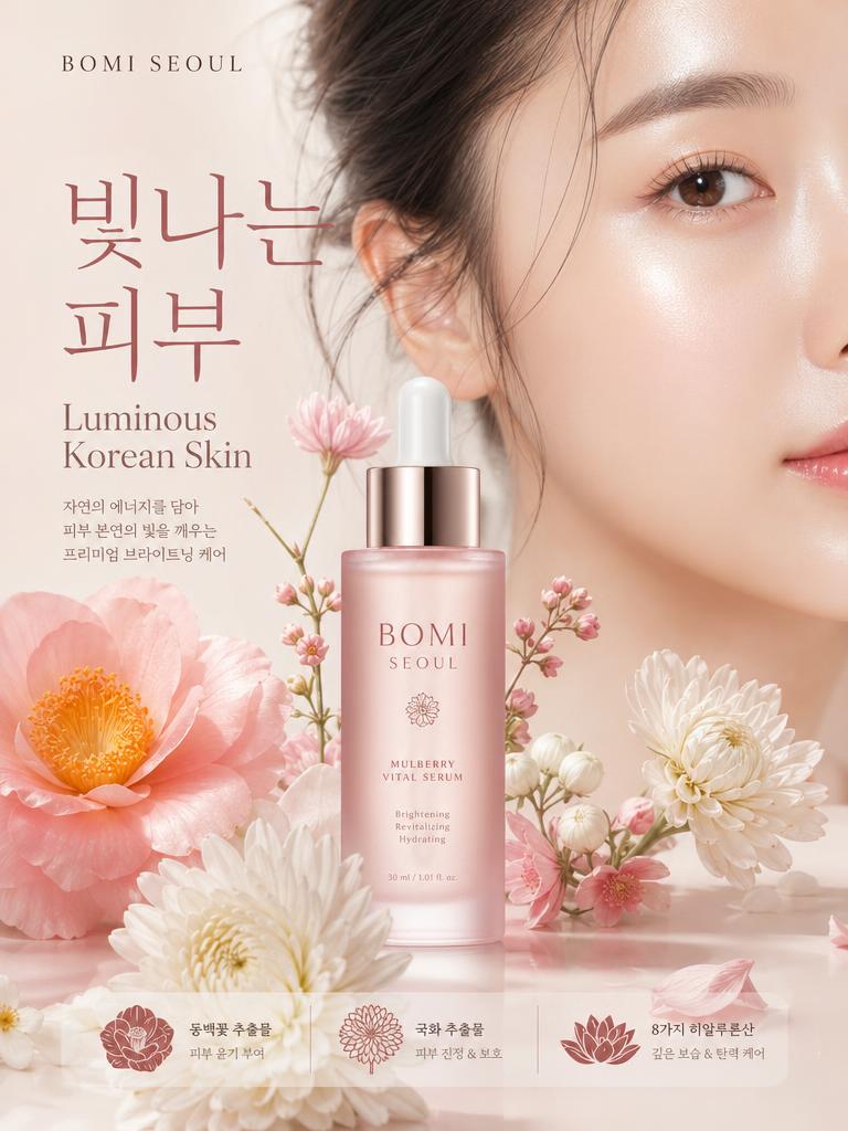
Luxury Cosmetic Brand Infographic

Nano Banana Pro· Image
A professional cosmetic brand infographic in a soft aesthetic style. The color palette features {argument name="colors" default="muted rose, cream, and champagne gold"}. At the top center, a high-fashion portrait of a woman with glowing skin and soft makeup, wearing a {argument name="outfit" default="cream turtleneck"}. Below her, a clean grid of isolated makeup products: a glass foundation bottle with a liquid swatch, a sleek black mascara wand, and a rose-gold blush compact. The background is a clean, minimal gradient. Professional studio lighting, soft shadows, high-end commercial photography style, 8k resolution.
@Minahil42298354
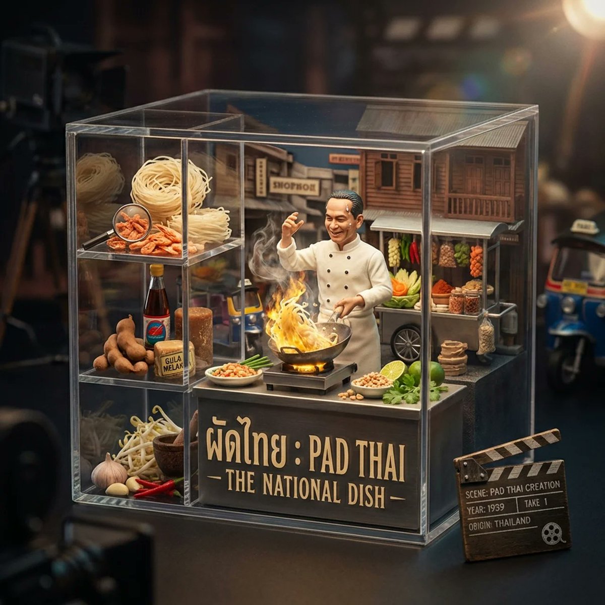
AI-generated Food Origin Recipe Infographic made with Nano Banana 2

Food Origin Recipe Infographic

Nano Banana 2· Image
<instruction> Input A is a famous dish. Study its origin, credited creator, preparation ritual, cultural importance, and core ingredients. Optional Input B is style reference. Default: cinematic still meets gourmet collectible. Goal: Transparent acrylic cube staged as a single frozen frame from an imagined biographical film about the dish’s creation. Center: the inventor dramatically preparing the dish under theatrical miniature lighting, mid-gesture, with steam or flame effects. Surrounding compartments contain ingredients arranged as film props (close-ups of herbs, spices, vessels). Background subtly recreates the historical kitchen or street setting with tiny architectural details made from food. Include a tiny clapperboard or film reel element showing the dish name and origin year. Color palette drawn from classic cinema posters of the origin country. Bilingual title in period-appropriate font. Output: ONE image, 16:9 horizontal, moody cinematic lighting with high contrast and subtle lens flare. </instruction>
@Gdgtify
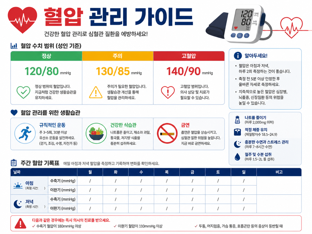
GPT 이미지 2로 생성한 혈압 관리 가이드 인포그래픽

혈압 관리 가이드 인포그래픽

GPT Image 2· Image
A clean health infographic about blood pressure management. White background with red and blue accent colors. Title text '혈압 관리 가이드' in Korean. Show a blood pressure range chart with color-coded zones (정상 120/80, 주의 130/85, 고혈압 140/90), a lifestyle tips section with simple icons for exercise, diet, and no smoking, and a weekly tracking table template. Modern infographic design with clear data visualization and medical aesthetic.
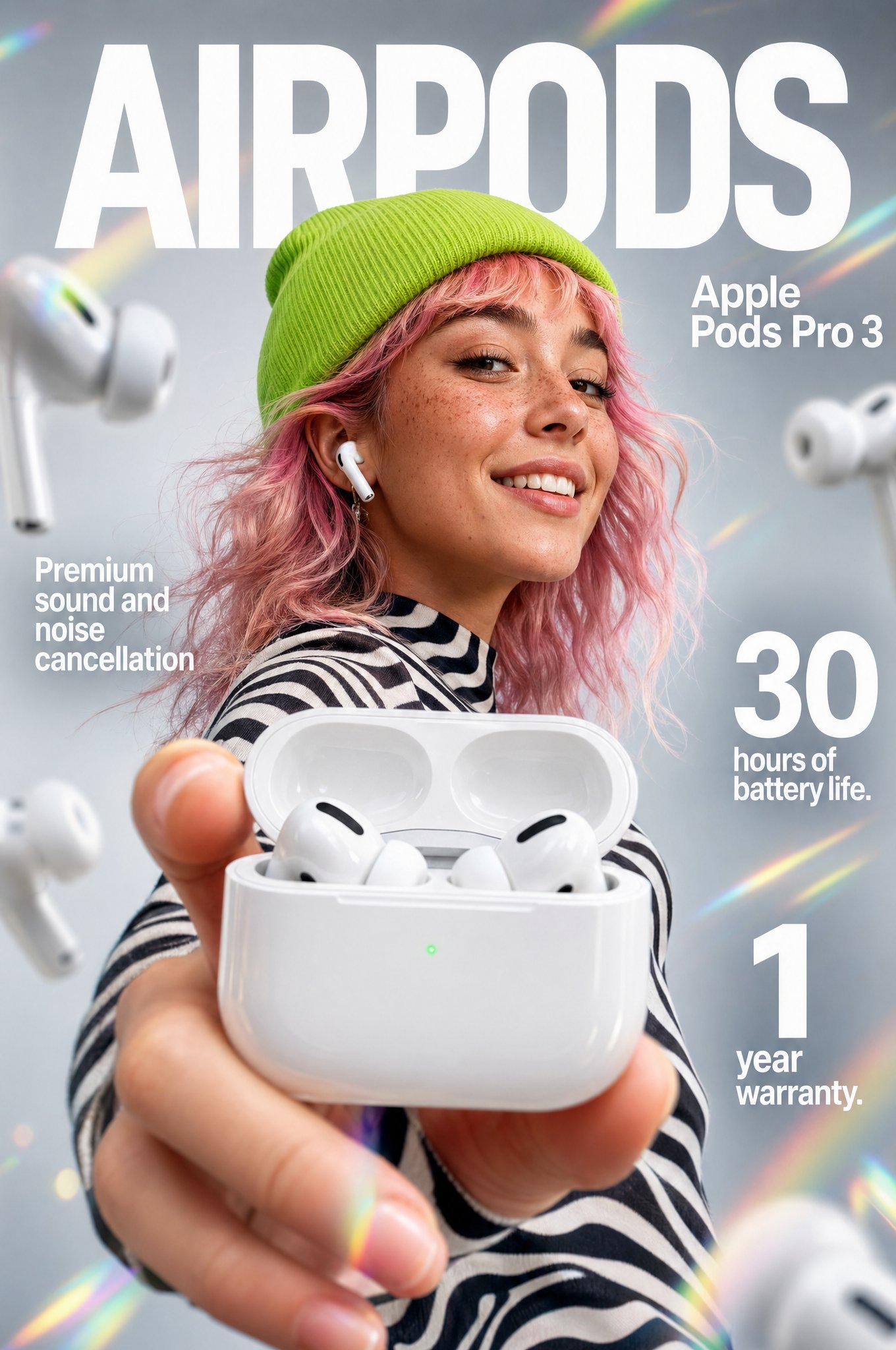
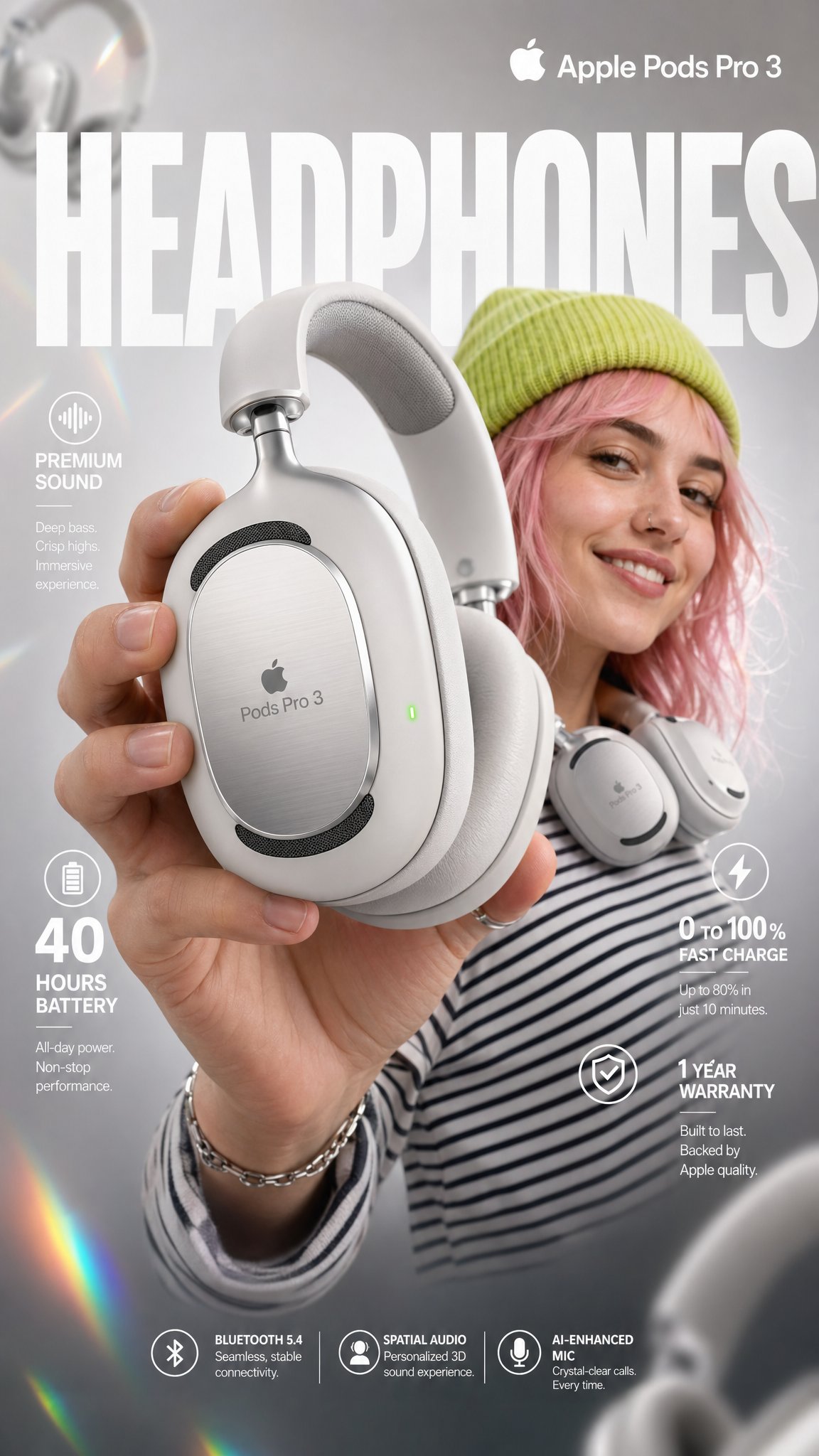
AI-generated Apple Pods Pro 3 Headphone Infographic made with GPT Image 2
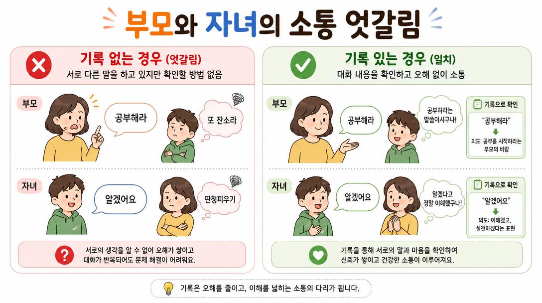
Apple Pods Pro 3 Headphone Infographic

GPT Image 2· Image
High-impact e-commerce infographic for "Apple Pods Pro 3" premium wireless over-ear headphones. FOREGROUND - PRODUCT HERO SHOT Extreme close-up of a hand holding a sleek, matte-white premium over-ear headphone toward the camera at a slight angle. The headphone features: - Glossy white ear cushions with soft memory foam padding - Brushed aluminum silver headband with subtle Apple Pods Pro 3 embossed branding - Black mesh speaker grille visible on the ear cup face - A tiny glowing green LED status indicator on the right ear cup edge - Subtle touch-control icons etched on the outer cup surface Macro-lens shallow depth of field — hand and headphone slightly blurred at edges to create cinematic depth. Product remains razor-sharp in center frame. CENTRAL SUBJECT — MODEL In the mid-ground: a smiling young woman with freckles and wavy pastel-pink hair. She wears: - A vibrant lime-green knit beanie - A psychedelic black and white-striped long-sleeve shirt - The white over-ear headphones resting stylishly around her neck (not on ears) — one hand casually touching the ear cup Expression: relaxed, confident, joyful. She is glancing slightly off-camera with a natural smile. BACKGROUND & ATMOSPHERE Clean soft-focus studio backdrop — light gray gradient fading to warm white at center. Atmospheric overlays: - Diagonal rainbow prism lens flares cutting across upper-left to lower-right - Soft pastel light leaks in pink and yellow at corners - 4–5 blurred white over-ear headphones floating artistically in the background at various depths and rotation angles - Subtle bokeh circles from background studio lights Lighting: Soft professional three-point studio lighting. Key light from upper-left, fill light right side. Rim light behind model for separation. Glossy highlights on headphone surfaces catching light naturally. TYPOGRAPHY & LAYOUT — Sans-Serif, Clean white TOP CENTER (behind model, large background text): → Massive bold oversized text: "HEADPHONES" Semi-transparent white, spanning full width behind subject TOP RIGHT CORNER: → Bold clean text: "Apple Pods Pro 3" Subtitle smaller text: "Over-Ear Wireless" MID LEFT: → Icon: small sound wave symbol → Bold text: "Premium Sound" → Sub-text: "Active Noise Cancellation + Transparency Mode" MID RIGHT: → Extra-large bold numeral: "40" → Smaller text below: "hours of battery life" LOWER LEFT: → Extra-large bold numeral: "0" with "to" beside it → then bold "100%" → Sub-text: "Fast charge — 10 min = 3hrs playback" BOTTOM RIGHT: → Extra-large bold numeral: "1" → Sub-text: "Year Warranty Included" BOTTOM CENTER (fine print style): → Small elegant text: "Bluetooth 5.4 | Hi-Res Audio Certified | Foldable Design | USB-C Charging" TECHNICAL SPECS Resolution: 8K ultra-sharp Style: Commercial product photography meets editorial fashion advertising Color Palette: White, lime green, pastel pink, rainbow prism accents Focus: Tack-sharp on headphone product — shallow DOF on everything else Lens: 85mm macro, slight low angle Render Quality: Hyperrealistic, clean ad aesthetic, vibrant yet professional color grading
@meng_dagg695

What Are Infographic Design AI Prompts?

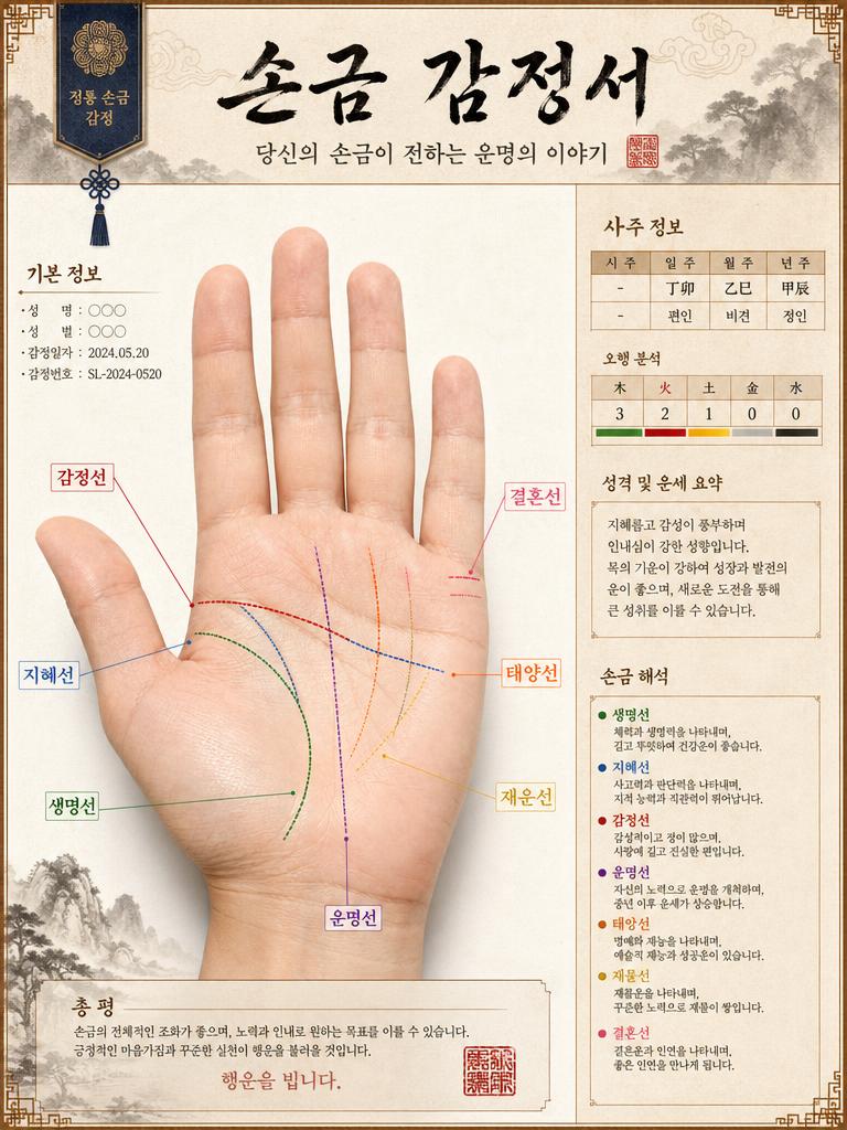
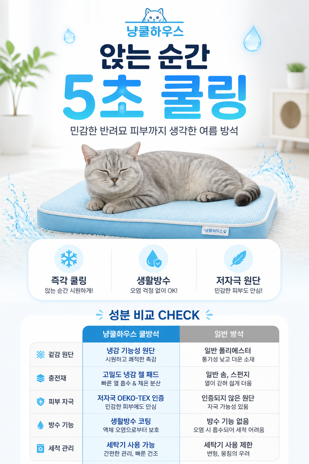
Infographic design AI prompts generate designs that visually express complex data and information in an easily understandable format. Covering topics like nutrition guides, blood pressure management, fintech investment posters, human skeletal labels, and washing machine technical diagrams, these prompts create both beautiful and functional information designs. Rather than simply listing data, they structure information into visual hierarchies that help readers understand intuitively.

Carat's infographic prompt collection spans health, technology, finance, product, and cultural domains. From e-commerce infographics and luxury brand analysis to museum-style hanbok analysis and cinematic concept posters, these prompts deliver both information clarity and aesthetic completion.

Key Use Cases

  • Healthcare content: Visual guides for nutrition, blood pressure management, and human anatomy
  • Product technical explanations: Infographics showing technical features of washing machines, earbuds, and smartphones at a glance
  • Fintech and finance: Visualizing investment guides, financial analysis, and monetary data clearly
  • Brand analysis reports: Infographic designs analyzing luxury cosmetics, fashion brands, and product features
  • Cultural and educational content: Information designs with educational value like hanbok analysis, food origin recipes, and museum-style layouts

Why This Tag Is Useful

Infographics are a consistently in-demand design format across marketing, education, and media due to their high information delivery efficiency. Keywords like 'infographic', 'information design', and 'data visualization' have search volume across both B2B and B2C contexts. In a digital marketing environment where data-driven content is increasingly important, the ability to quickly generate infographic concepts via AI without manual layout work adds significant value for designers and marketers.

Related Prompts

  • Health Infographic
  • Infographic
  • PPT Design
  • Poster
  • Isometric Illustration
  • Cutaway Diagram
  • Blueprint Sheet

Prompt Construction Tips

  1. Define information structure: Specify data hierarchy including primary data, secondary data, and visual emphasis points for structured infographics.
  2. Use visual metaphors: Specify subject-appropriate metaphors like human skeleton, floor plans, or cross-sections for intuitive information delivery.
  3. Color-code categories: Assigning colors to data categories makes classification clear and improves readability.
  4. Choose layout style: Specify layout types like grid, flowchart, or timeline that match the information flow for effective communication.

Infographic design prompts operate at the intersection of information and aesthetics. By combining these tips, you can transform any complex data into an understandable and beautiful visual.
Frequently Asked Questions

Related Prompts

Infographic

Infographic

68 prompts

Product Detail Page

Product Detail Page

118 prompts

Poster

Poster

575 prompts

Health Infographic

Health Infographic

7 prompts

Carat Prompt Gallery

Create trending AI prompts instantly

Prompts

  • Logo
  • PPT Design
  • Thumbnail
  • Poster
  • Web Novel Cover
  • ID Photo
  • Caricature
  • Product Detail Page
  • Banner

Models

  • GPT Image 2
  • Seedance 2.0
  • NanoBanana Pro
  • NanoBanana 2

Carat

  • Get started
  • About
  • Blog
  • Careers
  • Contact
  • Partnership
  • Terms
  • Privacy

© 2026 Paradot.Inc All rights reserved.