Korean Pop Culture
K-pop, K-beauty, 팬에딧, 예능 캡처 감성에 바로 쓸 수 있는 Korean Pop Culture AI 프롬프트. 한국식 SNS 비주얼과 트렌디한 캐릭터 이미지를 빠르게 만들 수 있습니다.
2026.05.28
Futuristic K-pop Concert Spectacle
Early-2000s Korean Neighborhood Home Video
K-pop Dance Routine
World Landmarks Travel Selfie
K-Pop Choreography Sequence
Viral K-pop Dance Choreography
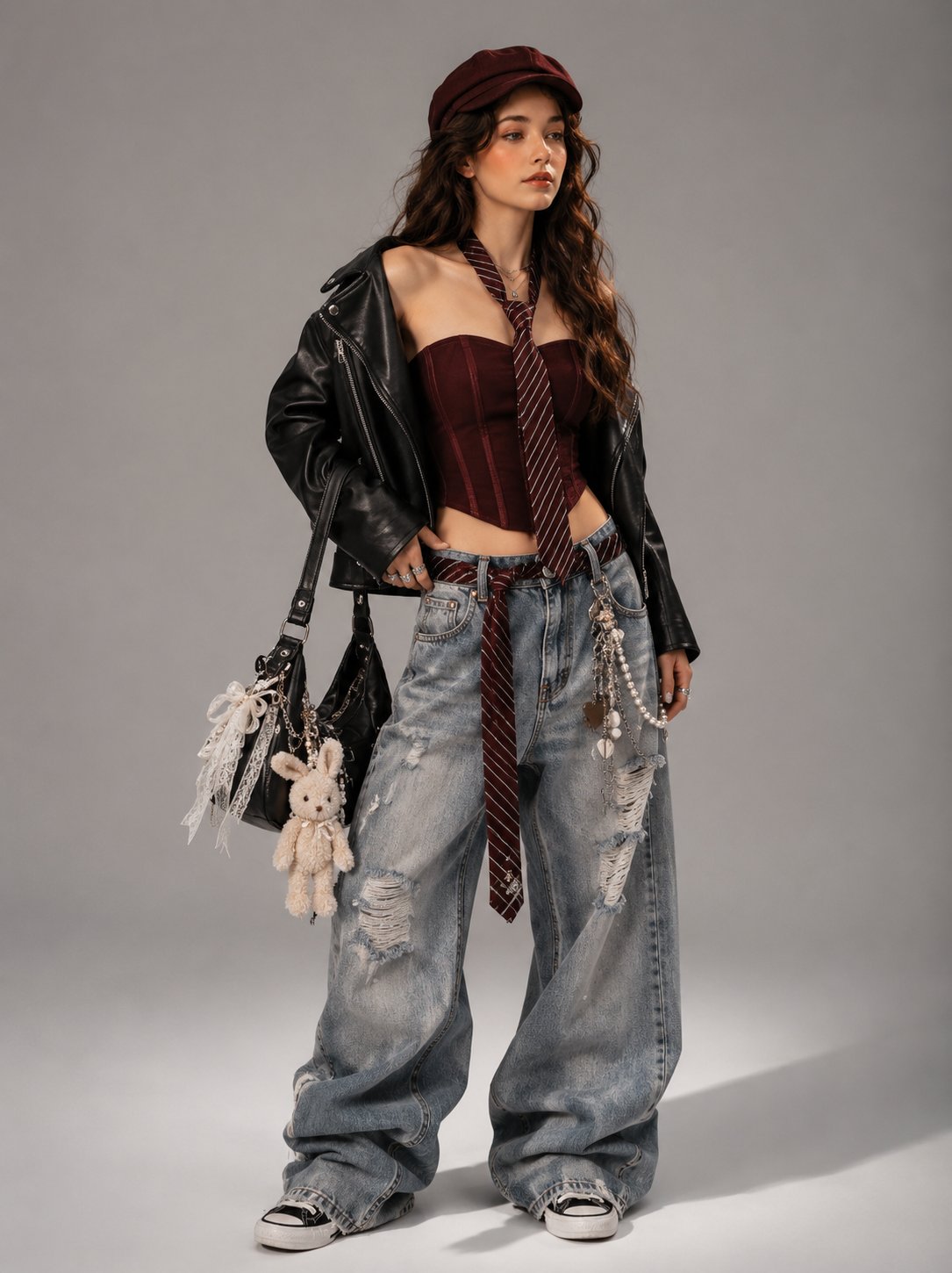
Y2K Korean Streetwear Editorial
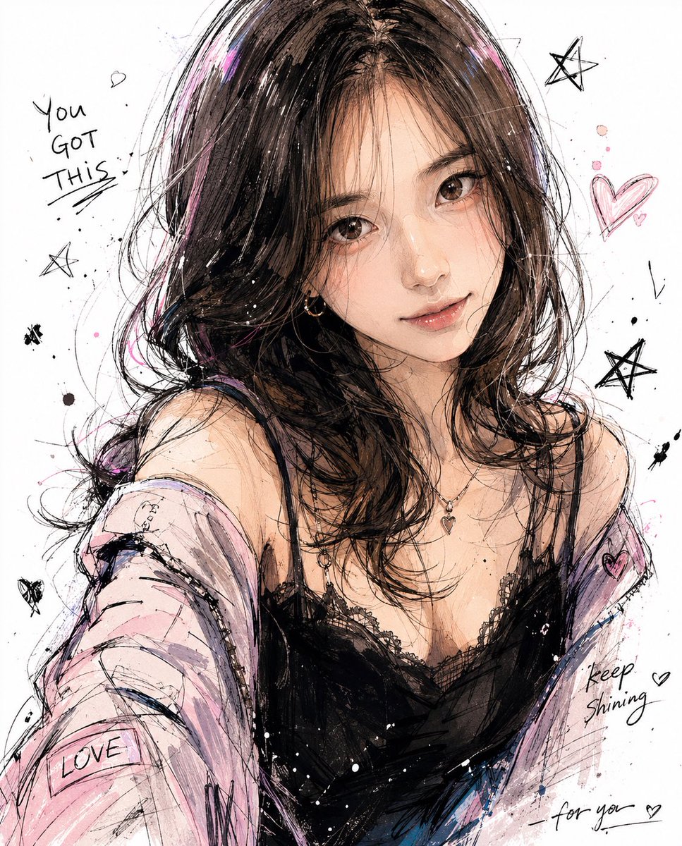
Korean-Style Character Illustration
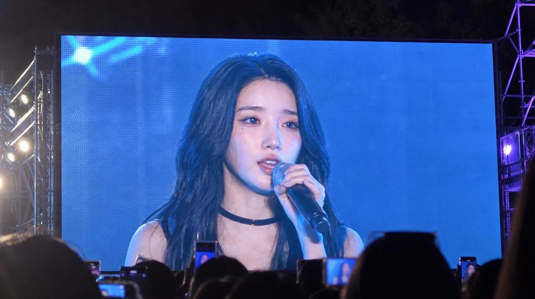
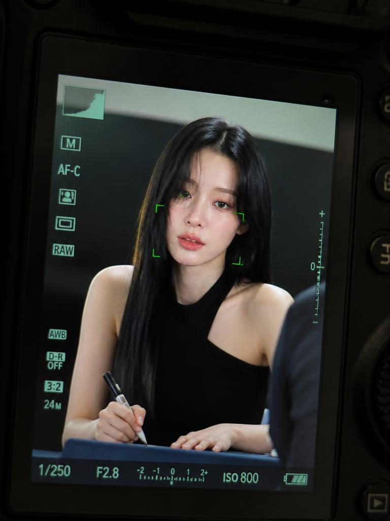
University Festival Jumbotron Fancam Shot
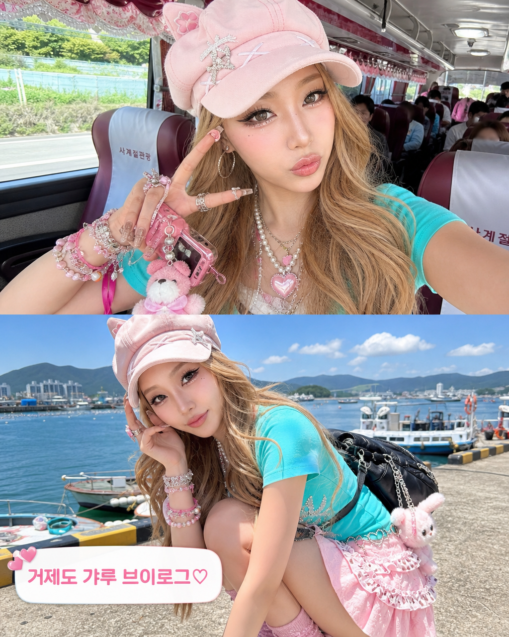
Geoje Gyaru Vlog Screenshot
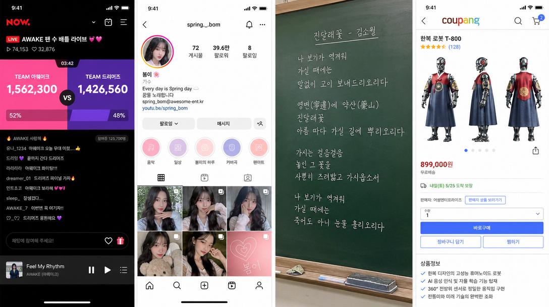
Korean Idol Group Fan Count Battle in a Naver Now Live Stream Screenshot
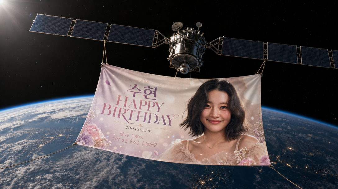
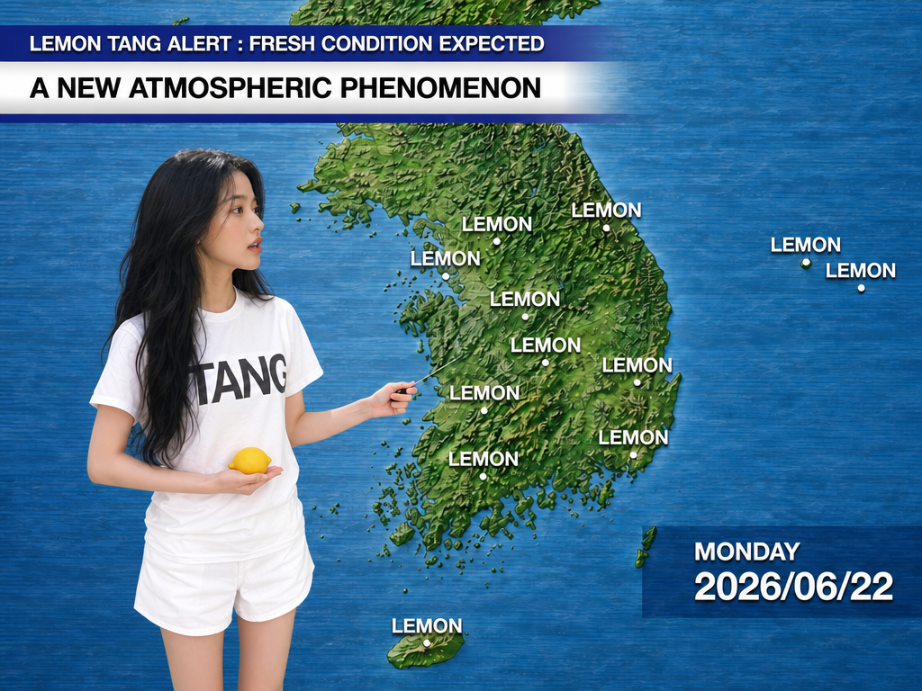
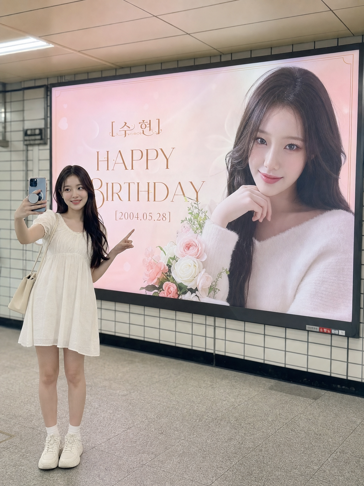
Space Satellite Birthday Banner
What Are Korean Pop Culture AI Prompts?
Korean Pop Culture prompts create images and videos with the visual grammar of K-pop, idol fan edits, K-beauty selfies, character art, and birthday billboard ads. Rather than copying a real celebrity, they capture cues like glossy makeup, sticker captions, and a photo mounted on a famous city display. In Carat they use GPT Image 2 for stills and Seedance 2.0 for stage and dance clips, and results can be edited or animated.
Where You'll Use It
- K-pop idol fan edits, concert and dance videos
- birthday billboard, bus wrap, and banner mockups
- K-gyaru street selfies and glossy K-beauty portraits
- webtoon and anime style Korean character art
- trendy social posts, thumbnails, and card-news visuals
Why This Tag Is Useful
Korean pop-culture visuals depend on small cultural signals, which is what makes a result feel authentic. Sticker captions, idol-vlog framing, and a celebration photo on a Myeongdong or Shibuya screen quickly set the mood. Selfies, fan edits, character art, and celebration ads share one tone, so this tag fills a feed fast.
Tips for Crafting Prompts
- Decide the channel and ratio first, such as Instagram 4:5 or Shorts 9:16.
- Name the format: stage fancam, vlog selfie, fan edit, or billboard ad.
- Describe observable details like glossy lips, aegyo-sal, and sticker captions.
- For photo-on-billboard mockups, attach the input image and set placement.
Generate a first version, then refine only the culturally specific parts such as caption shape and grading, or feed a still into Seedance 2.0 for a clip.