
3x3 Product Storyboard Mockup
Nano Banana Pro· Image
This prompt needs a photo. Attach one with the + button on the left of the input box.
Create ONE final image.
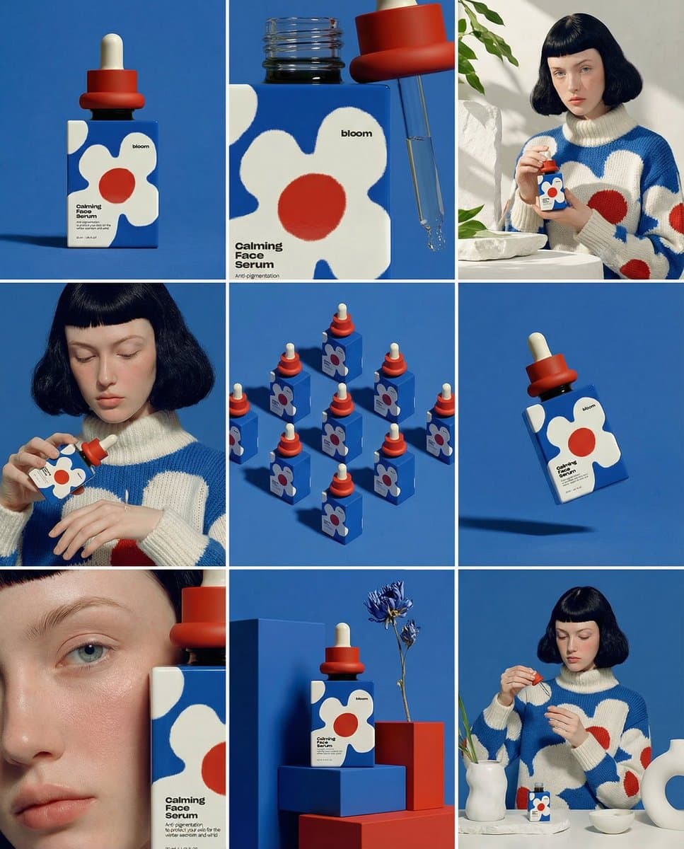
A clean 3×3 [ratio] storyboard grid with nine equal [ratio] sized panels on [4:5] ratio.
Use the reference image as the base product reference. Keep the same product, packaging design, branding, materials, colors, proportions and overall identity across all nine panels exactly as the reference. The product must remain clearly recognizable in every frame. The label, logo and proportions must stay exactly the same.
This storyboard is a high-end designer mockup presentation for a branding portfolio. The focus is on form, composition, materiality and visual rhythm rather than realism or lifestyle narrative. The overall look should feel curated, editorial and design-driven.
FRAME 1:
Front-facing hero shot of the product in a clean studio setup. Neutral background, balanced composition, calm and confident presentation of the product.
FRAME 2:
Close-up shot with the focus centered on the middle of the product. Focusing on surface texture, materials and print details.
FRAME 3:
Shows the reference product placed in an environment that naturally fits the brand and product category. Studio setting inspired by the product design elements and colours.
FRAME 4:
Product shown in use or interaction on a neutral studio background. Hands and interaction elements are minimal and restrained, the look matches the style of the package.
FRAME 5:
Isometric composition showing multiple products arranged in a precise geometric order from the top isometric angle. All products are placed at the same isometric top angle, evenly spaced, clean, structured and graphic.
FRAME 6:
Product levitating slightly tilted on a neutral background that matches the reference image color palette. Floating position is angled and intentional, the product is floating naturally in space.
FRAME 7:
is an extreme close-up focusing on a specific detail of the label, edge, texture or material behavior.
FRAME 8:
The product in an unexpected yet aesthetically strong setting that feels bold, editorial and visually striking.
Unexpected but highly stylized setting. Studio-based, and designer-driven. Bold composition that elevates the brand.
FRAME 9:
Wide composition showing the product in use, placed within a refined designer setup. Clean props, controlled styling, cohesive with the rest of the series.
CAMERA & STYLE:
Ultra high-quality studio imagery with a real camera look. Different camera angles and framings across frames. Controlled depth of field, precise lighting, accurate materials and reflections. Lighting logic, color palette, mood and visual language must remain consistent across all nine panels as one cohesive series.
OUTPUT:
A clean 3×3 grid with no borders, no text, no captions and no watermarks.17
Related Prompts
Podcast Cover Banner
Nano Banana 2· Image
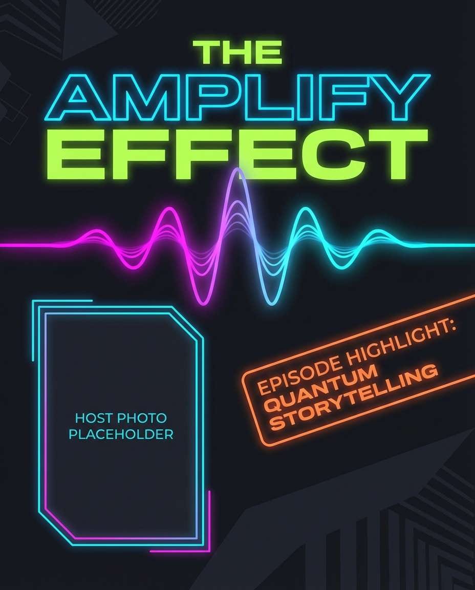
Podcast promo banner with bold title typography, waveform graphic element, host photo placeholder, episode highlight tag, dark mode palette with neon accents, clean composition, modern editorial layout, crisp vector finish, no watermark --ar 4:5
Travel Deal Ad
Nano Banana 2· Image
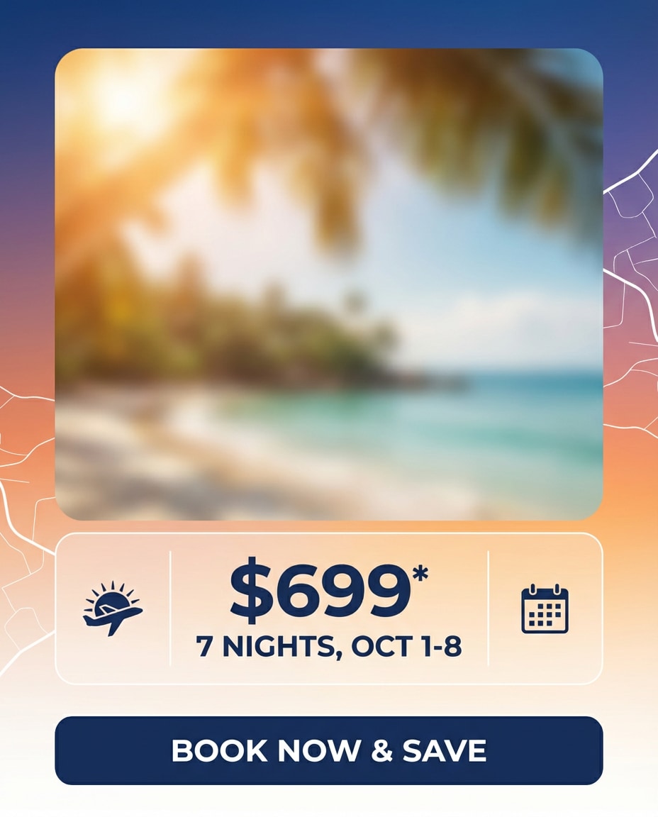
Travel deal banner with dreamy destination photo placeholder, sun flare overlay, clean price and dates module, airline-style icons, modern sans typography, gradient sky tones, minimal map lines in background, strong CTA block, polished ad creative, no watermark, 85mm lens, shallow depth of field --ar 4:5
Element Emerging From Polaroid
Nano Banana Pro· Image
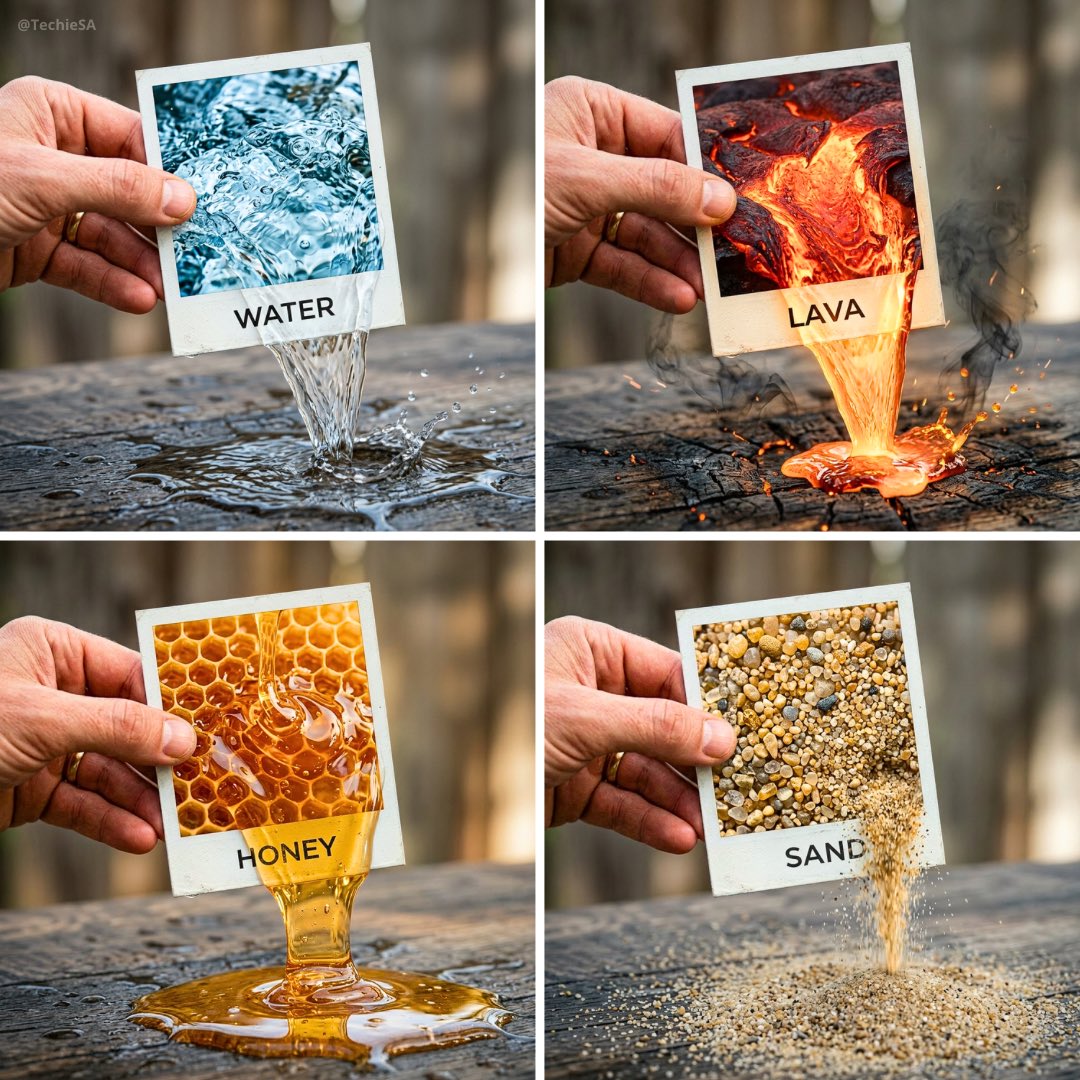
A hyper-realistic 3D photo concept showing a hand holding a square polaroid photo labeled “ELEMENT”. Inside the photo, there’s a close-up of [ELEMENT], and it flows seamlessly out of the photo frame into the real world, naturally interacting with the surface below. The text “ELEMENT” appears printed cleanly on the white border of the photo. Realistic cinematic lighting, ultra-detailed textures, artistic composition, 1080x1080 square format.
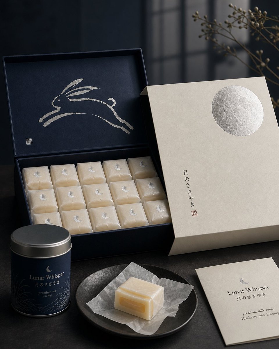
Japanese Confectionery Packaging
GPT Image 2· Image
Premium Japanese confectionery packaging concept, “Lunar Whisper” / 月のささやき, inspired by moon rabbit folklore and refined milk candy nostalgia, rigid uncoated cream paper outer sleeve with smooth eggshell texture, minimal negative space, single cool silver embossed full moon in upper-right corner, small vertical Japanese sumi ink typography, sleeve sliding open to reveal deep matte midnight indigo inner box, inside lid printed with elegant single brushstroke leaping rabbit in shimmering pearl ink, sumi-e style, abstract folkloric rabbit, rows of individually wrapped milk candies in translucent washi-style paper, tiny silver crescent moon stickers, pale ivory candies glowing softly through paper, one candy partially unwrapped showing silky nama caramel like milk core with delicate edible rice paper film, Hokkaido cream and honey feeling, quiet ceremonial unboxing, reusable keepsake tea sachet container, Japanese minimalism, luxury packaging design, tactile paper materials, pearl ink, silver foil embossing, soft diffused moonlight, editorial product photography, refined negative space, calm nocturnal atmosphere, award winning packaging render, high end boutique confectionery brand presentation.
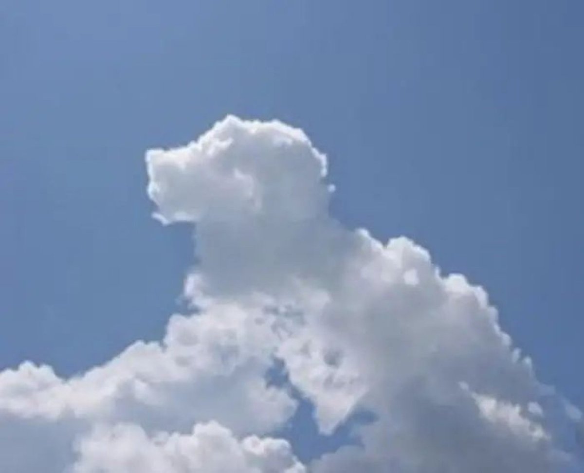
Based on the Shape of the Clouds in the Image
GPT Image 2· Image
Based on the shape of the {argument name="subject" default="clouds"} in the image, identify what object, animal, or person they most resemble. Do not change the original image; instead, draw that object, animal, or person over the original image in a {argument name="art style" default="doodle"} style.
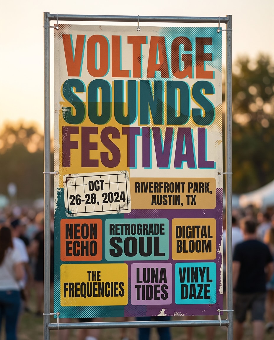
Music Festival Lineup
Nano Banana 2· Image
Music festival banner with bold typographic hierarchy, colorful halftone textures, layered stickers aesthetic, lineup grid, date and location blocks, retro-modern color palette, high visual rhythm, crisp vector poster vibe, no watermark, 85mm lens, shallow depth of field, soft cinematic lighting --ar 4:5
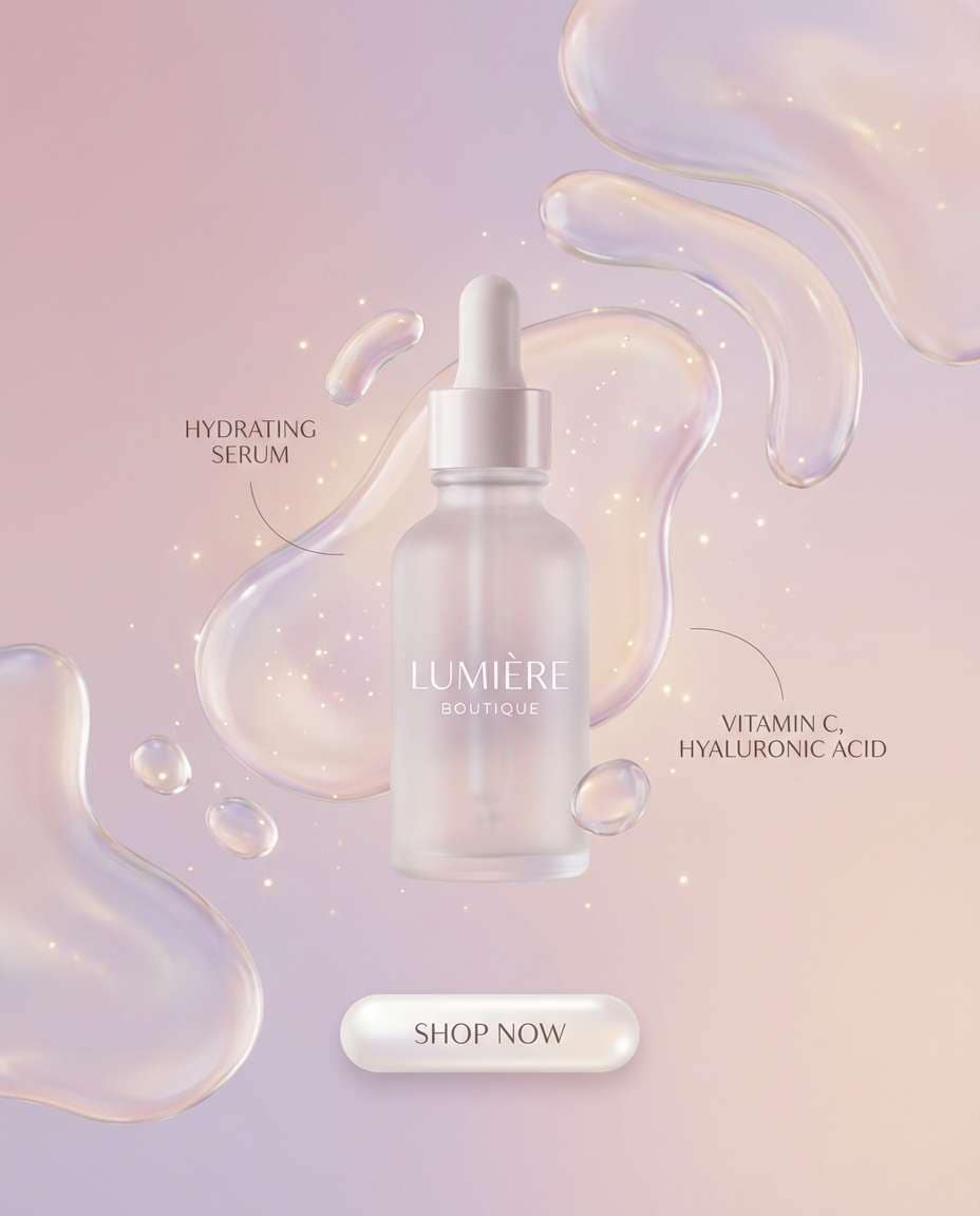
Beauty Skincare Drop
Nano Banana 2· Image
Skincare product banner with soft pastel gradient, glossy liquid shapes, minimal typography, ingredient callouts, clean white space, premium cosmetic ad style, subtle sparkle highlights, rounded CTA button placeholder, elegant modern layout, ultra crisp and clean, no watermark, 85mm lens, shallow depth of field --ar 4:5
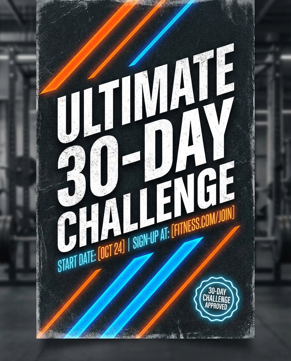
Fitness Challenge
Nano Banana 2· Image
High-energy fitness challenge banner with gritty texture overlay, bold condensed typography, diagonal stripes, neon accent highlights, badge for 30-day challenge, space for start date and sign-up link, athletic brand vibe, strong contrast and hierarchy, crisp poster design, no watermark, 85mm lens, shallow depth of field --ar 4:5
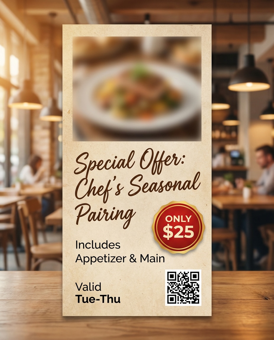
Restaurant Special
Nano Banana 2· Image
Restaurant promo banner with appetizing food photo placeholder, handwritten script accent for special offer, bold price badge, warm lighting color grade, textured paper background, clean menu-style layout, QR code placeholder, cozy modern bistro aesthetic, sharp and readable, no watermark, 85mm lens, shallow depth of field --ar 4:5
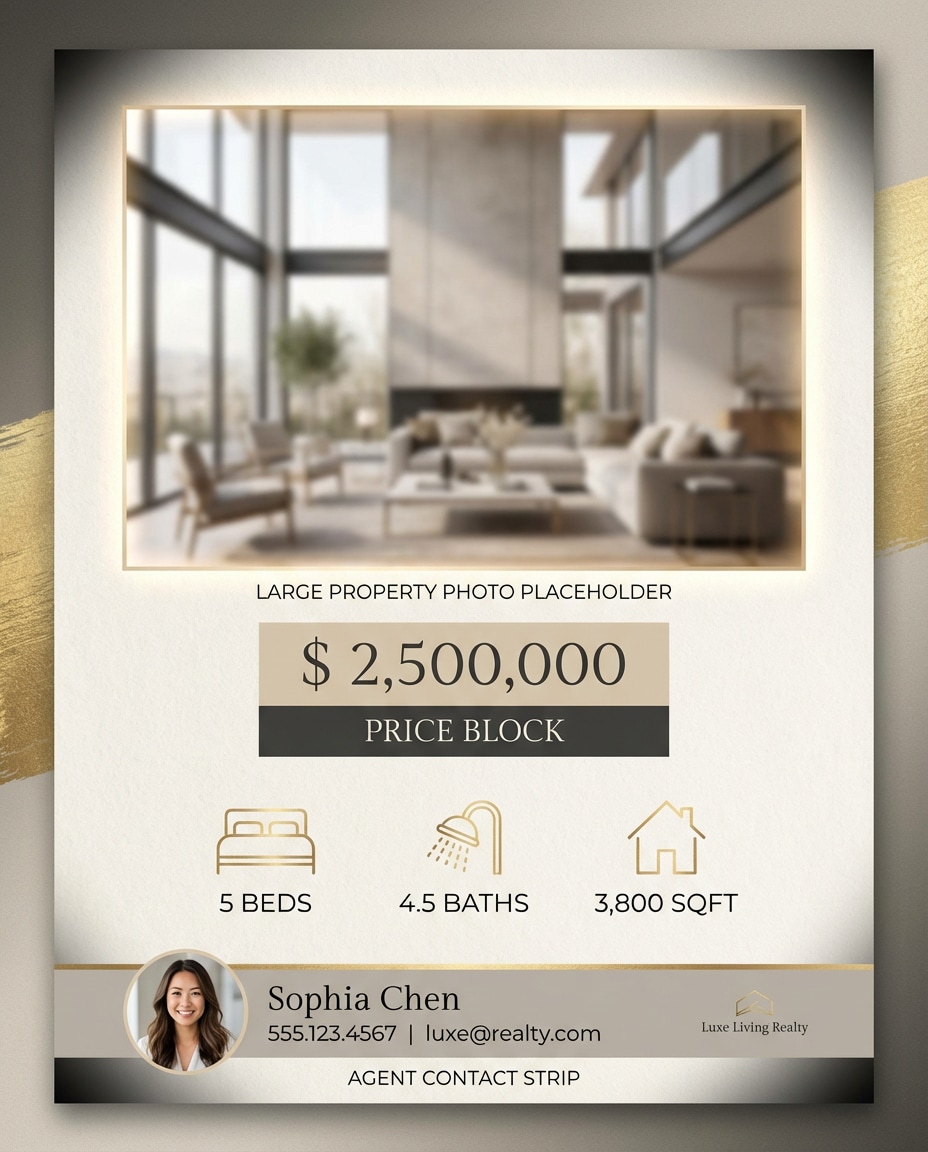
Real Estate Listing
Nano Banana 2· Image
Real estate listing banner with modern luxury look, warm neutral palette, large property photo placeholder, price block, 3 icons for beds baths sqft, agent contact strip, clean lines, premium serif plus sans pairing, subtle vignette, crisp print-ready design, no watermark, 85mm lens, shallow depth of field, soft cinematic lighting --ar 4:5
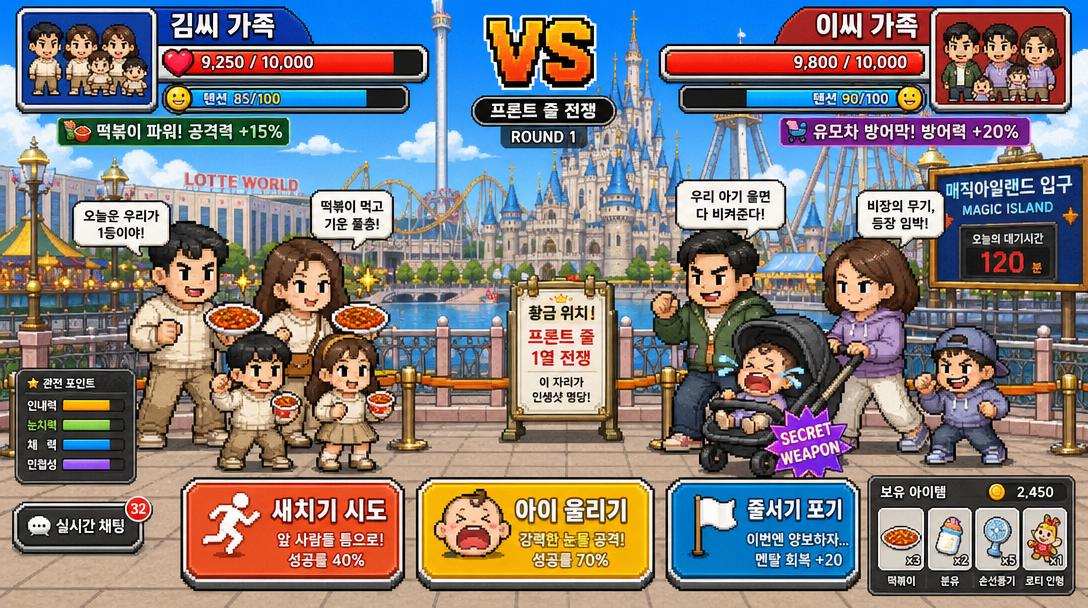
Tokyo DisneySea Front-Row Battle UI
GPT Image 2· Image
A funny Korean mobile game screenshot of a vs battle at Lotte World (롯데월드) theme park. Two Korean families competing for front-row position in pixel-art style. Health bars at top with Korean names '김씨 가족' vs '이씨 가족'. Action buttons: '새치기 시도', '아이 울리기'. Bright colorful Korean mobile game UI aesthetic.

Webinar Registration Banner
Nano Banana 2· Image
Webinar promo banner with clean layout: speaker photo placeholder circle, topic headline, 3 key takeaways bullet list, date/time badge, register CTA block, light background with soft shadows, professional B2B style, readable typography, minimal accent color, no watermark, 85mm lens, shallow depth of field --ar 4:5