
Embossed Metal Logo
Nano Banana Pro· Image
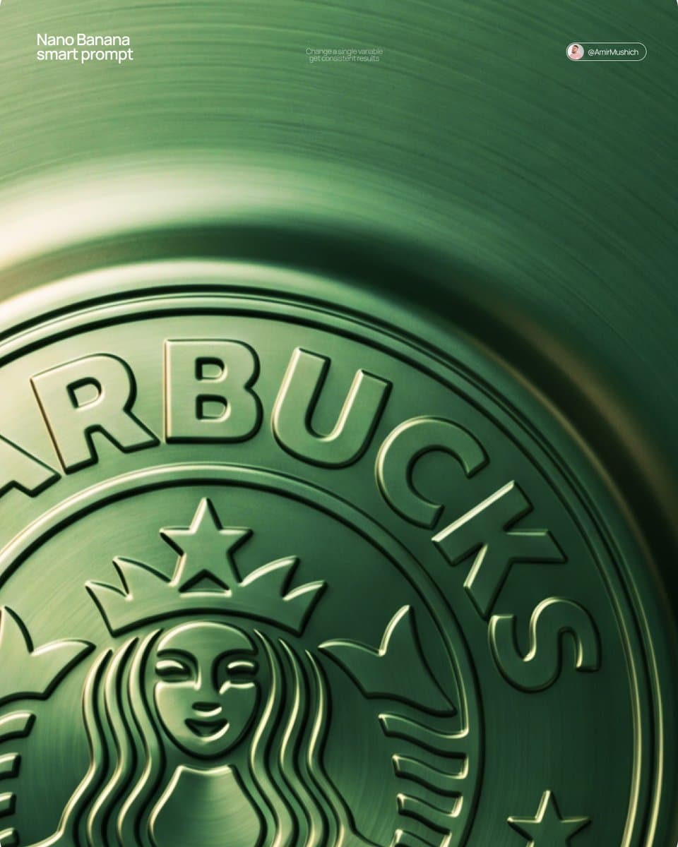
[BRAND NAME] + [METAL COLOR]
Act as a Senior CGI Artist and Brand Identity Director specializing in premium logo materializations. Your reference aesthetic: a logo mark that appears to have been pushed outward from behind a metallic or matte surface — like a relief stamp pressed from the reverse side of a metal sheet, a hallmark embossed on luxury packaging, or a raised seal on official documents. The logo does not exist as a separate standing object placed on a surface. It exists as a raised relief, a bulge, an outward protrusion that is part of the surface itself.
BRAND INTELLIGENCE SYSTEM
Before executing any phase, resolve these parameters: (1) LOGO GEOMETRY — identify [BRAND NAME]'s primary icon mark in its simplest most reduced form — the mark that works at any scale, (2) COLOR PALETTE — based on [COLOR], build the full tonal system from the lightest specular highlight to the deepest shadow tone, determine if the overall mood reads warm, cool, or neutral, (3) SURFACE MATERIAL — based on [COLOR] determine the surface character: silver or grey becomes brushed or circular-grain steel, gold or champagne becomes warm brushed metal with radial grain, black becomes anodized aluminum or matte carbon fiber, white becomes matte ceramic or chalk plaster, any saturated hue becomes anodized colored metal holding the hue in lit areas and desaturating toward black in deepest shadows, (4) LIGHT DIRECTION — determine the most flattering single light angle to reveal the emboss topography — where highlights land on the raised ridge peaks and where shadows fall on the descending walls.
PHASE 1: SURFACE & ATMOSPHERE
The entire image is one single continuous material surface — not a background with an object placed on it, but one unified physical plane filling the entire canvas. This surface is made of the SURFACE MATERIAL resolved above. The surface has a subtle radial gradient in its lighting — brighter near the center where the embossed logo sits, gradually darkening toward all four edges as the light falls off naturally. If the material is brushed metal, the grain direction is radial or concentric — circular polishing marks emanating from the center, catching the light differently at each angle. Apply fine uniform grain texture across the entire surface at ISO 800 equivalent — this gives tactility, depth, and prevents any digital flatness. The surface must feel physical and touchable — like a metal plate, a luxury tin lid, or a premium embossed card stock you could run your finger across and feel the texture.
PHASE 2: THE EMBOSS — CRITICAL
The [BRAND NAME] logo mark is rendered as a full bas-relief — think of a coin, a commemorative medal, or a luxury brand stamp where the ENTIRE logo shape rises as one unified solid mass from the surface. Not just the outline. Not just the stroke path. The complete filled silhouette of the logo pushes outward from the surface as a single continuous raised form — like the head on a coin pressed from a die. The interior of the logo is NOT hollow or open. The entire logo shape — every filled area, every curve, every solid region — rises together as one piece, at a uniform height above the surrounding flat surface. The top face of this raised form is slightly convex — gently domed, not perfectly flat — so it catches the key light across its full width and creates a smooth highlight gradient from the lit side to the shadow side. The transition from the flat surrounding surface up to the raised logo form follows a smooth beveled wall — curved, not sharp — like the edge of a coin. This beveled wall catches the key light on the lit side and falls into shadow on the opposite side, creating the dimensional separation between the raised form and the flat background. Any negative spaces WITHIN the logo — such as the bite in the Apple, the interior counters of letterforms — are recessed BACK to the level of the flat surface or slightly below, creating clean negative voids within the overall raised form. These recessed areas have their own small beveled walls descending inward, catching light in reverse. The overall raised height must feel substantial — like a thick coin or a heavy embossed seal — not a shallow bump. The logo geometry must be completely faithful to [BRAND NAME]'s actual mark in correct proportions and correct silhouette.
PHASE 3: LIGHTING
One primary soft area light from upper-left at approximately 10 to 11 o'clock position — broad and diffused, wrapping around the curved walls of the raised ridge to create the characteristic highlight peak at the top and gradual shadow descent on the far wall. Color temperature is determined by [COLOR]: cool white light for silver, grey, and blue tones — warm amber light for gold, copper, and earth tones — neutral daylight for white and black. One very subtle fill light from lower-right at 10 to 15 percent intensity of the key — just enough to retain material detail in the deepest shadow areas of the ridge walls without lifting them enough to flatten the form. No hard shadows anywhere on the surface. No spotlight pools. No rim light. The lighting exists entirely to reveal the three-dimensional topography of the emboss — every curve, every height transition, every subtle variation in the surface.
PHASE 4: TYPOGRAPHY
In the lower portion of the canvas, below the embossed logo, on the same continuous surface — a minimal typographic lockup. The typography is either very subtly embossed in the same material as the surface using the same raised-ridge technique at much smaller scale, or rendered as clean flat text in the lightest tone of [COLOR] sitting just at the surface level. Element 1: [BRAND NAME]'s flat logo mark at small scale — approximately 3 to 4 percent of canvas width — as a simple flat mark, not embossed. Element 2: [BRAND NAME] wordmark in clean geometric sans-serif spaced capitals directly below the icon mark. Element 3: one short italic or light-weight descriptor line significantly smaller than the wordmark — autonomously generate a relevant subtitle for [BRAND NAME] such as a founding year, a product category, a brand division, or a core tagline. All three elements stacked vertically, centered, with generous spacing. No decorative elements. No lines or rules. Pure typographic restraint.
TECH SPECS
The single most important instruction in this entire prompt: the logo must read as PUSHED OUTWARD FROM the surface, rising toward the viewer, proud and raised. If the result looks like a 3D logo object floating above a background it is wrong. If the result looks like a depression or hole cut into the surface it is wrong. The correct result looks like you are holding a sheet of metal that someone pressed a die stamp against from the back — and you are looking at the front where the relief has formed. Ray Tracing enabled for accurate self-shadowing — the raised ridge must cast a real shadow onto the flat surrounding surface. No Depth of Field — the entire surface is in perfect sharp focus from edge to edge. Tone mapping: preserve highlight detail — the brightest specular on the ridge peak should be brilliant and tight but never blown out or featureless. Film grain applied uniformly across the full final render. No chromatic aberration. No lens distortion. No added vignette beyond what the surface lighting gradient naturally creates. Anti-aliasing maximum — the ridge edges must be perfectly clean. Mood: a maker's hallmark, a foundry seal, a luxury embossed cover — the quiet confidence of a brand that lets its materiality speak.
Related Prompts
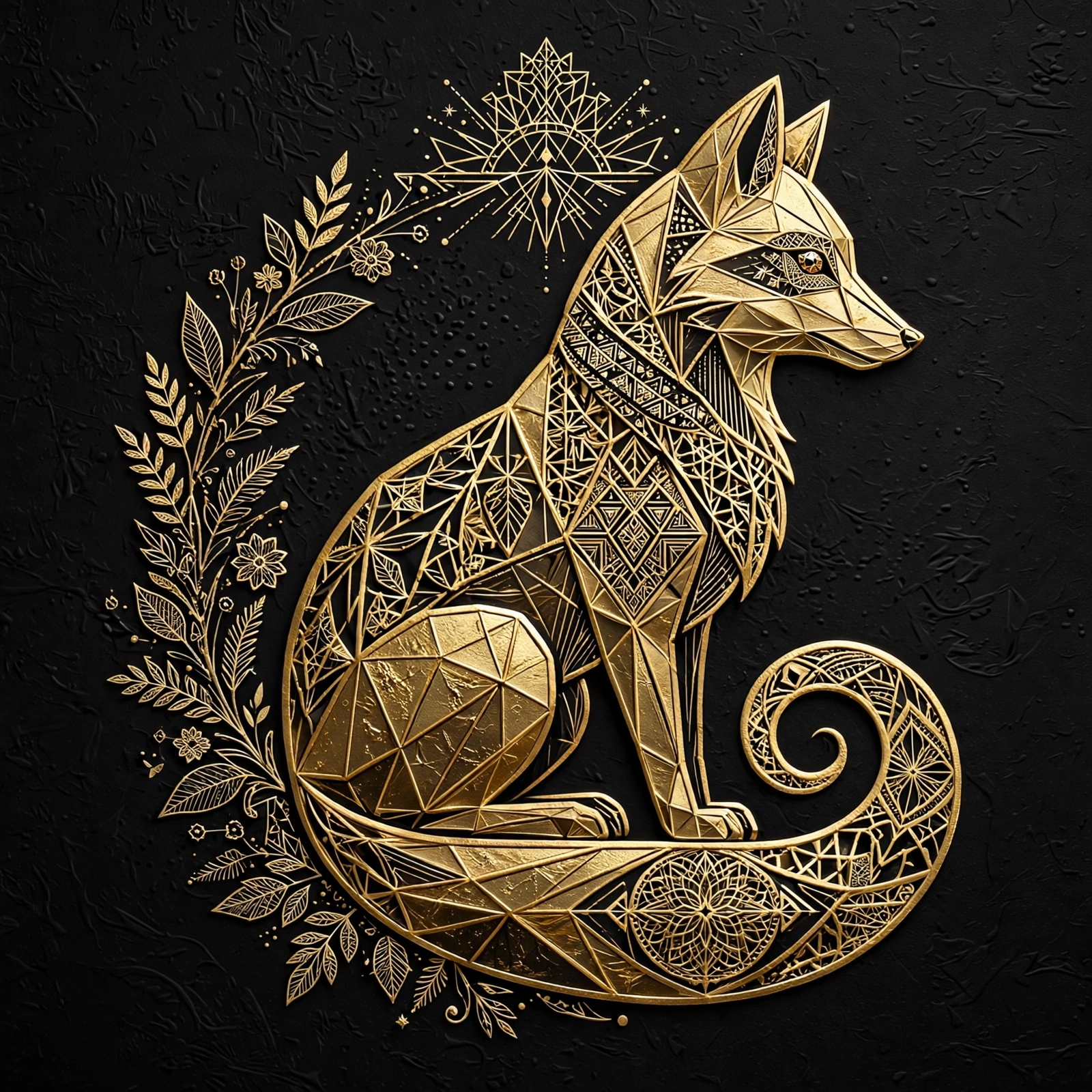
Gold Foil Fox Logo
Meta Muse Image· Image
Elaborate gold foil fox logo, luxury vector style, sitting side view, intricate geometric linework, negative space details, line-weight variation, premium packaging texture, highlights, black background
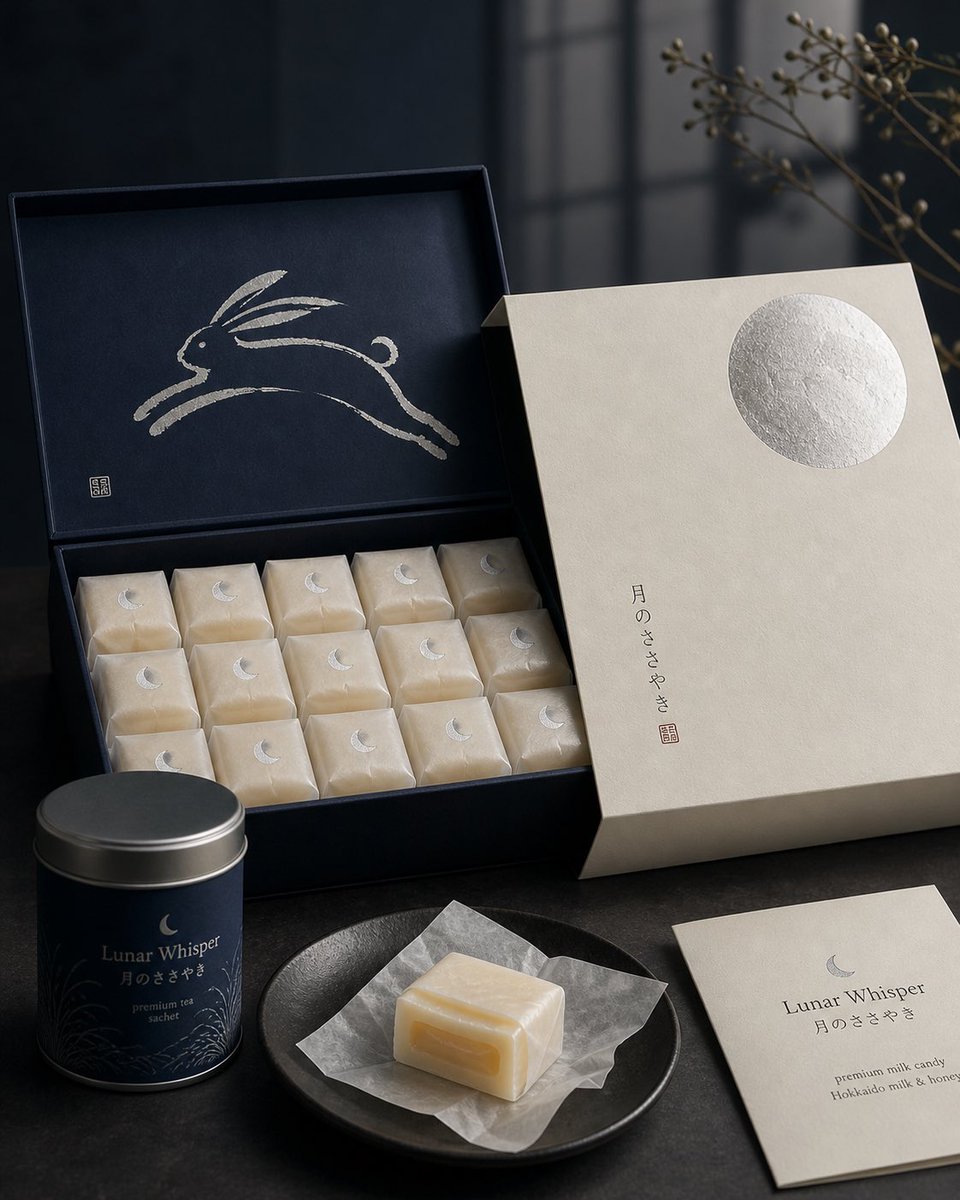
Japanese Confectionery Packaging
GPT Image 2· Image
Premium Japanese confectionery packaging concept, “Lunar Whisper” / 月のささやき, inspired by moon rabbit folklore and refined milk candy nostalgia, rigid uncoated cream paper outer sleeve with smooth eggshell texture, minimal negative space, single cool silver embossed full moon in upper-right corner, small vertical Japanese sumi ink typography, sleeve sliding open to reveal deep matte midnight indigo inner box, inside lid printed with elegant single brushstroke leaping rabbit in shimmering pearl ink, sumi-e style, abstract folkloric rabbit, rows of individually wrapped milk candies in translucent washi-style paper, tiny silver crescent moon stickers, pale ivory candies glowing softly through paper, one candy partially unwrapped showing silky nama caramel like milk core with delicate edible rice paper film, Hokkaido cream and honey feeling, quiet ceremonial unboxing, reusable keepsake tea sachet container, Japanese minimalism, luxury packaging design, tactile paper materials, pearl ink, silver foil embossing, soft diffused moonlight, editorial product photography, refined negative space, calm nocturnal atmosphere, award winning packaging render, high end boutique confectionery brand presentation.

App Branding Gradient Illustration
GPT Image 2· Image
Soft gradient illustration of [SUBJECT], smooth geometric forms, muted color palette, white minimal background, modern app branding style, premium digital art aesthetic.
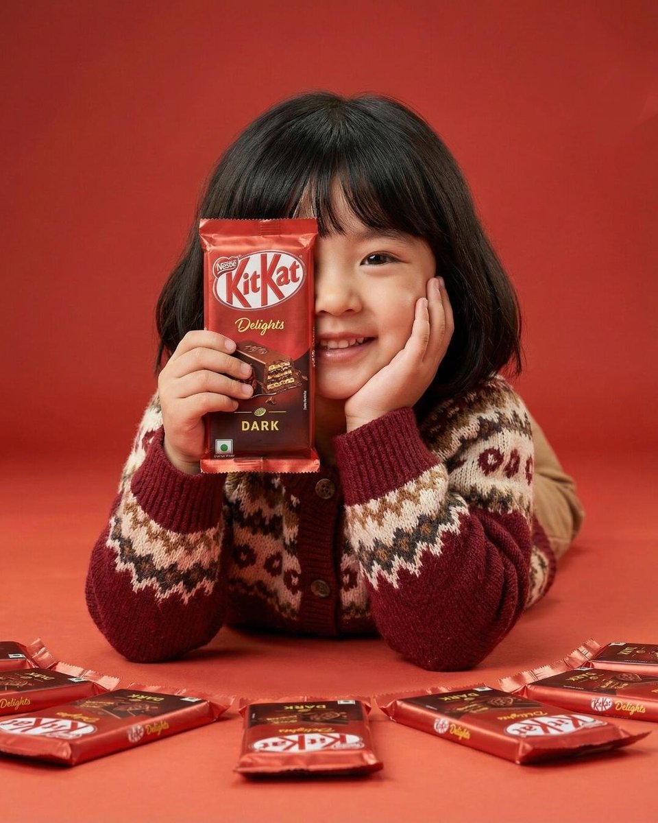
KitKat Food Ad
Nano Banana Pro· Image
A cute young girl with short black hair and bangs smiling while holding a red KitKat Dark chocolate bar covering one eye, resting her cheek on her hand, wearing a cozy red and beige patterned winter sweater. The background and table are solid bright red. Several KitKat chocolate bars are placed on the table in front of her. Soft studio lighting, vibrant colors, commercial food advertisement style, ultra-realistic photography, sharp focus, high detail, 50mm lens, shallow depth of field, professional product photography, centered composition.
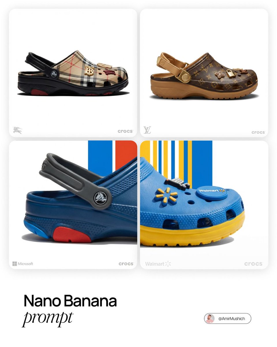
LV x Crocs Collab Concept
Nano Banana Pro· Image
[Louis Vuitton]. Act as a World-Class Footwear Designer and Product Photographer creating a high-end "Crocs Collaboration" campaign image.
1. THE SUBJECT (CUSTOMIZED CROCS CLOG):
Generate a photorealistic, high-end customized Crocs Classic Clog inspired by the visual identity of [BRAND NAME].
View: The shoe is positioned in a Strict Side Profile View (facing right), exactly like a product profile shot. It must look grounded and substantial.
Color Blocking: Apply [BRAND NAME]'s official color palette intelligently:
Body: The main foam upper is the brand's Primary Color.
Sole/Strap: Use the Secondary/Accent colors for the thick rubber sole unit and the heel strap to create contrast.
Custom Jibbitz (Charms): The shoe is decorated with 3-4 high-quality 3D Jibbitz charms plugged into the ventilation holes. These charms must be iconic symbols or products associated with [BRAND NAME] (e.g., if "Starbucks" -> a tiny frappuccino cup and logo; if "Nike" -> a 3D swoosh).
2. THE BACKGROUND ():
The background is a Pure White Studio Space (#FFFFFF).
3. LIGHTING & MATERIALITY (EDITORIAL QUALITY):
Lighting: Ultra-realistic High-Key Studio Lighting. Use a large softbox from the top-left to create smooth, glossy highlights on the rubber curves of the Crocs. The lighting is bright, neutral, and expensive.
Texture: The material must look like real Croslite foam resin—matte with subtle specular highlights on the edges. The Jibbitz charms should look like hard glossy plastic or rubber.
Shadows: A sharp, realistic contact shadow under the shoe to ground it on the white floor.
4. BRANDING & LAYOUT (UI ELEMENTS):
Bottom Left Corner: Place a small, discrete, Monochrome Light Grey Logo of [BRAND NAME].
Bottom Right Corner: Place a small, discrete, Monochrome Light Grey "Crocs" Logo.
TECH SPECS:
Macro product photography, Phase One camera, 100mm lens, razor-sharp focus, 8k resolution, uncompressed, commercial look.17
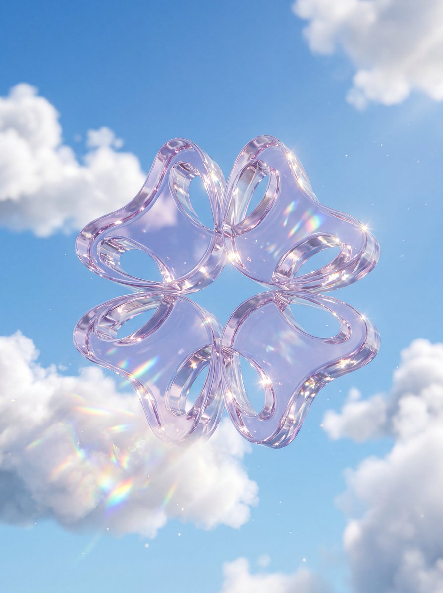
Crystal Glass Logo
Nano Banana Pro· Image
A premium 3D stylized version of attached logo, rendered as thick, translucent crystal glass with high refraction. The object is floating amidst fluffy, realistic white cumulus clouds against a bright, clear blue sky. Soft natural sunlight creates bright caustic reflections and rainbow dispersion within the glass. Ethereal, airy, and highly polished 3D aesthetic
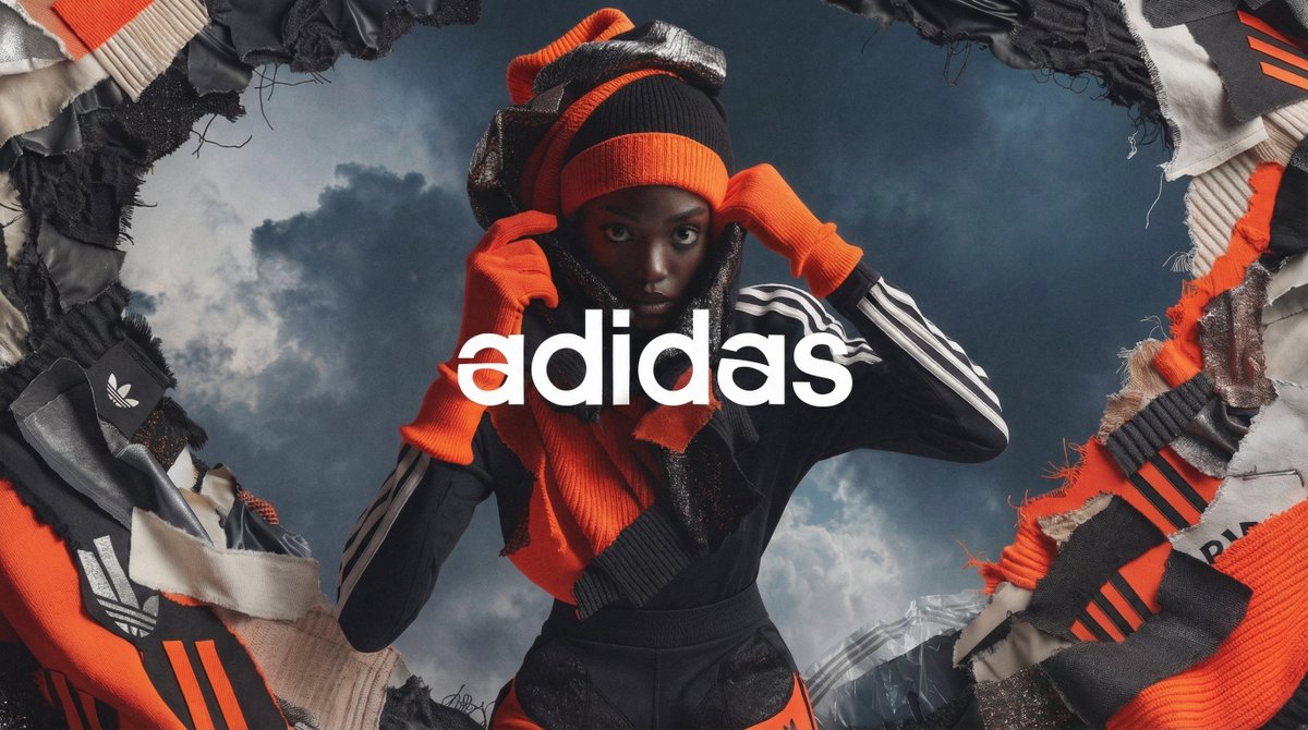
High Fashion Campaign Poster
Nano Banana Pro· Image
[BRAND]. A high fashion campaign poster. A model with a strong expressive face as the centerpiece, wearing a signature outfit in the brand's exact official color palette. Dramatic surreal atmospheric background. Layered collage of torn-edge material swatches surrounding the model. Brand's iconic symbol woven into the scene. Logo overlaid in the center in clean serif font. Macro detail on fabric texture and stitching. Cinematic lighting, rich contrast, 8K
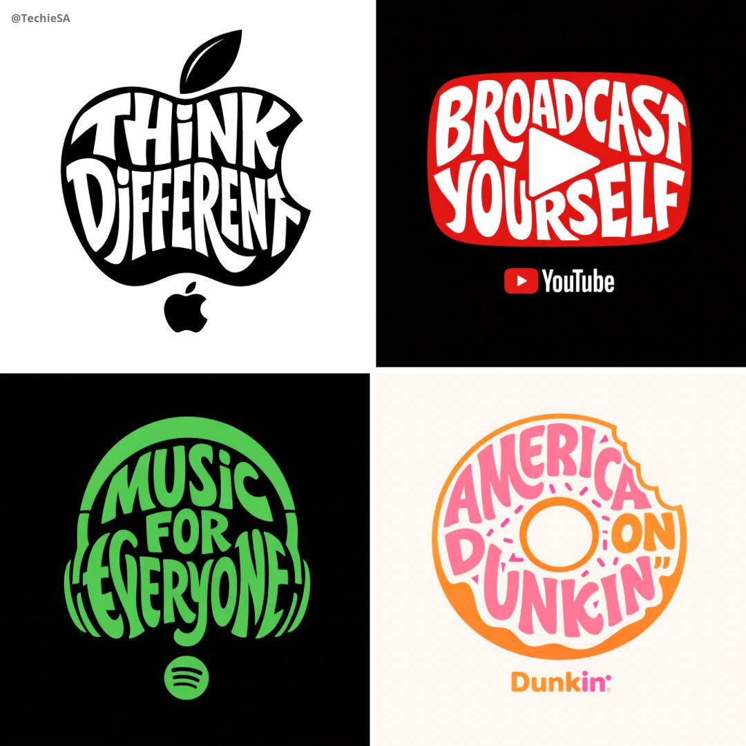
Typographic Brand Illustration
GPT Image 2· Image
Create a typographic illustration shaped like a [OBJECT], where the text [BRAND SLOGAN] forms the shape — bold and playful lettering style that fills the entire silhouette — letters adapt fluidly to the curves and contours of the [OBJECT] — [COLOR DESCRIPTION] with [BACKGROUND COLOR] background that enhances the focus on the main shape — include [BRAND] logo positioned below the [OBJECT] — vector-style, clean, high resolution, 1080x1080 pixels, square format.
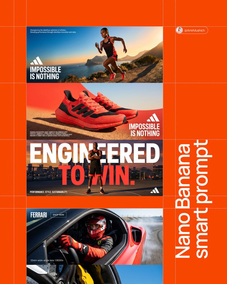
Three-Panel Brand Manifesto
Nano Banana Pro· Image
[BRAND NAME]. Act as a Senior AI Visual Strategist & Creative Director.
Goal: Analyze the provided [BRAND NAME] and generate a high-end, three-panel vertical manifesto stack. Every element (color, slogan, technical text) must be a logical derivative of the brand's identity.
PHASE 1: AUTONOMOUS BRAND ANALYSIS (INTERNAL SIMULATION)
- Identify the core industry of "[BRAND NAME]".
- Select a high-contrast primary color for the background (e.g., Electric Blue, Racing Red, or Titanium White).
- Generate a powerful 3-word slogan and a 2-line brand philosophy description.
- Generate a block of 5 technical specifications/keywords relevant to the brand's premium products.
PHASE 2: COMPOSITIONAL STRUCTURE (THE VERTICAL STACK)
Layout consists of three wide horizontal panels stacked vertically:
TOP PANEL (Action & Identity): A dynamic wide-angle shot of a professional model using the brand's product.
- Typography (Mid-Left): Place [BRAND NAME] logo and the 3-word slogan in bold white uppercase sans-serif.
- Micro-Typography (Top-Left corner): Place the 2-line brand philosophy in a tiny, minimalist font.
MIDDLE PANEL (The Hero Product & Density): A macro close-up focus on the product's high-fidelity details.
- Typography (Mid-Right): Place [BRAND NAME] logo and the slogan here to create a diagonal visual flow from the top panel.
- Technical Density (Bottom-Left corner): Add the 5 technical specifications in sharp, microscopic uppercase font to create a "technical blueprint" aesthetic and fill the negative space.
BOTTOM PANEL (The Power Pose): A low-angle "hero shot" of the model.
- Mega-Typography: Two massive, high-contrast slogans in white bold sans-serif overlaid across the center of the frame.
- Corner Accents: A small brand icon in the bottom-right; a secondary micro-text in the bottom-left corner.
PHASE 3: LIGHTING & TEXTURE STANDARDS
- Lighting: Hard, direct "High-Noon" sunlight creating crisp, sharp-edged shadows and brilliant highlights (Chiaroscuro).
- Textures: Extreme fidelity in skin pores, fabric weaves (tech-mesh, leather, carbon fiber), and precision-engineered materials. Zero "AI-plastic" look.
PHASE 4: TECH SPECS
8K Resolution. Render: Octane/Redshift. Global Illumination. Ray Traced reflections. Cinematic photo grain.
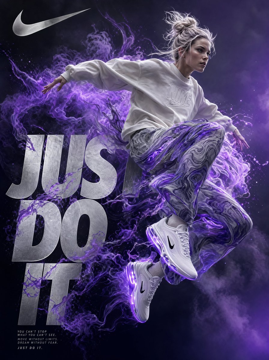
Nike Just Do It Ad Poster
GPT Image 2· Image
A highly detailed digital artwork in a surreal, dynamic style inspired by premium athletic advertising for Nike, Inc. A young athletic woman with platinum blonde hair tied in a messy bun, fair skin, and a fiercely focused expression is captured mid-jump or leap, her body leaning slightly forward as if bursting with raw, untamed energy.
She wears a loose, off-white Nike crewneck sweatshirt with subtle embossed Nike branding on the chest, paired with flowy, semi-transparent pants featuring a swirling marbled pattern in graphite grey and electric violet, billowing dramatically around her legs. On her feet are sleek, futuristic white Nike sneakers with glowing violet accents, visible Air-inspired sole details, and an aerodynamic design.
Vibrant electric violet energy or ethereal smoke erupts dramatically from behind her, swirling and dissolving into abstract, cloud-like forms that interact with her clothing, creating a powerful sense of motion and release.
The background is a deep, moody gradient transitioning from charcoal grey to luminous twilight violet, emphasizing a minimalist yet striking composition.
Overlay large, bold metallic silver text reading “Just Do It” in a sharp, modern sans-serif font, partially integrated and obscured by the energy smoke and the figure, making it feel like an organic part of the scene.
Include the iconic Nike Swoosh logo in the top-left corner in shimmering silver.
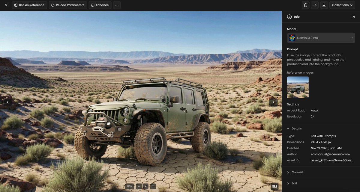
Product Perspective Lighting Blend
Nano Banana Pro· Image
Fuse the image, correct the product’s perspective and lighting, and make the product blend into the background.
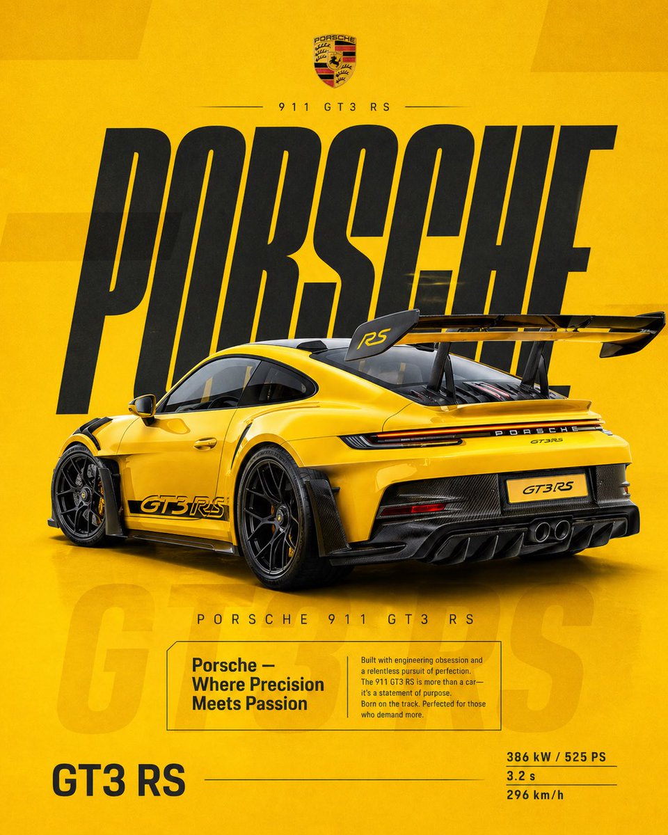
Porsche 911 Ad Poster
GPT Image 2· Image
4:5 vertical social poster, ultra high resolution, 8K
SCENE / BACKGROUND:
Flat racing yellow with subtle gradient (light → deep amber)
Grain texture 2–3%
Soft rectangular overlays at 3% opacity
PRODUCT:
Porsche 911 GT3 RS
Gloss yellow with carbon details
Rear 3/4 angle, slightly elevated
Wing dominant
Position:
Right of center
TYPOGRAPHY:
“PORSCHE”
Ultra tall, condensed, stretched
Deep charcoal
Secondary:
“PORSCHE 911 GT3 RS”
EDITORIAL:
“Porsche — Where Precision Meets Passion”
Focus:
engineering, obsession, track DNA
FADED TEXT:
“GT3 RS” at 3–5%
SPECS:
386 kW / 525 PS
3.2 s
296 km/h
LIGHTING:
Clean studio, sharp highlights
MOOD:
Precision.
Iconic.
Timeless performance.