carat

Prompt Gallery

/

포스터 Traditional Music Poster

Login
Sign Up

포스터 Traditional Music Poster

포스터 Traditional Music Poster prompts. Copy and use 포스터 Traditional Music Poster image generation prompts from Carat right away.

2026.08.15

·
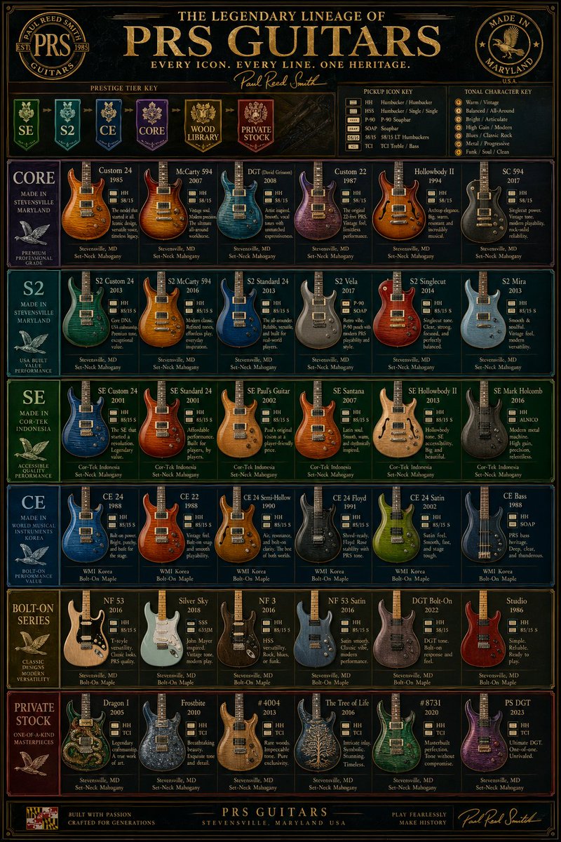
AI-generated {"type":"luxury Vintage Guitar Comparison Infographic Poster" made with GPT Image 2

{"type":"luxury Vintage Guitar Comparison Infographic Poster"

GPT Image 2· Image
{"type":"luxury vintage guitar comparison infographic poster","subject":"a highly detailed, vertically oriented PRS electric guitar lineup chart designed like a premium museum poster or collector's reference board","style":"ornate, dark, glossy, high-contrast, gold-foil typography, elegant wood-and-metal textures, symmetrical grid layout, premium catalog aesthetic, subtle vintage patina, ultra sharp graphic design","branding":{"main headline":"THE LEGENDARY LINEAGE OF {argument name="brand name" default="PRS GUITARS"}","subheadline":"EVERY ICON. EVERY LINE. ONE HERITAGE.","signature":"Paul Reed Smith","left seal":"PAUL REED SMITH GUITARS","right seal":"MADE IN MARYLAND U.S.A."},"palette":{"background":"black and deep charcoal with dark figured wood accents","primary":"antique gold","secondary":"cream","accent colors":["deep green","teal","royal blue","purple","gold","burgundy"]},"layout":{"format":"single-page vertical poster","header":{"position":"top","elements":["large central title","small tagline below","script signature","2 circular emblems in upper left and upper right","3 horizontal legend boxes under the title"]},"sections":[{"title":"PRESTIGE TIER KEY","position":"upper left below title","count":6,"labels":["SE","S2","CE","CORE","WOOD LIBRARY","PRIVATE STOCK"]},{"title":"PICKUP ICON KEY","position":"upper center-right below title","count":7,"labels":["HH","HSH","P-90","SOAP","58/15","TCI","Bass"]},{"title":"TONAL CHARACTER KEY","position":"upper right below title","count":7,"labels":["Warm / Vintage","Balanced / All-around","Bright / Articulate","High Gain / Modern","Blues / Classic Rock","Metal / Progressive","Funk / Soul / Clean"]},{"title":"CORE","position":"first main row left label","count":7,"labels":["Custom 24","McCarty 594","DGT (David Grissom)","Custom 22","Hollowbody II","SC 594","row category panel"]},{"title":"S2","position":"second main row left label","count":6,"labels":["S2 Custom 24","S2 McCarty 594","S2 Standard 24","S2 Vela","S2 Singlecut","S2 Mira"]},{"title":"SE","position":"third main row left label","count":6,"labels":["SE Custom 24","SE Standard 24","SE Paul's Guitar","SE Santana","SE Hollowbody II","SE Mark Holcomb"]},{"title":"CE","position":"fourth main row left label","count":6,"labels":["CE 24","CE 22","CE 24 Semi-Hollow","CE 24 Floyd","CE 24 Satin","CE Bass"]},{"title":"BOLT-ON SERIES","position":"fifth main row left label","count":6,"labels":["NF 53","Silver Sky","NF 3","NF 53 Satin","DGT Bolt-On","Studio"]},{"title":"PRIVATE STOCK","position":"sixth main row left label","count":6,"labels":["Dragon I","Frostbite","#4004","The Tree of Life","#8731","PS DGT"]}],"footer":{"position":"bottom","elements":["small badge at lower left","centered company line","right-side script signature"]}},"content grid":{"total guitar models shown":37,"card design":"each product card contains a guitar render, model name, year, small pickup icons, a short descriptive blurb, and origin/wood specs at the bottom","row side panels":6},"visual details":{"guitars":"front-facing electric guitars with varied body shapes and highly polished figured maple tops, metallic and transparent finishes, some solid colors, some natural wood","typography":"all caps serif headlines, small serif body text, script signature accents","borders":"thin decorative gold rules around every panel and the full poster","lighting":"studio-lit instruments against dark panel backgrounds","render quality":"clean infographic precision with realistic product renders"},"camera":"straight-on flat poster view, no perspective distortion, centered composition","quality":"ultra detailed, print-ready, high-resolution editorial infographic, luxury brand poster"}

@GlennHasABeard
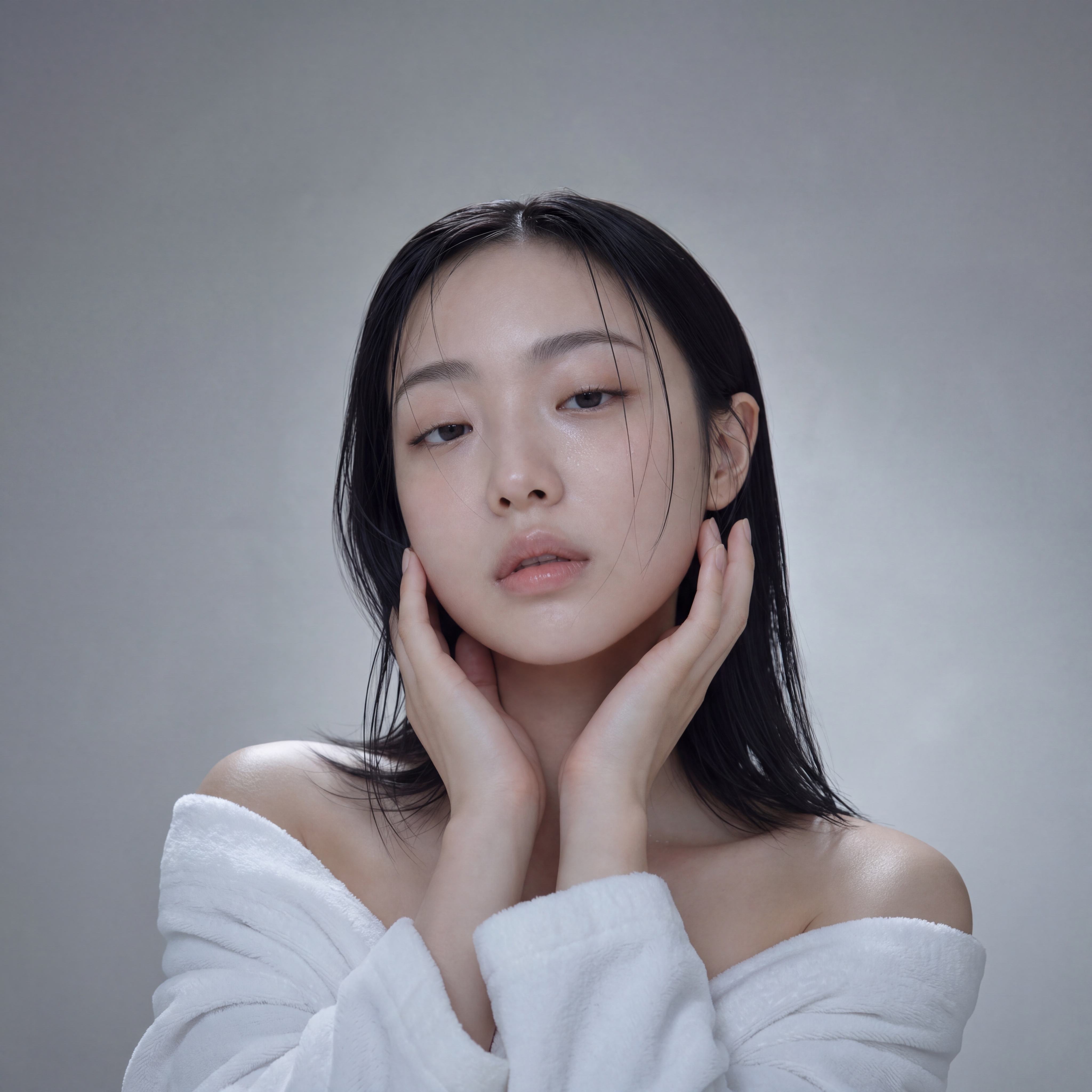
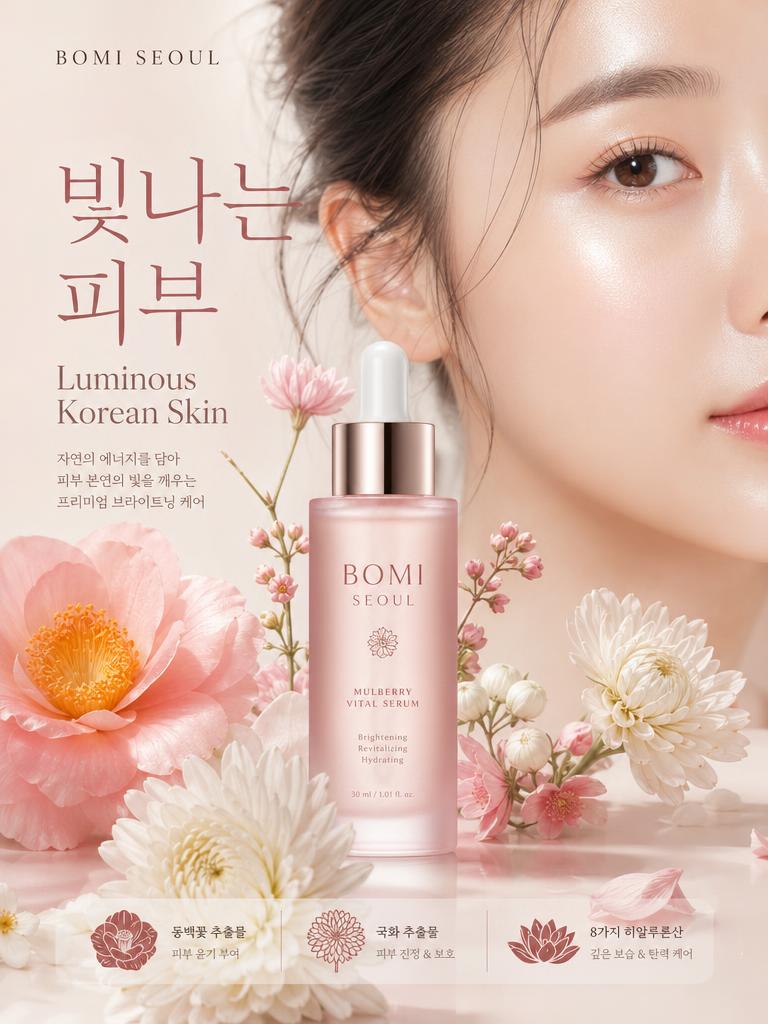
AI-generated Dewy Skin Beauty Portrait made with GPT Image 2

Dewy Skin Beauty Portrait

GPT Image 2· Image
85mm macro-portrait editorial photograph. Medium-format skincare campaign quality. Framing: chin to crown, neck fully visible, slight collarbone at lower frame edge. Korean woman early to mid 20s. SKIN FOCUS: bare skin minimal coverage, natural pore texture visible, freshly-moisturized surface — not glossy, not matte, in between: satin-damp. Gentle water-droplet or moisture-mist trace on one cheek or collarbone. No color cosmetics except bare moisturized lips, natural lashes. FACE BASE: fair cool-neutral skin satin-damp finish, natural pore texture, dark brown medium-sized iris, natural facial asymmetry. Expression: eyes slightly closed then reopened mid-blink — lids at 80% open, soft dreamy relaxed, lips slightly parted 3mm, jaw completely relaxed. EYELID: double eyelid tapered crease wide-set slightly wider than one eye-width, outer corners very slightly downturned, defined lash line, natural length lashes. NOSE: moderate bridge rounded button tip, narrow well-defined nostrils aligned to inner eye corners. LIPS: lower lip noticeably fuller 1.5x ratio, deep well-defined philtrum, one cupid bow peak slightly higher than other, moderate mouth width, natural bare moisture sheen. BROWS: medium-thin extends 3-4mm beyond outer eye corner, fades naturally at both ends, minimal arch, feathered texture. SKIN MARK: flawless glass skin no distinctive marks, subtle warm-cool tone variation at temples. FACE: heart-shaped narrow pointed chin, smooth tapering jaw, high soft cheekbones. HAIR: sleek straight center-part jet black hair, collarbone length, high-shine finish, one strand falling over cheek naturally. POSE: both hands gently cradling face or neck, fingertips lightly touching cheekbones from below, clean bare nails. OUTFIT: minimal white robe or towel wrap peeking at very bottom of frame, not a fashion shot. BACKGROUND: pale cool-gray seamless studio, slightly gradient lighter behind head area. LIGHTING: 90cm octobox key 45 degrees above left eye-level butterfly pattern, 5500K neutral, white bounce board right side for fill, rim light 5000K from behind right shoulder defining hair and jaw silhouette. SKIN RENDERING: pore texture visible in all midtone areas, micro-down on upper lip and cheeks, skin translucency at ear helix and temple — bone structure visible through skin at cheek and orbital. BACKGROUND: cool gray gradient at -1 stop vs subject, slight depth separation. COLOR GRADE: clean cool neutral, desaturation -15 global, slight blue-green in deep shadows, cool-magenta midtone, airy highlight rolloff. Fine sensor grain shadows. Natural not retouched appearance.
AI-generated Ink Silhouette Collage Poster made with GPT Image 2

Ink Silhouette Collage Poster

GPT Image 2· Image
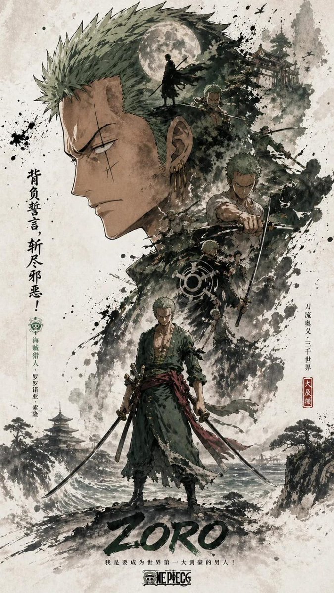
[Main Roles] the most recognizable head, face outline, mask or outer outline of the figure is the large visual subject, forming a highly recognizable silhouette main shape; the middle and lower part is arranged with the complete figure as the second subject, showing a stable standing or slight movement posture, forming the visual core of the picture.Double exposure and collage narrative compositions inside and around the large outline, combining multiple scenes, images, small character relationships, auxiliary elements and environmental layers in clouds, ink, and whitening. The left and right side is equipped with an echoing side of the scene, which creates story tension and space changes. Link the main character, internal collage, and large outline above with a flow of clues across the screen to enhance integrity and vision guidance.The overall picture retains a large area of whiteness, and the edge is stained with ink and virtual broken, creating a real relationship and breath in the Oriental aesthetics. Overall style uniform, advanced and restrained, emphasizing layers, narrative, main visual impact and serialized poster language. Size: 9:16.
@SimplyAnnisa
AI-generated Solo Leveling Character Poster made with GPT Image 2

Solo Leveling Character Poster

GPT Image 2· Image
Create a promotional poster of a SOLO LEVELING-themed character with a vertical Facebook portrait post composition (4:5 ratio, 1080x1350). Use a hierarchy structure with large elements on top and smaller ones below: the top section should feature a very large head, shadowed face silhouette, glowing eyes, or half-body of Sung Jin-Woo as the main visual subject, forming a strong, instantly recognizable iconic silhouette.
@SimplyAnnisa
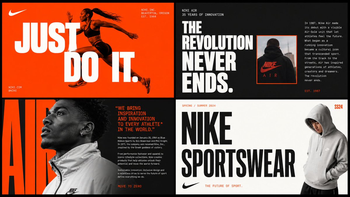
AI-generated 2x2 Brand Moodboard Grid made with GPT Image 2

2x2 Brand Moodboard Grid

GPT Image 2· Image
[BRAND NAME] Act as a Senior Brand Art Director and Editorial Designer creating a 2×2 grid brand moodboard — four distinct editorial cards unified by [BRAND NAME]'s visual identity system. References: Ivy Park campaign editorial, Supreme lookbook layouts, Palace Skateboards zine design, Off-White editorial grids, Highsnobiety brand feature spreads. --- PHASE 0: BRAND INTELLIGENCE — AUTONOMOUS RESEARCH Before generating any visual, perform a complete brand decode of [BRAND NAME] from training data. Extract and apply all of the following autonomously: Color system: identify the exact primary and secondary brand colors — their specific hex values, how they are used in hierarchy (dominant background color, accent color, text color). These colors drive every card in the grid. Typography DNA: identify the exact typeface or typeface category [BRAND NAME] uses — serif, sans-serif, condensed, extended, grotesque, slab. Identify the weight hierarchy: what weight is used for headlines, what for body text, what for labels. Apply this typography system throughout all four cards. Brand language: identify the tone of voice, key phrases, campaign slogans, product categories, founding year, key collaborators, cultural positioning. Extract real factual information about [BRAND NAME] that can be used as text content across the four cards — real product names, real campaign titles, real dates, real locations, real brand statements. Visual codes: identify the photographic style associated with [BRAND NAME] — editorial fashion, sport, street, luxury, industrial. Identify compositional patterns the brand uses — full bleed photography, text-dominant layouts, graphic-only compositions, collage. All text content across all four cards must be real information about [BRAND NAME] — not placeholder text, not generic copy. Real brand slogans, real product lines, real campaign names, real founding information. --- PHASE 1: GRID SYSTEM The output is a single image composed of four equal rectangular cards arranged in a 2×2 grid. Total image dimensions: square or slightly landscape — 1:1 or 4:3 ratio. Each card is identical in size — exactly one quarter of the total image area. A thin gap of 4 to 6px between cards — neutral dark or light depending on brand palette. The four cards form a unified editorial system — they share the same color palette and typography but each has a distinct layout typology. Together they tell the brand story. --- PHASE 2: CARD 1 — HERO EDITORIAL (top left) Layout typology: large bold typography layered over or integrated with photography. Dominant background color: [BRAND NAME]'s primary brand color at full saturation — fills the entire card. Photography: a fashion or lifestyle image relevant to [BRAND NAME]'s visual world — model, product, or environment. The photo is either full-bleed behind the text or cropped into a specific zone of the card with text occupying the remaining space. Photo treatment: slight blend mode integration with the background color — the photo and background feel like one unified surface. Typography: the most recognizable [BRAND NAME] headline or slogan in the largest type size on the card — bold condensed, uppercase, white or brand secondary color. The text is large enough to partially overlap the photo. Secondary small text: brand name, location, date — set in small caps or tracking-heavy small type in a corner. The overall feeling: a magazine cover or campaign poster. --- PHASE 3: CARD 2 — EDITORIAL TEXT LAYOUT (top right) Layout typology: text-dominant editorial layout with a small photo inset. Background: [BRAND NAME]'s secondary brand color or a dark neutral consistent with the brand palette. Large headline: a real [BRAND NAME] campaign title or brand statement broken across multiple lines — each line a different size or weight, creating a typographic staircase effect. The largest line is very large, the smallest is medium, they are left-aligned creating a ragged right edge. Small body text column: a real paragraph of brand information — founding story, product description, or campaign context — set in small regular weight type, positioned in the upper right or lower right of the card. Photo inset: a small rectangular photo — 20 to 30% of card area — positioned where it interrupts or overlaps the headline text, creating editorial tension. The photo has a colored border or frame in the brand primary color. --- PHASE 4: CARD 3 — FASHION EDITORIAL (bottom left) Layout typology: photography-forward with typography as structural background element. Photography: a strong fashion or product image — model wearing [BRAND NAME] product, or a key product hero shot. The photo is positioned in the left 50 to 60% of the card, cropped tightly. Photo treatment: slightly desaturated or high contrast — editorial black and white or brand-tinted. Background typography: behind and around the photo, a very large single word or letterform from [BRAND NAME]'s identity — set at 200 to 300% of the card height, in the brand primary or secondary color, acting as graphic wallpaper behind the photo. This background type is partially obscured by the photo. Body text: a column of real [BRAND NAME] editorial copy — 3 to 5 short paragraphs, small regular weight, positioned to the right of the photo. Pull quote: one sentence extracted from the body copy, set larger and in brand accent color, positioned between the photo and the body text. --- PHASE 5: CARD 4 — CLEAN BRAND STATEMENT (bottom right) Layout typology: minimal, graphic, brand identity statement. Background: white, off-white, or the lightest tone in [BRAND NAME]'s palette — maximum contrast with the other three cards. Primary element: [BRAND NAME]'s wordmark or brand name set in massive type — ultra-bold, condensed or extended depending on the brand's typographic DNA. The wordmark is broken across 2 to 3 lines, each line flush left, occupying 70 to 80% of the card width. Type color: black or the darkest brand color — maximum contrast on the light background. Secondary element: a model or product image positioned at the right edge of the card, slightly cropped — human presence that grounds the graphic layout. The model/product is not the focus — the typography is. Accent element: a year, a number, a collection identifier, or a brand slogan set small in the brand primary color — positioned as a superscript or footnote near the main wordmark, adding a handwritten or stamped quality. --- PHASE 6: UNIFIED VISUAL SYSTEM Typography consistency across all four cards: all type is set in typefaces consistent with [BRAND NAME]'s identity. Headline type: one typeface, one weight — the boldest, most brand-representative option. Body type: one typeface, regular weight — legible at small sizes. No decorative or unrelated typefaces. Color consistency: only the colors identified in PHASE 0 appear across all four cards — primary brand color, secondary brand color, neutral (white or black), and one accent. No colors outside this palette. No gradients. No drop shadows. No textures on type. Information consistency: all text is real [BRAND NAME] information. No lorem ipsum. No generic placeholder text. Every word on every card is either the brand name, a real product name, a real campaign title, a real date, a real location, or a real brand statement. Grid alignment: elements across cards share implied alignment axes — a headline that starts at a certain x-position in card 1 aligns with an element in card 3 at the same x-position. This creates visual cohesion across the 2×2 grid when viewed as a whole. --- PHASE 7: TECH SPECS Output: a single flat image of the complete 2×2 grid. No separate files. Aspect ratio: 1:1 square or 4:3 landscape. Total resolution feel: high enough to read all body text clearly. Typography rendering: all type anti-aliased and crisp — no blurry text. Photography: editorial quality, not stock photography aesthetic. Color accuracy: brand colors exactly as identified in PHASE 0 — not approximated. No film grain unless it is a brand-authentic texture. No vignettes. No lens flare. Clean, precise, editorial. Output feel: this moodboard could be published on Hypebeast, Highsnobiety, or used as an internal brand presentation deck slide.
@AmirMushich
GPT 이미지 2로 생성한 설날 복주머니 일러스트

설날 복주머니 일러스트

GPT Image 2· Image
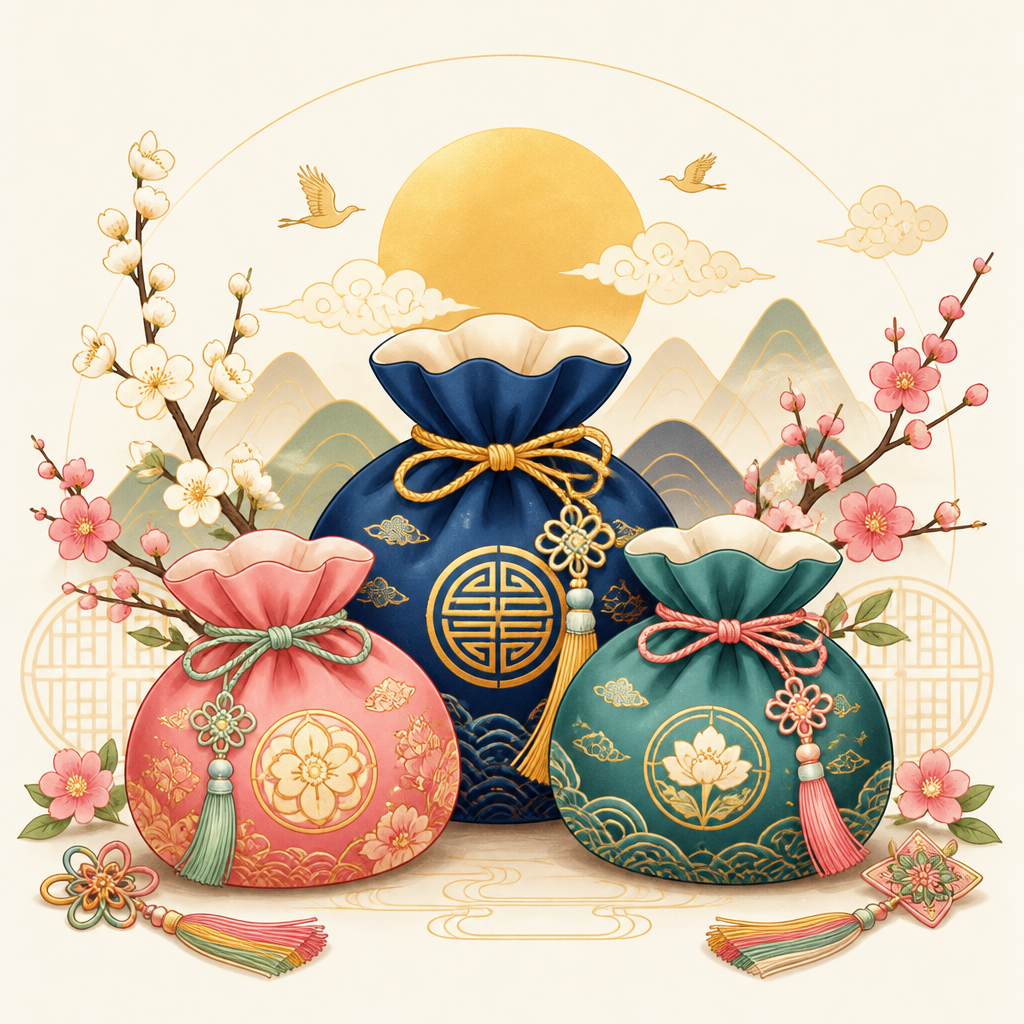
A polished Seollal holiday illustration featuring colorful bokjumeoni lucky pouches, soft gold accents, traditional Korean patterns, clean cream background, friendly festive mood, vector-like but warm hand-drawn finish, no text, centered composition.
AI-generated Gothic Castle 3D Pop-up Card made with Nano Banana Pro

Gothic Castle 3D Pop-up Card

Nano Banana Pro· Image
A dramatic 3D pop-up card with a gothic castle silhouette, layered bats, and a full moon cutout, black cardstock with silver highlights, fog effect from vellum layers, moody low-key lighting with rim light, shot on Sony A7R IV 85mm, high contrast, sharp edges, realistic paper texture --ar 4:5
gothic-castle-night
AI-generated Children’s Game App Icon Board made with GPT Image 2

Children’s Game App Icon Board

GPT Image 2· Image
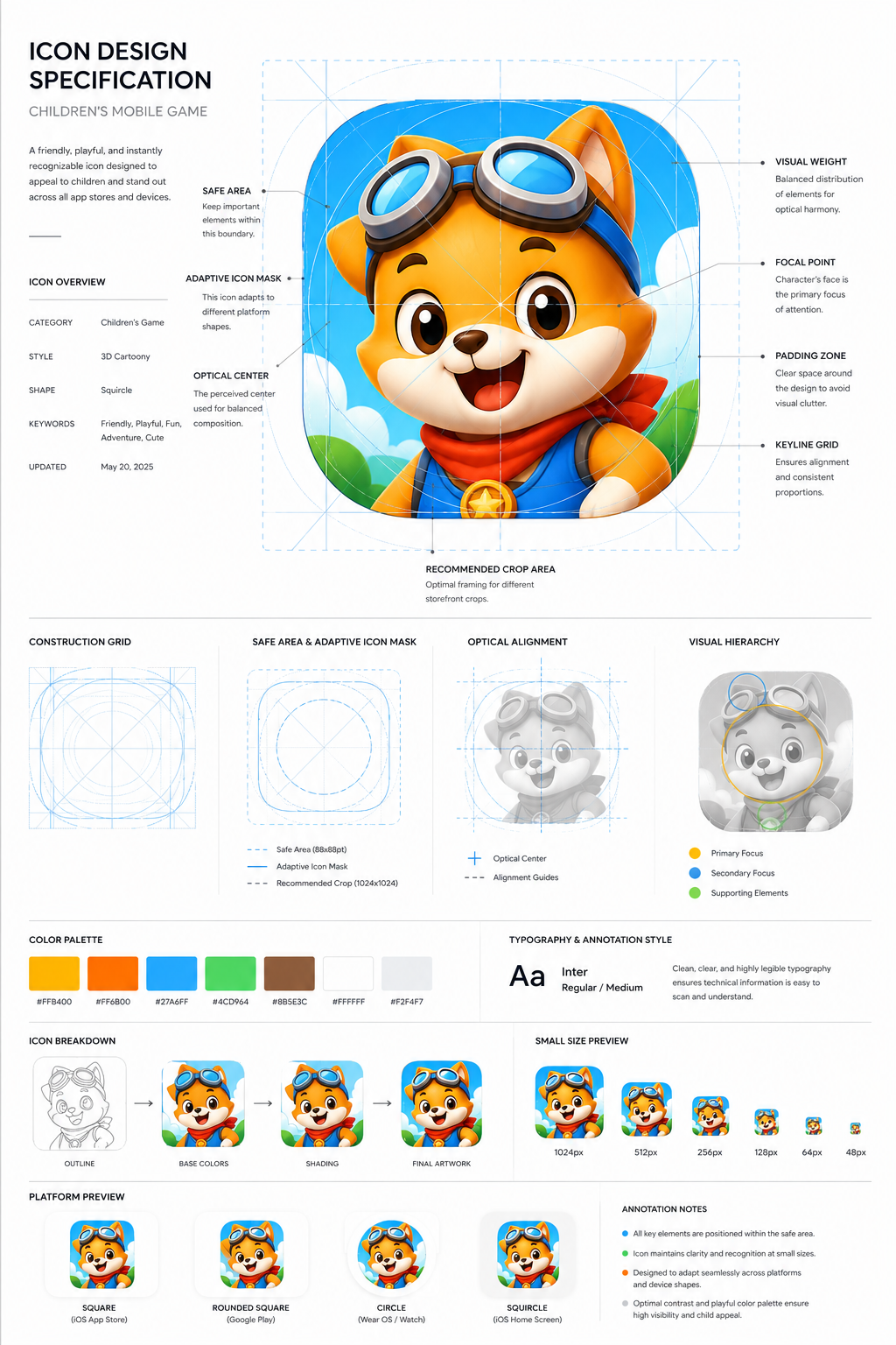
Design a premium app icon presentation board for a children's mobile game icon, inspired by Apple Human Interface Guidelines, Google Material Design documentation, and professional Behance case studies. Use a clean editorial layout with a minimalist white background, subtle light-gray construction grids, generous whitespace, and modern Swiss-inspired typography. The presentation should feel like it was created by a senior brand designer at a top mobile game studio.Place the final app icon as the hero element in the center, occupying approximately 60–70% of the page. Surround it with elegant technical annotations connected by thin gray leader lines. Include labels such as Safe Area, Adaptive Icon Mask, Optical Center, Visual Weight, Focal Point, Padding Zone, Keyline Grid, and Recommended Crop Area.Overlay a precise construction grid consisting of circles, squares, alignment guides, center lines, diagonal guides, proportional geometry, and adaptive icon boundaries. The grid should be subtle, using thin cyan or light-blue lines with low opacity, similar to Apple's icon construction documentation.Around the hero icon, include clean presentation sections with consistent spacing:Hero Icon ShowcaseConstruction GridSafe Area & Adaptive Icon MaskOptical AlignmentVisual Hierarchy DiagramColor Palette Swatches with HEX valuesTypography & Annotation StyleIcon Breakdown (Outline → Base Colors → Shading → Final Artwork)Small Size Preview (1024px, 512px, 256px, 128px, 64px, 48px)Platform Preview (Square, Rounded Square, Circle, Squircle)Use elegant monochrome labels, thin divider lines, subtle spacing, and professional alignment throughout the page. Typography should resemble modern design documentation with lightweight sans-serif fonts, small uppercase section titles, and minimal captions.The overall aesthetic should communicate precision, craftsmanship, and premium product design rather than marketing. Avoid gradients, decorative backgrounds, heavy shadows, colorful graphics, unnecessary icons, or visual clutter. The presentation should look like an official design specification created for a world-class mobile game studio and be suitable for Behance, Dribbble, or an AAA game design portfolio. Ultra-clean, highly organized, modern editorial design, perfect spacing, museum-quality layout, premium UI/UX presentation style.Avoid mockup devices, laptops, desks, hands, unnecessary 3D objects, colorful backgrounds, random decorative elements, excessive shadows, glassmorphism, neon effects, AI-style layouts, distorted grids, inconsistent spacing, low-resolution typography, cluttered composition, watermarks, logos, and marketing banners. Focus entirely on a clean professional icon specification sheet.
aacc56f2eccdceb35eb26a505aeb3232
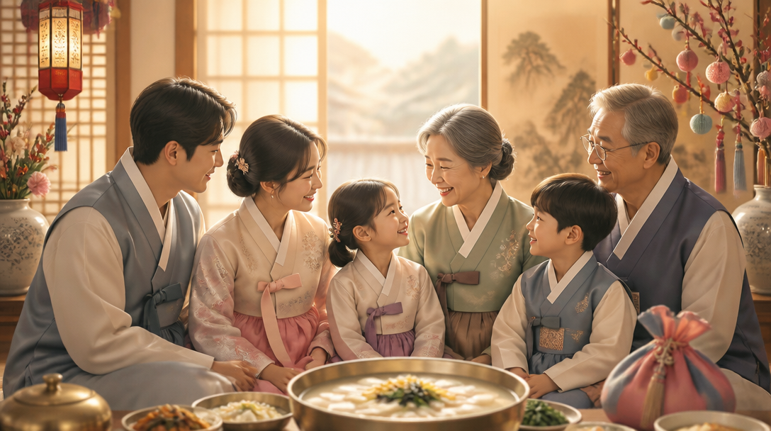
GPT 이미지 2로 생성한 설날 가족 인사 이미지

설날 가족 인사 이미지

GPT Image 2· Image
A cozy Korean New Year family greeting image: three-generation family silhouettes in modern hanbok, warm indoor light, rice cake soup table hinted in foreground, tasteful festive decorations, soft cinematic illustration, no readable text, 16:9.
AI-generated Luxury Monogram 3D Pop-up Card made with Nano Banana Pro

Luxury Monogram 3D Pop-up Card

Nano Banana Pro· Image
A minimalist luxury 3D pop-up card with a single large monogram rising from the center, thick white cotton cardstock, gold foil embossing, clean geometric fold structure, high-end studio lighting with soft shadow falloff, shot on Hasselblad X2D 65mm, crisp focus, premium stationery product photo --ar 4:5
luxe-monogram-minimal
AI-generated Unicorn Birthday 3D Pop-up Card made with Nano Banana Pro

Unicorn Birthday 3D Pop-up Card

Nano Banana Pro· Image
Two hands opening a 3D pop-up birthday card that reveals a layered rainbow unicorn scene, bright pastel cardstock, glittery foil accents, confetti pieces lifting from the fold, soft daylight from a nearby window, shot on Sony A7IV 35mm f/2, candid lifestyle angle, photorealistic paper craft detail --ar 4:5
unicorn-card-opening
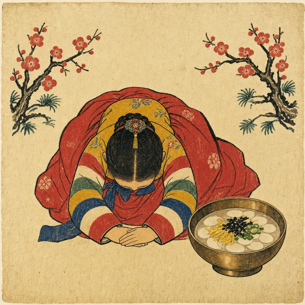
GPT 이미지 2로 생성한 설날 한복 새해 인사 카드

설날 한복 새해 인사 카드

GPT Image 2· Image
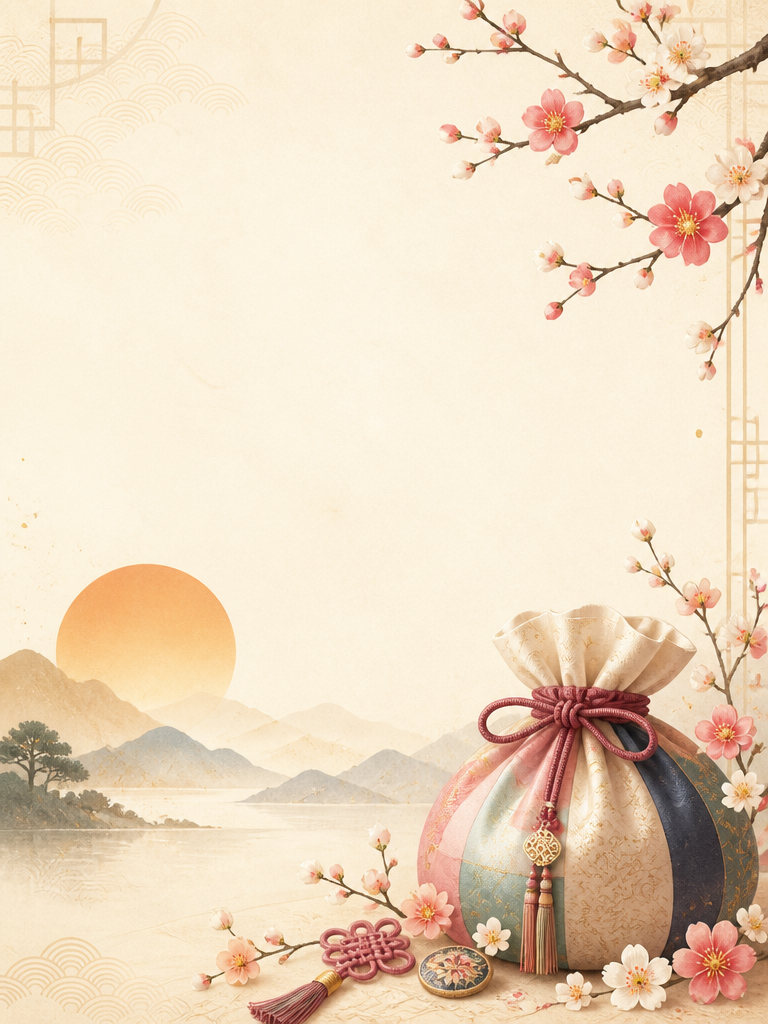
Create a clean Korean Seollal greeting card image: warm ivory background, subtle traditional paper texture, elegant hanbok-inspired color palette, plum blossoms, bokjumeoni lucky pouch, gentle sunrise, refined Korean holiday atmosphere, spacious composition for greeting text but do not render any readable text, premium editorial illustration style, 4:5 vertical.

What are 포스터 Traditional Music Poster Prompts?

A collection of AI prompts for generating 포스터 traditional music poster images. Copy the 포스터 Traditional Music Poster prompts provided by Carat and paste them into an AI image generation tool to get professional-grade results.

How to Use 포스터 Traditional Music Poster Prompts

  1. Select and copy your desired prompt.
  2. Paste it into the Carat agent.
  3. Modify colors, styles, and composition as needed.
  4. Download the generated image and use it in your project.

Tips for Writing 포스터 Traditional Music Poster Prompts

Specify lighting, texture, composition, and lens information in detail for more precise results. Add "No text, no watermark" to prevent unwanted text overlays.

포스터 Traditional Music Poster Prompt Applications

포스터 Traditional Music Poster prompts are used across content creation, marketing, design, and educational resources. AI-generated images dramatically reduce production time while maintaining professional quality.

포스터 Traditional Music Poster Prompt Optimization Guide

Choose the aspect ratio based on your use case: vertical (9:16) for social media, horizontal (16:9) for web banners, and square (1:1) for product images.

Frequently Asked Questions

Related Prompts

Korean Traditional Illustration

Korean Traditional Illustration

103 prompts

Korean Alphabet Poster

Korean Alphabet Poster

12 prompts

Year-End Greeting Card

Year-End Greeting Card

21 prompts

Illustration

Illustration

774 prompts

Carat Prompt Gallery

Create trending AI prompts instantly

Prompts

  • Logo
  • PPT Design
  • Thumbnail
  • Poster
  • Web Novel Cover
  • ID Photo
  • Caricature
  • Product Detail Page
  • Banner

Models

  • GPT Image 2
  • Seedance 2.0
  • NanoBanana Pro
  • NanoBanana 2

Carat

  • Get started
  • About
  • Blog
  • Careers
  • Contact
  • Partnership
  • Terms
  • Privacy

© 2026 Paradot.Inc All rights reserved.