Typography video prompts for planning letter scale, rhythm, color, motion, transitions, and readable text areas.
2026.07.21
Make “Typography Video” exactly the way you wantCreate your own “Typography Video”
Just ask in plain language — Carat generates optimized images and videos for you.

Start now with 100 free credits daily
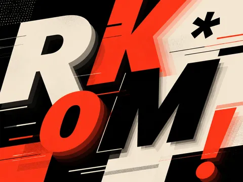
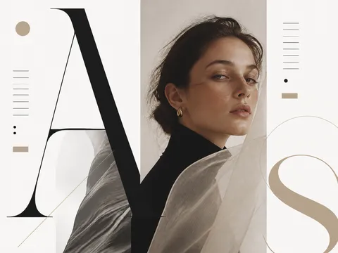
Typography video AI prompts treat letters as the main visual subject rather than as ordinary subtitles. Define sentence length, letter scale and weight, reveal order, negative space, rhythm, and transition speed to plan a lyric video, brand opener, event teaser, or motion graphic. Typography examples in the Carat gallery can help you study contrast, layout, and color systems before adapting the structure to your own message.
Choose the one sentence viewers should read first. Make it large, then place supporting copy at a smaller scale so the hierarchy is obvious. A phrase that pops in, builds one letter at a time, or travels across the screen creates a different mood. Keep the background simple enough that movement remains readable, and use one or two accent colors to emphasize the most important words.
List the message, type character, aspect ratio, background texture, reveal behavior, transition pace, and reserved copy area. If exact Korean or English wording matters, ask for short placeholder text or a clean text zone and add final lettering in an editor because generated text can be inaccurate. For music-led edits, define timing rules such as one word per beat or a scale increase at the chorus.
Check lyrics, quotations, logos, and font permissions, then compare visible lettering with the approved copy. Inspect the video on a mobile screen to ensure fast transitions do not hide the message and that text remains inside the safe area. Verify every number and date against the source material, and obtain final approval for brand colors and restricted wording before release.