브랜드 가이드 템플릿
브랜드 가이드 템플릿 프롬프트. 캐럿에서 제공하는 브랜드 가이드 템플릿 이미지 생성 프롬프트를 복사해 바로 사용해보세요.
2026.07.14
「브랜드 가이드 템플릿」 원하는 대로 직접 만들어보세요「브랜드 가이드 템플릿」 직접 만들어보세요
대화로 요청만 하면 최적화된 이미지·영상을 만들어줘요

매일 무료 100크레딧으로 바로 시작
·
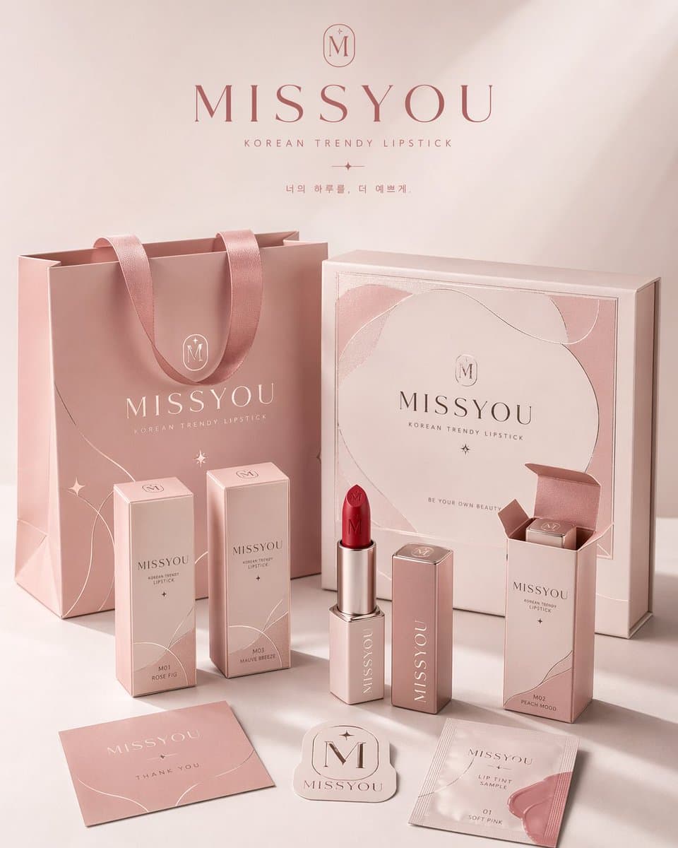
브랜드 패키지 시스템 전시 포스터
GPT 이미지 2· 이미지
请为品牌[品牌名称]、类目为[品牌类目]创作一张高审美、高完成度的「品牌包装系统展示图」。这不是普通电商白底图,也不是单一产品图,而是一张具有品牌提案感、视觉识别系统感和商业摄影质感的包装家族陈列效果图。画面需要体现“同一品牌在多个包装载体上的统一落地”,呈现一个成熟消费品牌的完整包装系统。
【画幅要求】整体必须为固定 4:5 的竖版海报构图,画面方向明确为纵向,禁止生成横版构图、宽幅桌面陈列或过于分散的横向展示。整体构图需符合海报阅读逻辑:上方保留呼吸感,中部为品牌包装系统的主要视觉焦点,下方安排辅助包装、标签和产品本体,整体重心集中,适合直接作为品牌展示海报发布。
【核心要求】根据【类目】自动匹配最合理、最自然的包装组合与产品形态,并围绕【品牌名字】建立统一的品牌视觉系统。画面中应选择少量但有代表性的包装形式,组成一组完整而精炼的品牌包装系统,不追求堆砌数量,而强调主次层级、品牌统一性与陈列美感。可根据类目合理选择以下包装类型中的一部分:手提袋 / 购物袋、纸盒 / 礼盒 / 外包装盒、长条盒 / 单品盒 / 套装盒、包装袋 / 封套 / 小样袋 / 软袋、杯子 / 瓶子 / 罐子 / 管状容器 / 喷雾瓶 / 泵头瓶、标签 / 贴纸 / 封签 / 吊牌 / 小卡片,以及与类目对应的真实产品本体。
【类目适配逻辑】包装形式与产品形态需要根据【类目】自动匹配,但不局限于单一方向。可参考以下适配逻辑自由发散:若类目为食品 / 烘焙 / 零食 / 饮品,则以纸袋、纸盒、包装袋、杯子、食品容器、贴纸、封签及真实产品本体为主;若类目为茶饮 / 咖啡 / 饮料,则以杯子、瓶子、罐装包装、提袋、杯套、封口贴、礼盒等为主;若类目为美妆 / 护肤 / 彩妆 / 香水,则以瓶、罐、管、盒、礼盒、手提袋、小样包装等为主;若类目为香氛 / 家居 / 生活方式,则以香薰瓶、蜡烛杯、包装盒、礼盒、提袋、吊卡、标签卡等为主;若类目为服饰 / 饰品 / 潮玩 / 文创,则以包装盒、抽屉盒、防尘袋、手提袋、贴纸、吊牌、配件包装等为主;若类目为数码配件 / 工具 / 小型消费品,则以硬盒、外包装盒、收纳袋、说明卡、贴纸、封套、标签等为主。整体必须体现“类目合理、品牌统一、包装成体系”的效果。
【数量与密度控制】请控制画面中的物件数量,不要过多堆砌,也不要把所有可能包装形式全部展示出来。整体应呈现“少而精、完整但不拥挤”的品牌包装系统效果。建议选择最具代表性的包装载体进行展示:大件包装 1~2 个,中型包装 2~3 个,小型包装或辅助物件 2~4 个,真实产品本体 1~3 个,总可见元素建议控制在 6~10 个之间。包装种类应体现层次变化与系统感,但不宜重复过多同类物件。画面需要有足够留白与呼吸感,确保每个包装都清晰可见、主次明确、摆放舒展,宁可少而精,也不要为了“完整”而过度塞满。
【品牌视觉系统要求】所有包装必须属于同一个品牌系统,统一使用【品牌名字】作为核心品牌识别元素。整体应具备一致的 logo / 标志呈现、字体风格、图形语言、插画语言或纹样系统、排版逻辑、配色体系、材质与印刷质感。品牌调性、色彩方向、图案元素、辅助图形和视觉氛围,请根据【类目】自动匹配并合理发散,不局限于任何固定风格。整体风格应统一、协调、具有品牌识别度,可以是简约高级、自然有机、时尚现代、轻奢精致、年轻清新、艺术感、潮流个性或经典优雅,但必须符合【类目】特征,并呈现成熟品牌的设计完成度。
【配色机制要求】整体配色不要固化为某一种固定组合,也不要连续多次出现高度相似的主色系统。每次生成时应根据【类目】与品牌气质,主动形成不同的主色方案与配色关系,采用“受控发散”的方式进行色彩演绎。色彩可以是低饱和自然色、现代中性色、轻复古色、明快清新色、轻奢深色系或艺术感综合色系,但必须保持高级、统一、克制、有品牌感。允许每次生成时呈现不同的视觉气质,例如奶油白与焦糖棕、雾灰蓝与暖白、橄榄绿与亚麻米、酒红与奶霜白、可可棕与象牙白、炭灰与麦秆金、雾粉灰与米白、海军蓝与暖灰等,仅作为参考方向而非固定模板。不要荧光色,不要廉价高饱和,不要杂乱失控的多色拼贴。
【画面构图与陈列要求】画面采用品牌包装家族陈列逻辑,而不是杂乱堆放。整体为商业摄影棚场景,使用 3/4 轻俯视角或略带透视的正面陈列角度,形成有层次、有秩序、有主次的包装展示画面。构图参考以下逻辑:后景摆放 1~2 个较大的包装作为视觉支撑,如手提袋、大礼盒、大外盒;中景安排品牌核心包装或主力单品包装,作为主要视觉焦点;前景摆放较小包装形成有层次、有秩序、有主次的包装展示画面。构图参考以下逻辑:后景摆放 1~2 个较大的包装作为视觉支撑,如手提袋、大礼盒、大外盒;中景安排品牌核心包装或主力单品包装,作为主要视觉焦点;前景摆放较小包装、辅助包装、标签、贴纸及真实产品本体;至少有一个真实产品与包装产生自然互动,如产品半露出、摆放在包装前方、与包装组合展示;整体形成平衡而有设计感的三角式或错落式构图。画面干净、有留白、不拥挤,内容丰富但克制,以有限而精准的包装组合体现完整的品牌包装生态。
【视觉风格要求】整体呈现高端商业摄影质感与品牌提案感,背景为干净的摄影棚环境,可为白色、暖白色、浅灰色,或根据品牌调性自动匹配的极简背景。画面应强调真实的包装材质表现、清晰的纸张折痕、盒型结构、瓶罐轮廓、标签细节、印刷质感、压纹 / 烫金 / 哑光 / 棉纸纹理 / 牛皮纸纹理等材质细节,以及统一而高级的配色搭配、精致现代干净的品牌视觉语言和强烈的“这是一整套品牌包装系统”的完整感。
【光影要求】采用真实商业摄影级光影,可为柔和棚拍光,也可带有轻微方向性的自然侧光。需要有清晰但克制的阴影,以增强立体感、空间感与高级感。整体光线通透、明亮、干净,不要阴暗,不要廉价感,不要杂乱背景。
【最终效果要求】最终画面应像一个成熟品牌的包装系统展示海报、包装家族提案图或品牌视觉落地效果图,而不是零散商品拼图。重点突出:固定 4:5 竖版海报感、品牌统一性、包装家族完整性、商业摄影感、设计提案感、类目适配性,以及高级审美与视觉完成度。
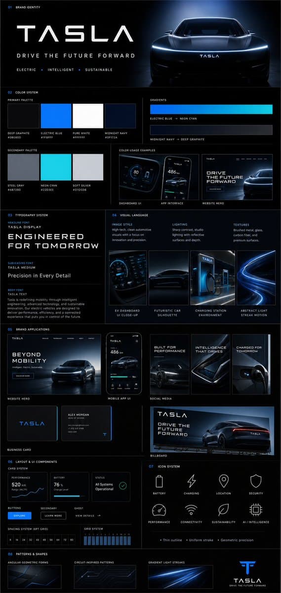
브랜드 가이드라인 보드
GPT 이미지 2· 이미지
{
"prompt": {
"title": "Premium Vertical Brand Guideline Board",
"aspect_ratio": "4:5",
"brand_inputs": {
"brand_name": "[BRAND NAME]",
"industry": "[INDUSTRY / NICHE]",
"target_audience": "[AUDIENCE TYPE]",
"brand_personality": "[3–5 TRAITS]",
"core_emotion": "[FEELING YOU WANT TO EVOKE]"
},
"layout": {
"type": "structured_modular_grid",
"columns": "3–4",
"style": "high-end agency presentation",
"rules": [
"precise spacing",
"clean alignment",
"strong visual hierarchy",
"no collage appearance"
]
},
"core_rules": [
"All elements must be derived from brand inputs",
"Color palette must reflect personality and industry",
"Typography must match tone",
"Shapes and visuals must be consistent",
"No randomness",
"No generic defaults"
],
"sections": {
"header": {
"elements": [
"Brand name (dominant headline)",
"Tagline (max 6 words)",
"3 brand descriptors"
],
"style": "clean, confident, visually anchored"
},
"color_system": {
"primary_colors": "3–5",
"secondary_colors": "2–4",
"display": [
"Large swatches",
"HEX codes",
"Color labels"
],
"extras": [
"2 gradient styles",
"2–3 real pairing examples (UI or branding usage)"
],
"requirement": "intentional and cohesive palette"
},
"typography_system": {
"hierarchy": {
"headline": "strong, expressive",
"subheading": "structured",
"body": "high readability"
},
"samples": [
"Large title",
"Medium subheading",
"Short paragraph"
],
"requirement": "aligned with brand tone"
},
"visual_language": {
"definitions": [
"Image style",
"Lighting direction",
"Texture/material inspiration"
],
"assets": "3–4 moodboard tiles",
"requirement": "clearly reflect brand world"
},
"brand_applications": {
"mockups": [
"Website hero section",
"Mobile app UI",
"2–3 social media creatives",
"Business card",
"Poster or billboard"
],
"requirement": "strict adherence to system"
},
"layout_ui_components": {
"elements": [
"Card layout system",
"Buttons",
"Spacing rules",
"Grid alignment"
],
"style": "functional, minimal, consistent"
},
"icon_system": {
"count": "6–8",
"style": "consistent (outline or solid)",
"rules": [
"uniform stroke weight",
"geometry aligned with brand personality"
]
},
"patterns_shapes": {
"elements": [
"Geometric forms",
"Repeating motifs",
"Background textures"
],
"requirement": "supportive, not dominant"
}
},
"rendering": {
"composition": "ultra-clean",
"structure": "clear section separation",
"hierarchy": "strong",
"aesthetic": "editorial or tech premium",
"effects": [
"soft shadows",
"depth",
"premium lighting"
]
},
"output_requirement": "Must resemble a professional brand guideline board used in real client presentations, not AI-generated clutter"
}
}"

글로시에 브랜드 무드보드
나노바나나 프로· 이미지
You are a world class creative director, brand strategist, editorial art director, and visual identity designer specializing in high impact campaign systems for global brands.
Your task is to create a bold, visually explosive, highly curated editorial moodboard collage composition that feels like a modern brand identity system.
This should feel like a brand world captured in one frame, not a clean layout, slightly chaotic, layered, and expressive.
BRAND INPUTS:
BRAND NAME: GLOSSIER
INDUSTRY / PRODUCT TYPE: beauty / skincare
PRIMARY BRAND COLOR: soft pink
SECONDARY BRAND COLOR: white
ACCENT COLOR (optional): translucent gloss
BRAND PERSONALITY: fresh, minimal, youthful, clean
OPTIONAL SLOGAN / TEXT: SKIN FIRST
VISUAL STYLE:
Create a dense, layered moodboard-style composition combining:
• real product photography or lifestyle shots
• packaging elements (bags, boxes, labels, tags)
• typography snippets and brand phrases
• illustrated graphics and doodles
• icons, symbols, and stickers
• abstract graphic shapes and patterns
• UI-like elements (menus, cards, labels)
• editorial cutouts and overlapping assets
The composition should feel:
• slightly messy but intentionally designed
• layered with depth and overlaps
• like a Pinterest board meets high-end campaign
• expressive, youthful, and brand-heavy
• visually rich and scroll-stopping
ART DIRECTION:
Include a mix of elements such as:
• product packaging mockups (bags, boxes, labels, stickers)
• lifestyle shot (person interacting with product or brand)
• bold typography blocks with brand phrases
• illustrated objects interacting with real elements
• menu-style or UI-style panels
• abstract shapes, blobs, squiggles, starbursts
• brand-related icons or symbols
• badge / stamp graphics
• textile or merch items (t-shirt, cap, tote bag, etc.)
• playful graphic overlays
COMPOSITION RULES:
• asymmetrical layout (NOT grid-based)
• elements scattered but balanced
• overlapping layers with depth
• mix of large hero elements + small details
• combine clean areas with dense clusters
• include cutout-style compositions
• avoid too much empty space
COLOR & DESIGN LANGUAGE:
• strictly follow brand color palette
• strong use of PRIMARY COLOR across elements
• secondary color used for contrast and layering
• minimal additional colors (keep it brand-consistent)
• high contrast, bold visual identity
TYPOGRAPHY:
• modern editorial typography
• mix of serif / sans-serif if relevant
• bold headlines + small UI text
• include brand name and/or slogan naturally in layout
• typography should feel integrated, not separate
VISUAL CHARACTERISTICS:
• premium campaign look
• modern brand identity system
• editorial + commercial hybrid aesthetic
• highly shareable social media visual
• playful but intentional chaos
• cohesive even in randomness
IMPORTANT:
This should feel like:
• a brand world explosion in one frame
• a creative direction board for a global campaign
• a visual identity snapshot of the brand
NOT a clean layout
NOT a grid
NOT minimal
It must feel alive, layered, and expressive.
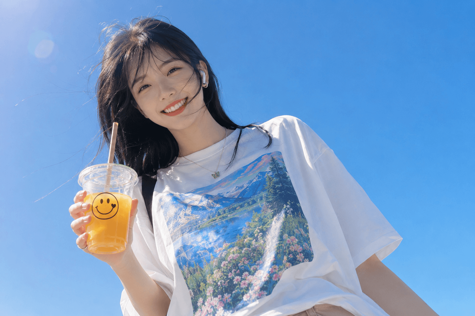
브랜드 로고 디자인
GPT 이미지 2· 이미지
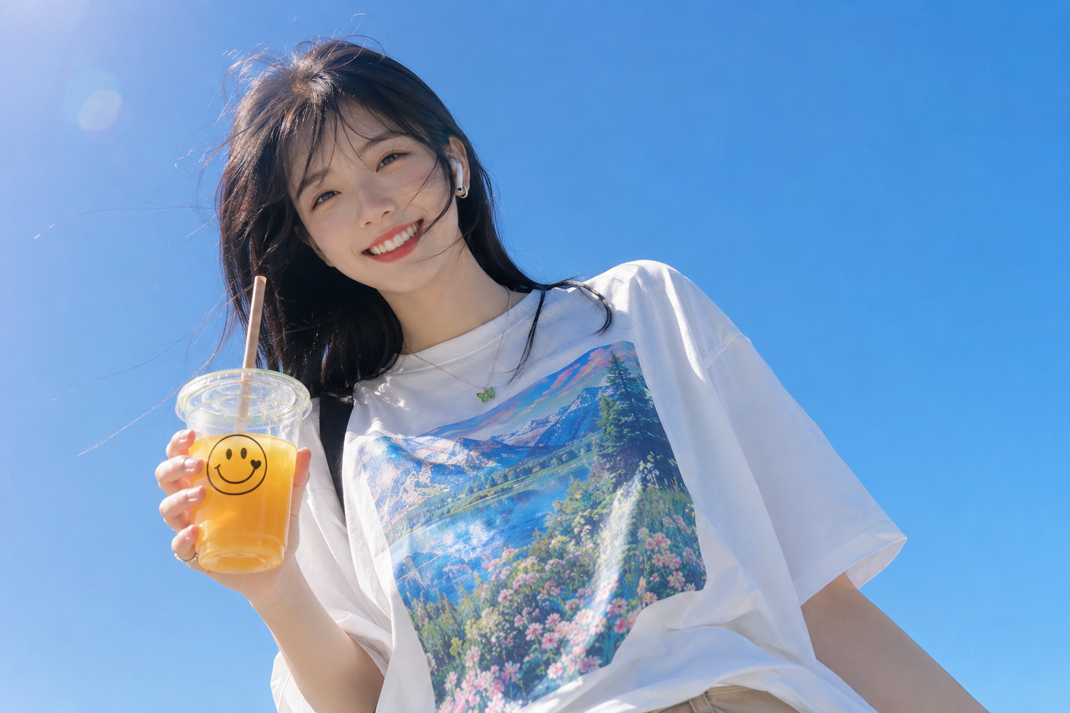
Ultra-realistic lifestyle portrait of a cheerful young woman with fair porcelain skin, medium-length straight black hair with wispy curtain bangs gently blown by the wind, bright genuine smile, almond-shaped dark brown eyes, and natural soft makeup. She wears an oversized white graphic T-shirt with colorful landscape prints, a delicate silver necklace with a small green butterfly pendant, and a white wireless earbud. She casually holds a transparent cup of iced orange juice with a brown straw and a cute smiling face logo. Captured from a dramatic low-angle wide-angle perspective against a clear blue sky, illuminated by bright natural midday sunlight with soft shadows and vibrant colors. Fresh, youthful, carefree summer atmosphere, candid lifestyle photography, minimalist composition, natural skin texture, realistic hair strands, HDR, cinematic color grading, DSLR quality, sharp focus, ultra-photorealistic, editorial style, masterpiece, 8K.
브랜드 가이드 템플릿 프롬프트란?
브랜드 가이드 템플릿 이미지를 생성하기 위한 AI 프롬프트 모음입니다. 캐럿에서 제공하는 브랜드 가이드 템플릿 프롬프트를 복사하여 AI 이미지 생성 도구에 붙여넣으면 전문가 수준의 결과물을 얻을 수 있습니다.
브랜드 가이드 템플릿 프롬프트 활용 방법
- 원하는 프롬프트를 선택하여 복사합니다.
- 캐럿 에이전트에 붙여넣습니다.
- 필요에 따라 색상, 스타일, 구도를 수정합니다.
- 생성된 이미지를 다운로드하여 활용합니다.
브랜드 가이드 템플릿 프롬프트 작성 팁
조명(Lighting), 질감(Texture), 구도(Composition), 렌즈(Lens) 정보를 구체적으로 명시하면 더 정밀한 결과를 얻을 수 있습니다. "No text, no watermark"를 추가하면 불필요한 텍스트를 방지할 수 있습니다.
브랜드 가이드 템플릿 프롬프트 적용 사례
브랜드 가이드 템플릿 프롬프트는 콘텐츠 제작, 마케팅, 디자인, 교육 자료 등 다양한 분야에서 활용됩니다. AI 이미지를 활용하면 제작 시간을 단축하면서도 전문적인 퀄리티를 유지할 수 있습니다.
브랜드 가이드 템플릿 프롬프트 최적화 가이드
이미지 비율은 용도에 맞게 선택하세요. SNS용은 세로형(9:16), 웹 배너는 가로형(16:9), 제품 이미지는 정사각형(1:1)이 적합합니다.