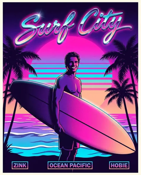
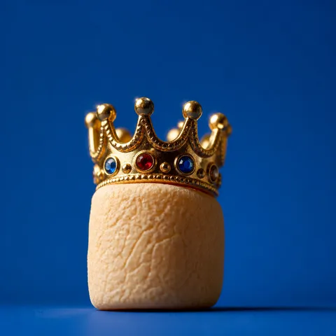
웃긴 포스터는 행사, 콘텐츠, 브랜드 메시지를 유머와 반전 있는 시각 언어로 전달하는 홍보 이미지를 위한 AI 이미지 프롬프트를 실용적으로 활용합니다.
2026.07.15
「웃긴 포스터」 원하는 대로 직접 만들어보세요「웃긴 포스터」 직접 만들어보세요
대화로 요청만 하면 최적화된 이미지·영상을 만들어줘요

매일 무료 100크레딧으로 바로 시작
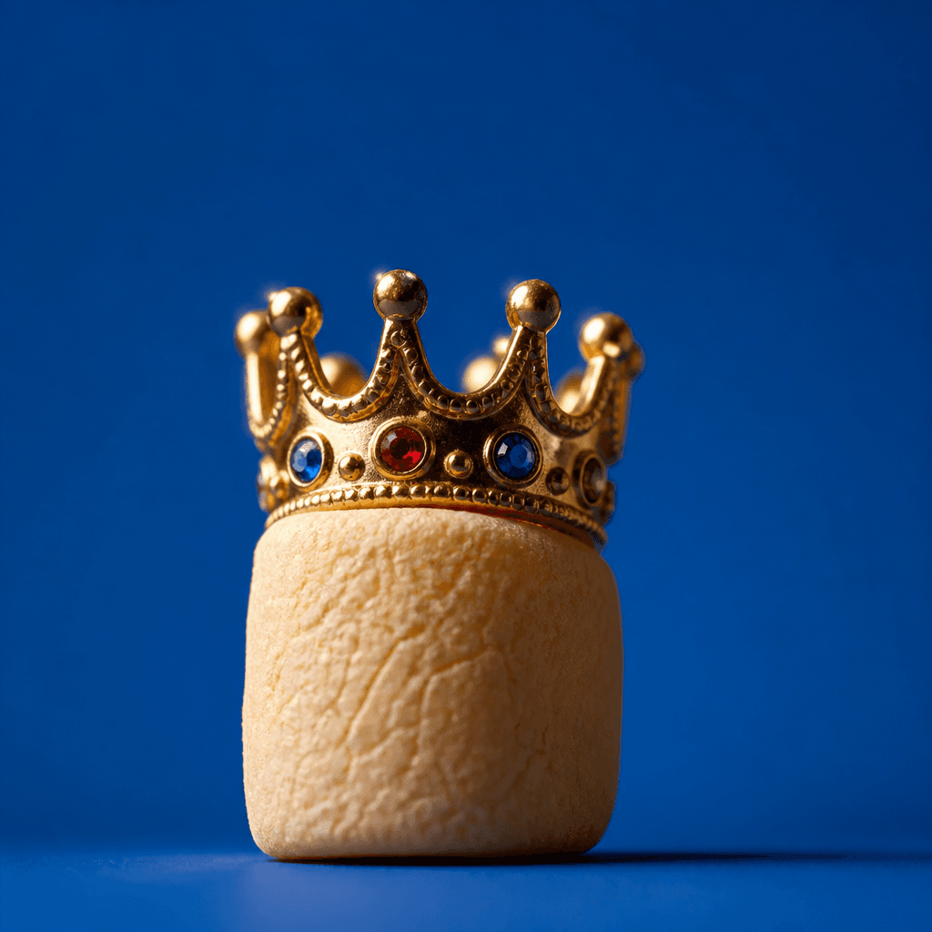

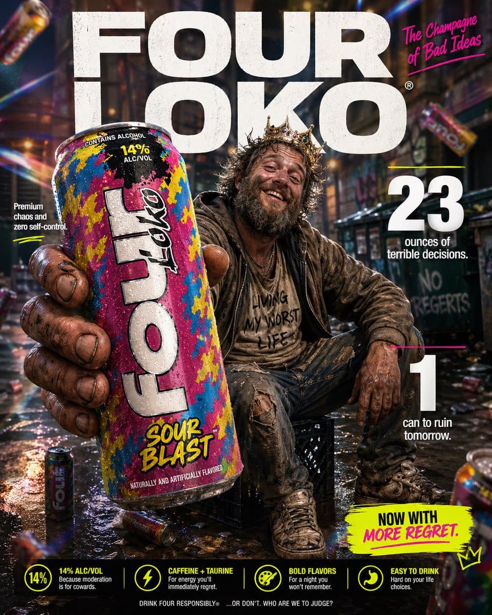
웃긴 포스터는 행사, 콘텐츠, 브랜드 메시지를 유머와 반전 있는 시각 언어로 전달하는 홍보 이미지입니다. 좋은 프롬프트는 단순히 주제 이름만 적지 않고 누가 어디에서 볼지, 어떤 정보가 첫눈에 읽혀야 할지, 어떤 장면과 색으로 관심을 끌지까지 지정합니다. 기존 아이템을 참고하면 모델별 표현 차이를 비교하면서 자신에게 맞는 구도를 고를 수 있습니다.
과장된 표정, 예상 밖의 조합, 짧은 카피, 만화적 장면처럼 한눈에 웃음 포인트를 파악할 수 있는 요소를 먼저 정하세요. 화면의 중심에는 한 가지 대표 요소를 두고 제목과 보조 정보를 서로 다른 크기와 위치로 구분하면 썸네일에서도 메시지가 살아납니다. 배경 장식은 주제를 돕는 범위로 제한하고, 중요한 글자가 들어갈 영역은 충분히 비워 두세요.
코미디 행사, 동아리 이벤트, 밈 기반 SNS 콘텐츠, 신제품의 가벼운 캠페인, 친구 모임 초대장 등에 응용할 수 있습니다. 같은 콘셉트를 인스타그램 피드, 스토리, 포스터, 웹 배너로 확장할 때는 핵심 색상과 대표 이미지를 유지하되 비율에 맞게 정보량을 줄이는 것이 좋습니다.
웃음의 원인을 한 문장으로 정한 뒤 표정, 소품, 색상, 타이포그래피 중 두세 가지에만 집중처럼 작업 순서를 잡아 보세요. 이어서 촬영 또는 일러스트 스타일, 조명 방향, 카메라 시점, 배경 질감, 타이포그래피 영역, 출력 비율을 추가합니다. AI가 만든 문구가 정확하지 않을 수 있으므로 실제 이름과 숫자는 편집 단계에서 교체하는 흐름을 전제로 작성하면 안정적입니다.
결과를 실제 게시 크기로 축소해 제목과 대표 이미지가 먼저 보이는지 확인하세요. 색상만으로 정보를 구분하지 말고 크기, 간격, 선, 아이콘을 함께 사용하면 읽기 쉽습니다. 인쇄물은 재단과 안전 여백을 확인하고, 온라인 이미지는 플랫폼 UI에 가려지는 영역을 피하세요. 공개 전에는 오탈자, 일정, 가격이나 장소, 연락처, QR 코드, 이미지 사용 권리를 검수해야 합니다. 이렇게 하면 보기에는 재미있거나 아름답지만 실제 사용이 어려운 시안을 피하고 목적에 맞는 웃긴 포스터를 완성할 수 있습니다.