정기 휴무 및 임시 휴무 안내를 세련되게 전달해 대면 신뢰감을 드높여 줄 고품질 감성 안내문 템플릿과 프롬프트를 배포합니다.
2026.07.22
「휴무 안내문」 원하는 대로 직접 만들어보세요「휴무 안내문」 직접 만들어보세요
대화로 요청만 하면 최적화된 이미지·영상을 만들어줘요

매일 무료 100크레딧으로 바로 시작
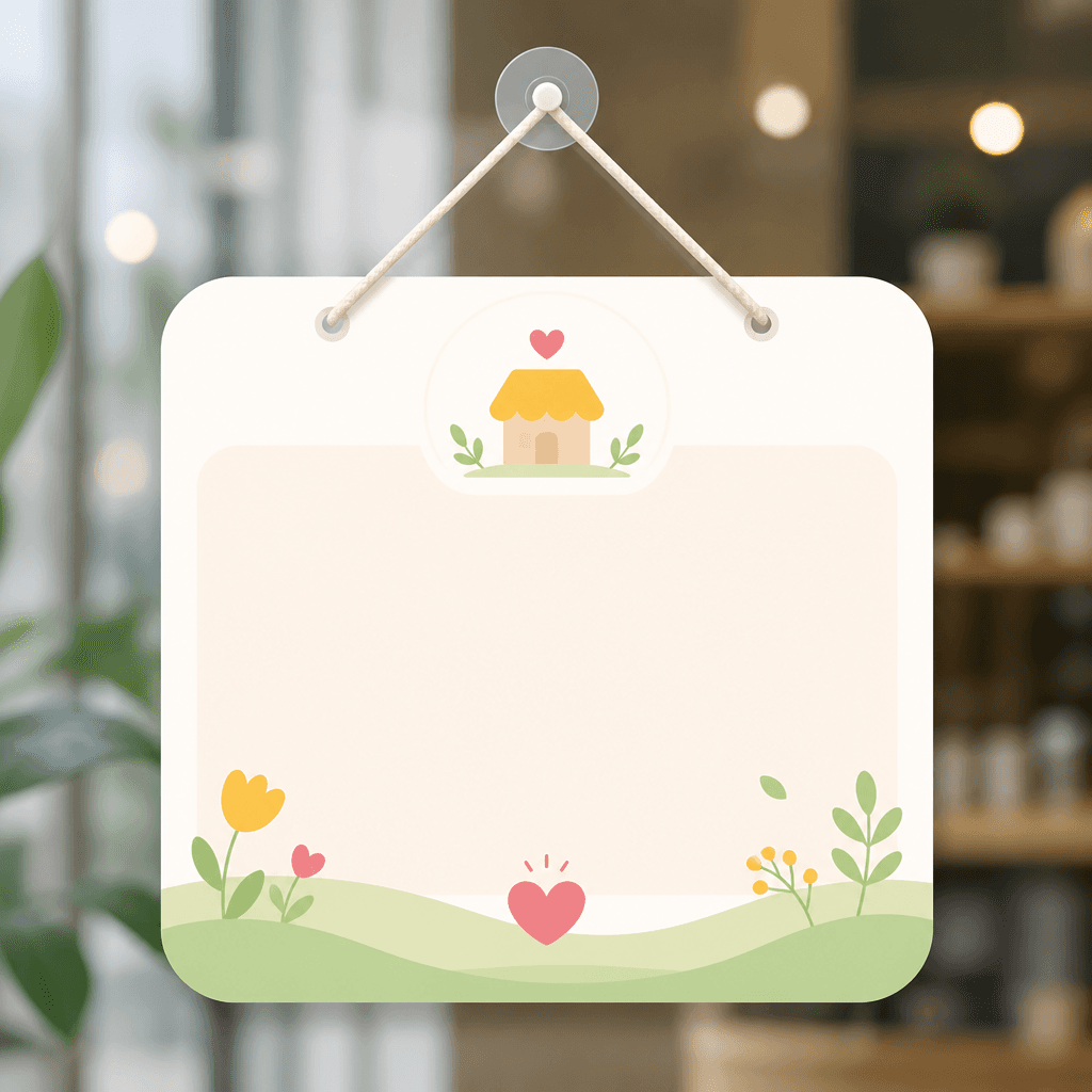
휴무 안내문은 오프라인 매장을 운영하는 사장님들이 고객과 소통할 때 가장 기본적으로 활용하는 시각적 공지 수단입니다. 부득이하게 영업을 쉬어가는 날이나 정기적인 휴일을 알릴 때 매장의 정체성(Identity)을 흐리지 않으면서도 정중한 인상을 주는 디자인이 필요합니다. 프롬프트 단계에서 캘린더나 달력, 귀여운 상점 실루엣 등의 핵심 키워드를 함께 매칭하면 가독성과 온화함을 한 번에 잡을 수 있습니다.
매장 유리문이나 출입구에 기재하는 시안이므로, 화면의 중심부에 'CLOSED' 같은 정형화된 메인 팻말을 두고 그 주변에 세부 날짜를 쉽게 기입할 수 있는 여백 구조를 배치합니다. 복잡한 입체 텍스처 대신 평면적이고 트렌디한 라인 일러스트나 은은한 백그라운드 컬러를 주조색으로 설정하면 직관성이 크게 상승합니다. 중요한 날짜와 임시 휴무 텍스트 슬롯은 안전 영역 안쪽에 선명한 서체로 배치해 정보 스캐닝을 편안하게 유도해야 합니다.
휴무 안내 디자인을 위한 프롬프트를 구성할 때는 따스하고 정돈된 상업 템플릿 느낌을 주는 'commercial template design' 수식어를 명시합니다. "정기 휴무", "임시 휴무"처럼 구체적인 테마명을 정의하고 "부드러운 일러스트", "대조가 확실한 플랫 벡터", "심플한 캘린더 그래픽" 문구를 추가해 복잡하고 인위적인 3D 가짜 광택이 튀어 나오지 못하도록 막습니다. 출력 비율은 수평 공간감이 넉넉한 landscape 4:3 비율이 안정감을 줍니다.
결과물에 표현된 아이콘이나 작은 문구 부근의 배치가 찌그러지거나 무너지지 않았는지 꼼꼼히 점검하십시오. 달력 칸의 격자가 비정상 형상으로 얽히거나 영문 'CLOSED' 알파벳이 흐릿한 노이즈로 뭉개지지 않았는지도 확인 사항입니다. 매일 지나는 고객들이 멀리서도 상점 정기 휴무임을 바로 스캔할 수 있도록 명도 대비와 폰트 레이아웃의 비례가 탄탄하게 떨어졌는지 확인을 거칩니다.
실무 매장에 이 썸네일 그래픽을 즉시 반영하여 출력하고자 할 때는 생성된 일러스트를 그대로 뽑아 하단의 디테일 공란에 유성매직이나 보드마커로 구체적 날짜를 정성스럽게 적어보세요. 또는 그래픽 툴에 올려서 깔끔한 산세리프 한글 서체로 매장을 위한 가이드를 삽입하는 방식으로 가공하면, 적은 노력으로도 훌륭한 맞춤 공지판을 설계할 수 있습니다.