
3D 오브젝트 배경
GPT 이미지 2· 이미지
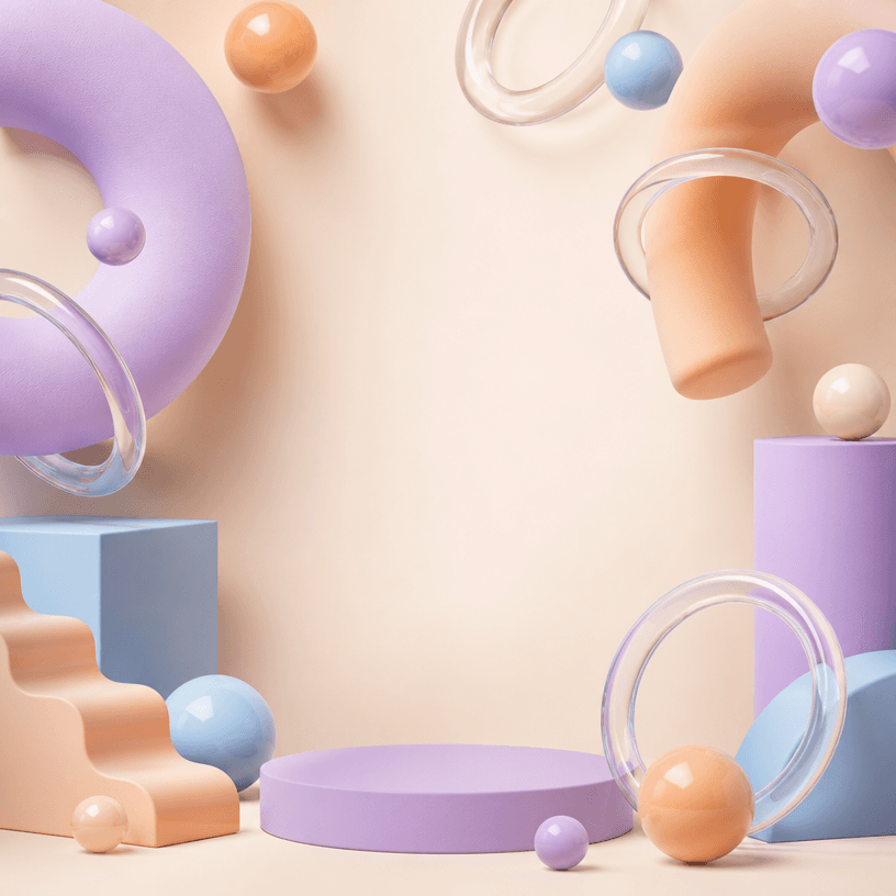
Square abstract 3D object background with glossy spheres, glass rings, inflated arches and matte geometric blocks around an empty center, pastel palette and soft studio shadows. No readable text, no logo, no watermark.
관련 프롬프트
프로모션 배너 템플릿
GPT 이미지 2· 이미지
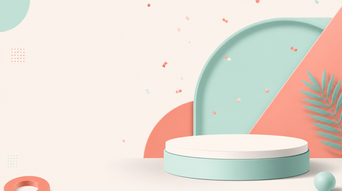
A modern e-commerce promotion banner template design. Clean layout with geometric shapes in coral and mint colors, abstract product podium in center with soft shadow, subtle confetti particles floating. Minimalist flat design with depth, professional marketing aesthetic. Plenty of negative space on left for text placement. No actual text, no watermark.
앱 아이콘 보드
GPT 이미지 2· 이미지
Design a premium app icon presentation board for a children's mobile game icon, inspired by Apple Human Interface Guidelines, Google Material Design documentation, and professional Behance case studies. Use a clean editorial layout with a minimalist white background, subtle light-gray construction grids, generous whitespace, and modern Swiss-inspired typography. The presentation should feel like it was created by a senior brand designer at a top mobile game studio. Place the final app icon as the hero element in the center, occupying approximately 60–70% of the page. Surround it with elegant technical annotations connected by thin gray leader lines. Include labels such as Safe Area, Adaptive Icon Mask, Optical Center, Visual Weight, Focal Point, Padding Zone, Keyline Grid, and Recommended Crop Area. Overlay a precise construction grid consisting of circles, squares, alignment guides, center lines, diagonal guides, proportional geometry, and adaptive icon boundaries. The grid should be subtle, using thin cyan or light-blue lines with low opacity, similar to Apple's icon construction documentation. Around the hero icon, include clean presentation sections with consistent spacing:Hero Icon ShowcaseConstruction GridSafe Area & Adaptive Icon MaskOptical AlignmentVisual Hierarchy DiagramColor Palette Swatches with HEX valuesTypography & Annotation StyleIcon Breakdown (Outline → Base Colors → Shading → Final Artwork)Small Size Preview (1024px, 512px, 256px, 128px, 64px, 48px)Platform Preview (Square, Rounded Square, Circle, Squircle)Use elegant monochrome labels, thin divider lines, subtle spacing, and professional alignment throughout the page. Typography should resemble modern design documentation with lightweight sans-serif fonts, small uppercase section titles, and minimal captions. The overall aesthetic should communicate precision, craftsmanship, and premium product design rather than marketing. Avoid gradients, decorative backgrounds, heavy shadows, colorful graphics, unnecessary icons, or visual clutter. The presentation should look like an official design specification created for a world-class mobile game studio and be suitable for Behance, Dribbble, or an AAA game design portfolio. Ultra-clean, highly organized, modern editorial design, perfect spacing, museum-quality layout, premium UI/UX presentation style. Focus entirely on a clean professional icon specification sheet.