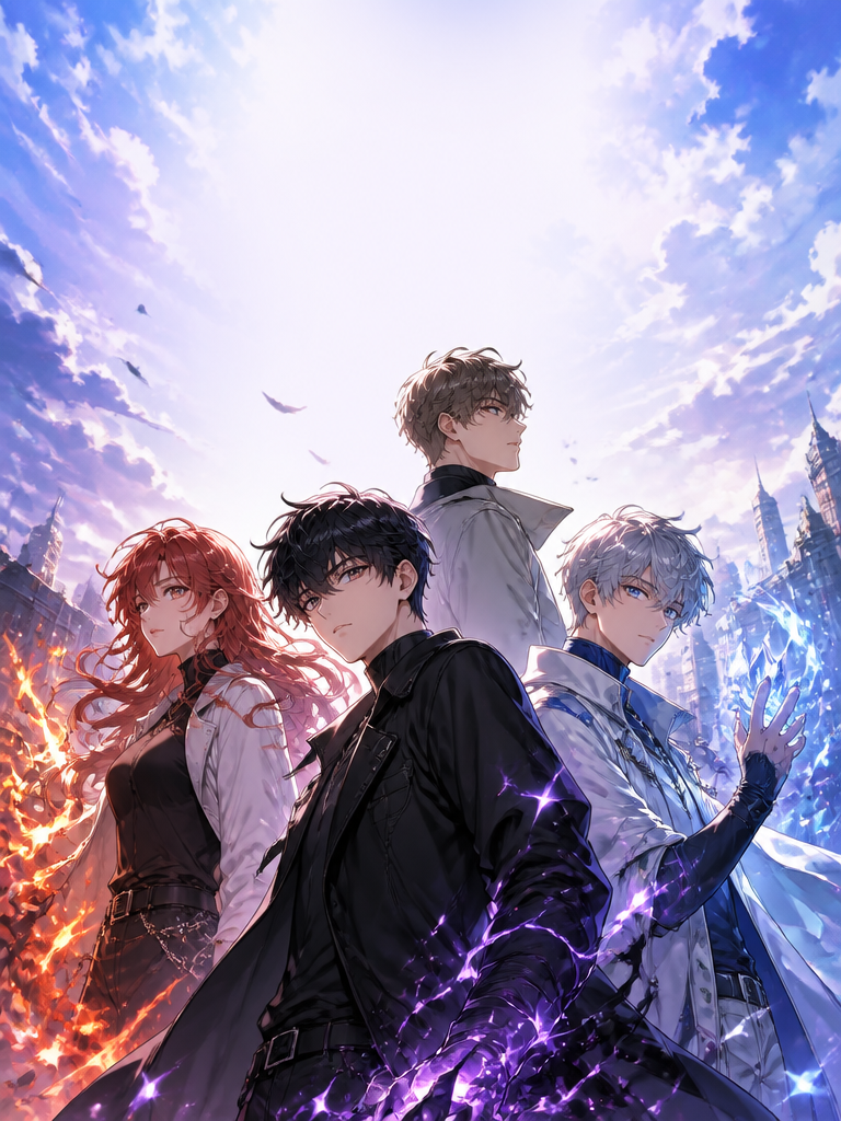
Grid Design
Create AI grid design layouts for posters, carousel covers, moodboards, and structured visual collections.
2026.07.02
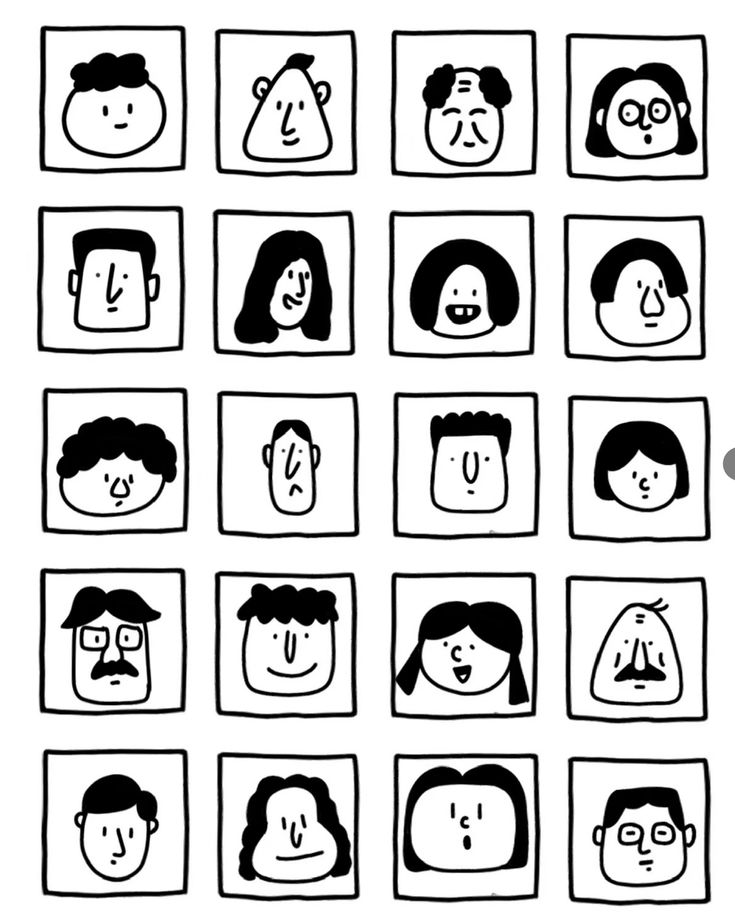
Black and White Face Grid
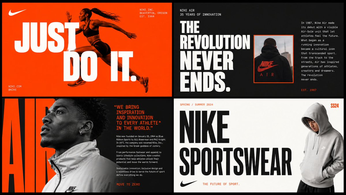
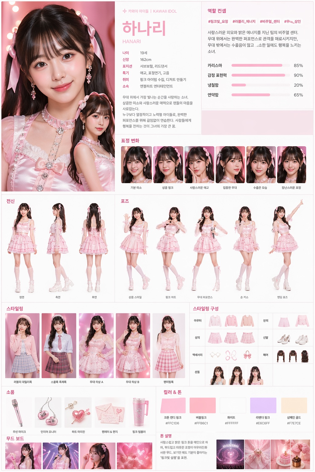
2x2 Brand Moodboard Grid
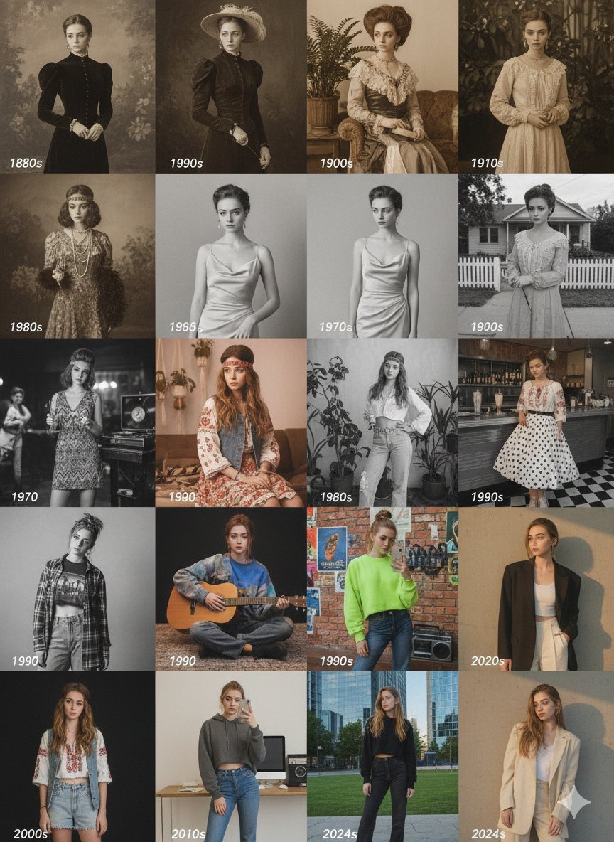
Decades Fashion Evolution Grid
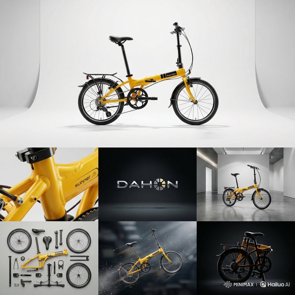
7-Panel Product Studio Grid
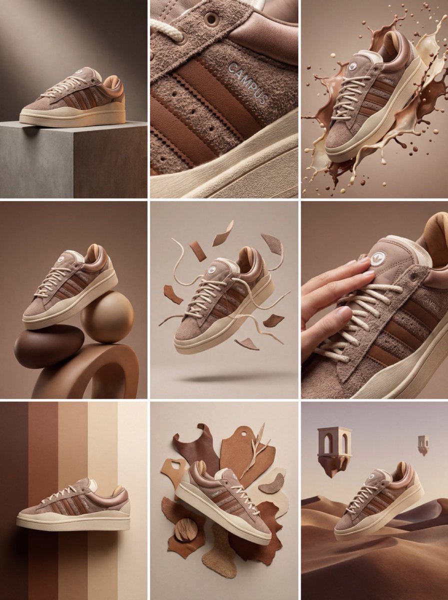
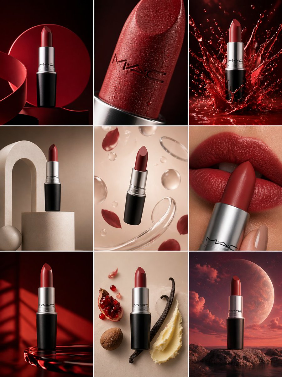
3x3 Product Campaign Grid
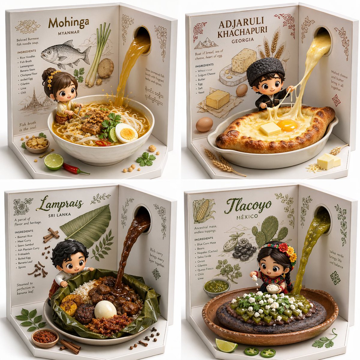
Hidden Gem Foods 2x2 Grid
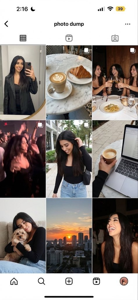
Weekend Photo Dump Nine Grid
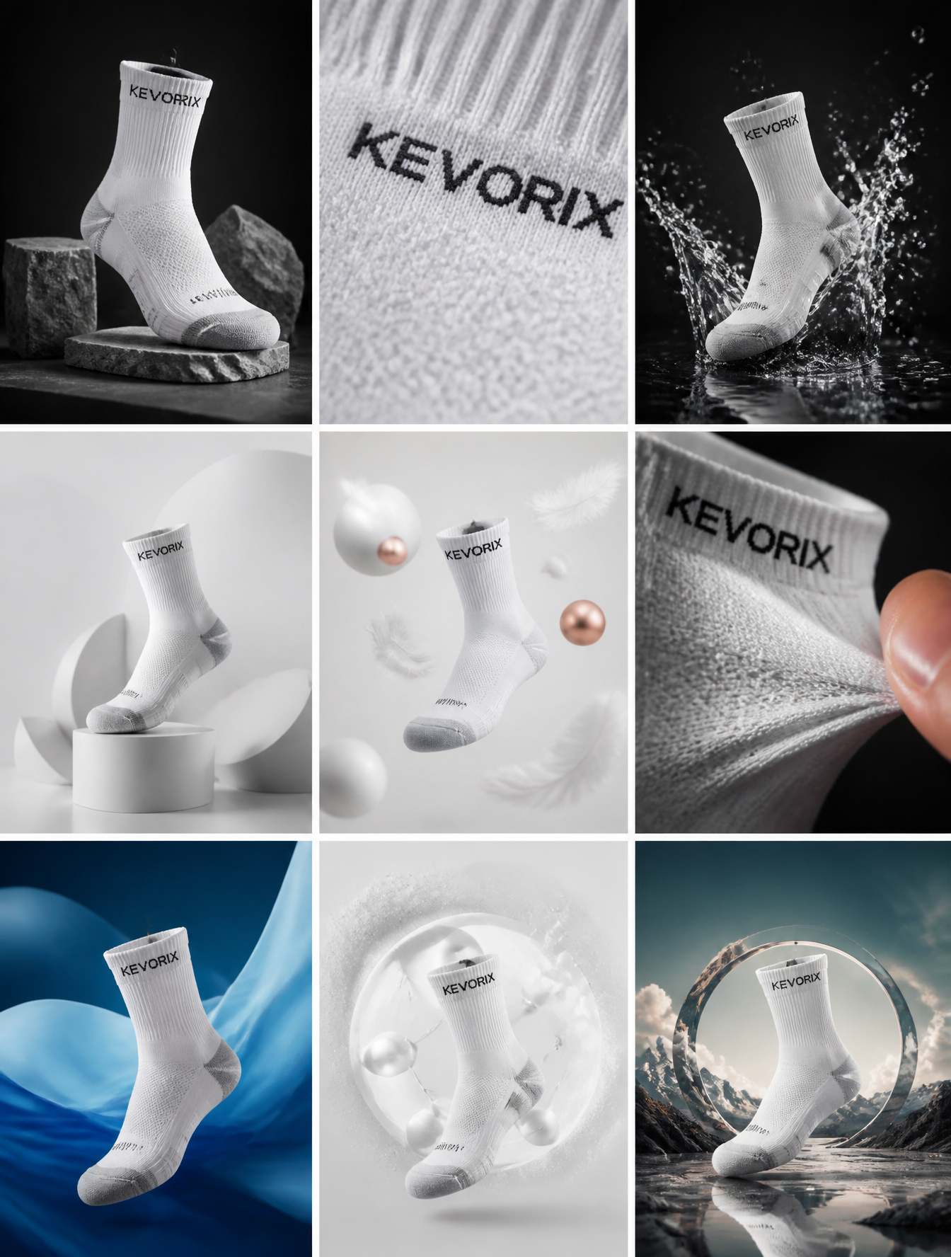
KEVORIX Sock Campaign 3x3 Grid
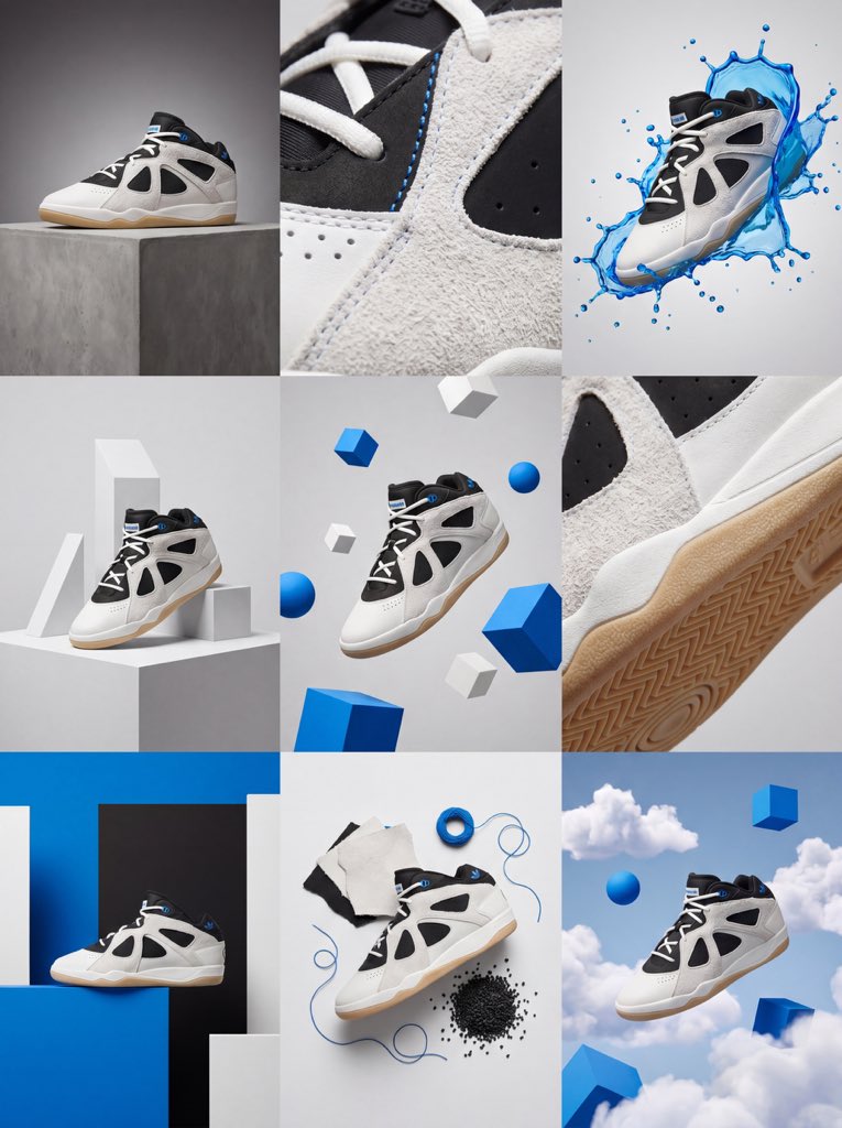
Premium Product Campaign 3x3 Grid
3x3 Product Campaign Visual Grid
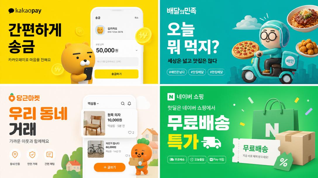
×2 Grid of Korean Digital Advertisement Banners
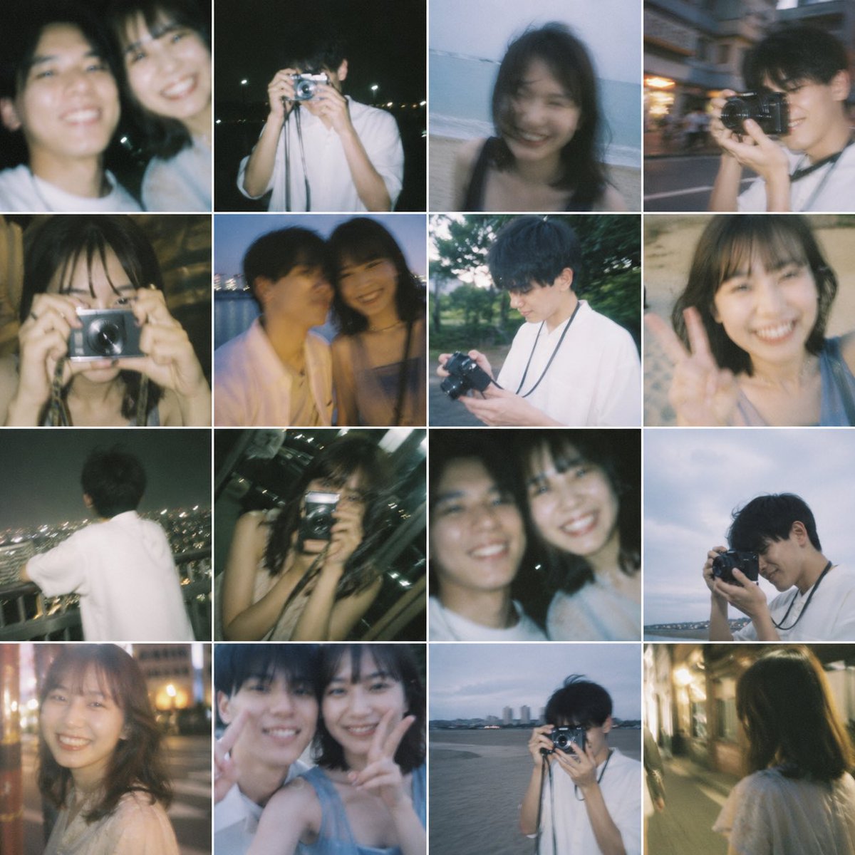
{"type":"16-photo Nostalgic Contact Sheet Collage"
What Are Grid Design AI Prompts?
Grid Design prompts are structured instructions that guide an AI model toward a specific visual or video result. A short topic alone often produces inconsistent outputs, so a stronger prompt defines the subject, environment, composition, lighting, color palette, material quality, and finishing style. The examples in Carat prompt gallery are designed to be copied, adapted, and reused in real creative workflows. They can support campaign drafts, social media content, portfolio experiments, client proposals, and reusable reference libraries. By adjusting aspect ratio, brand tone, camera distance, and platform context, one prompt pattern can become several distinct creative directions.
Key Use Cases
- 카드뉴스 표지: quickly shape a usable concept for this channel
- 브랜드 무드보드: quickly shape a usable concept for this channel
- 포트폴리오 오버뷰: quickly shape a usable concept for this channel
- 제품 컬렉션 이미지: quickly shape a usable concept for this channel
- 캠페인 키비주얼: quickly shape a usable concept for this channel
Why This Tag Is Useful
Grid Design work depends on small prompt choices that strongly affect quality and usability. A useful prompt explains what should be visually dominant, how the viewer’s eye should move through the frame, what level of polish is expected, and which details should be avoided. This structure makes repeated generations easier to compare and helps teams give more precise feedback. Instead of searching through broad prompt categories, this tag gathers focused examples that can be adapted quickly for a real project. Beginners can start by replacing the subject, colors, and background, while advanced users can keep the composition and lighting consistent across a larger series.
Explore Related Prompts
Tips for Building Your Prompt
- 몇 칸 그리드인지 먼저 지정한다
- 각 칸의 주제와 색감을 나눈다
- 여백, 테두리, 정렬 규칙을 적는다
- 전체 제목 영역을 별도로 남긴다
For the best results, separate scene description, style direction, and technical constraints instead of writing one vague sentence. Once you find a strong base result, keep the composition and lighting stable while changing props, materials, facial expression, product details, or color palette. This creates controlled variations without losing the visual logic of the original concept.