carat

Prompt Gallery

/

Chart Graphics

Login
Sign Up

Chart Graphics

Create clear chart graphics for reports, presentations, and social posts by turning metrics into readable visual comparisons.

2026.07.17

·
GPT 이미지 2로 생성한 차트 그래픽

차트 그래픽

GPT Image 2· Image
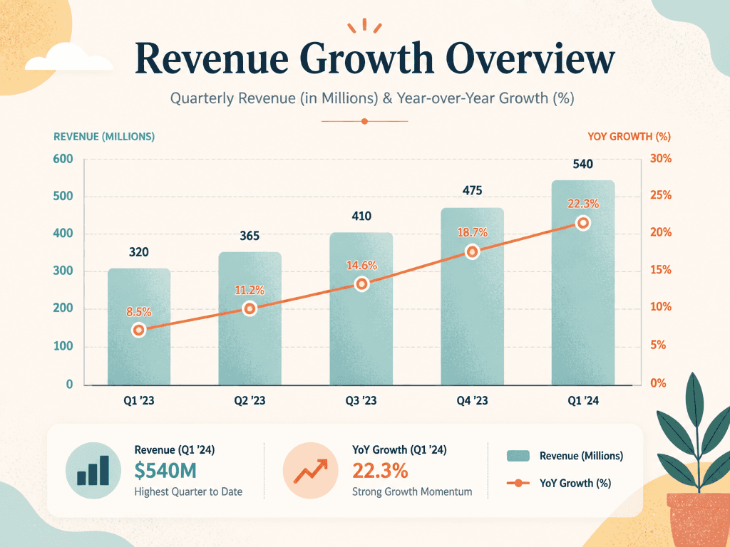
A polished chart graphic for presenting data clearly, combining a bar chart, a line trend, and a compact legend in a modern editorial layout. textured digital illustration, tasteful grain, balanced composition, distinctive shape language. front-facing centered composition with generous padding. soft pastel palette with warm highlights. Make the subject immediately recognizable at thumbnail size. Use clean composition, purposeful details, and no watermark. Choose the medium intentionally; do not default to any single decorative style.

What are chart graphics prompts?

Chart graphics prompts turn numbers and performance metrics into visual explanations that people can understand quickly. They can describe revenue, traffic, conversion rate, survey results, or campaign performance as bar charts, line charts, donut charts, comparison tables, or compact dashboards. A useful prompt should define the time period, units, labels, values, visual hierarchy, color system, and final publishing context instead of asking for a generic chart. If you provide real data, keep the source table nearby and verify every number in the generated image before publishing.

Practical use cases

  • Monthly revenue reports and year-over-year growth summaries
  • Survey results and audience breakdowns for social cards
  • Campaign dashboards comparing clicks, reach, and conversions
  • Educational graphics explaining trends and statistics
  • Newsletter and blog visuals that summarize a complex result

How to structure the visual

A strong chart graphic guides the viewer from the headline to one main insight and then to supporting details. Use one accent color for the key metric and quieter colors for comparison data. State the time period and units near the axes, keep the legend separate from the plotted marks, and leave enough padding for small screens. A 16:9 layout works well for presentations, while square or portrait layouts are useful for social media. Ask for readable labels and restrained decoration so the chart remains informative rather than becoming a poster with tiny text.

More related prompts

  • Infographic Poster
  • Timeline Diagram
  • Process Diagram

Prompt tips

  1. Include the period, categories, units, and source values.
  2. Choose a chart type that matches the comparison you need.
  3. Identify one primary metric and one accent color.
  4. Specify the aspect ratio, title area, legend position, and intended platform.
  5. Compare the final labels and values with the original data before use.

Accuracy should come before decoration. Preserve the source table, add a date or source note when appropriate, and treat the generated visual as a draft that still needs a factual review.

Frequently Asked Questions

Related Prompts

100-Day Celebration

100-Day Celebration

4 prompts

2D Anime

121 prompts

3D Avatar

3D Avatar

6 prompts

3D Cartoon

379 prompts

Carat Prompt Gallery

Create trending AI prompts instantly

Prompts

  • Logo
  • PPT Design
  • Thumbnail
  • Poster
  • Web Novel Cover
  • ID Photo
  • Caricature
  • Product Detail Page
  • Banner

Models

  • GPT Image 2
  • Seedance 2.0
  • NanoBanana Pro
  • NanoBanana 2

Carat

  • Get started
  • About
  • Blog
  • Careers
  • Contact
  • Partnership
  • Terms
  • Privacy

© 2026 Paradot.Inc All rights reserved.