carat

Prompt Gallery

/

Kinetic Typography Video

Login
Sign Up

Kinetic Typography Video

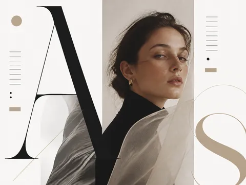
Design kinetic typography frames with clear type scale, direction, contrast, and rhythm ready to expand into motion graphics.

2026.07.21

No prompts available

What are kinetic typography video prompts?

Kinetic typography video prompts describe motion graphics in which words and sentences move through the frame. They define type scale, weight, alignment, color contrast, entry direction, and timing so language can follow music, narration, or a brand message. These prompts are useful for lyric videos, advertisements, event titles, brand slogans, and short-form captions. At the image stage, they establish a strong keyframe. At the video stage, individual words can slide, pop, rotate, stretch, or scale in sequence. The goal is not only to make attractive text, but to make the movement reinforce the meaning and rhythm of the message.

Where to use the concept

  • A lyric visual that follows the beat of a song
  • A product advertisement that emphasizes a short claim
  • An event opener or presentation title card
  • Social content built around a recurring brand slogan
  • Short-form captions that highlight key narration words

Elements that create visual rhythm

The words and the motion should support each other. A powerful word can receive a larger, heavier display face, while a fast section can be divided into short blocks that arrive in sequence. Diagonal alignment, overlapping layers, offset shadows, and directional streaks imply movement even in a still frame. A restrained black-and-cream base with one accent color can keep the composition readable while giving the eye a clear destination. Define the type personality, tracking, line spacing, safe area, and texture as well as the movement so the design remains legible when animated.

Related prompt ideas

  • Typography Poster
  • Brand Image

A practical writing order

  1. Decide the purpose and the main sentence, then select the words that deserve emphasis.
  2. Specify the type personality, such as bold sans serif, condensed display lettering, or expressive handwritten type.
  3. Describe direction and speed: slide from the left, pop in letter by letter, or scale on the beat.
  4. Set the background, accent color, shadow, texture, and frame ratio so the brand tone stays consistent.

If text becomes crowded or distorted, reduce the number of words per frame and split the sentence into separate shots. A start, emphasis, and closing frame based on one key visual can turn a static layout into a clearer and more purposeful sequence.

Frequently Asked Questions

Related Prompts

100-Day Celebration

100-Day Celebration

4 prompts

2D Anime

121 prompts

3D Avatar

3D Avatar

6 prompts

3D Cartoon

379 prompts

Carat Prompt Gallery

Create trending AI prompts instantly

Prompts

  • Logo
  • PPT Design
  • Thumbnail
  • Poster
  • Web Novel Cover
  • ID Photo
  • Caricature
  • Product Detail Page
  • Banner

Models

  • GPT Image 2
  • Seedance 2.0
  • NanoBanana Pro
  • NanoBanana 2

Carat

  • Get started
  • About
  • Blog
  • Careers
  • Contact
  • Partnership
  • Terms
  • Privacy

© 2026 Paradot.Inc All rights reserved.