본문으로 건너뛰기


앱 브랜딩 그라데이션 일러스트
GPT 이미지 2· 이미지
관련 프롬프트
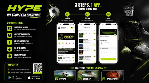
스포츠 예약앱 플렉스 배너
GPT 이미지 2· 이미지
Based on the given layout
Recommended Layout Structure (3ft × 5ft) horizontal flex banner.
Overall Grid Use a 2-column layout:Left Column → Branding + Benefits + ContactRight Column → App Flow + Sports Icons Visual Hierarchy LEFT SIDE (40%)Logo Area Top-left large rectangle. Height: ~28%Keep lots of whitespaceUse bold premium typographyAdd tagline if needed Example:HYPE
Book Your Sport Instantly
Benefits Box Middle-left large box. Use 3–5 short benefit points:✓ Easy Booking
✓ Nearby Turf Search
✓ Instant Confirmation
✓ Multiple Sports
Use icons beside each point. 3. Contact Strip Bottom-left horizontal strip. Include:PhoneWebsiteQR code (optional) Example:Call: +91 XXXXX XXXXX
www.hypeplay.com
RIGHT SIDE (60%) Mobile Screens Section Instead of plain rectangles, show actual mobile mockups. Use 3 phone cards: Screen 1 — SearchTurf listingMapSearch bar Screen 2 — SelectVenue detailsTime slots Screen 3 — BookPayment successConfirmation UI Sports Circles Section Instead of empty circles: Use:FootballCricketBadmintonBasketballTennis Add:Sport icon/photoSmall label below Example arrangement: ⚽ 🏀 🏏
Make circles slightly overlapping for modern look. Better Composition Your current sketch feels very boxed. Modern flex banners use:Consistent paddingLarger imageryFewer bordersStrong contrast Instead of outlines everywhere:Use background color blocksSoft shadowsMinimal separators mportant Design Improvements Avoid: Too many borders Centered italic text Uneven spacing Different box sizes without alignment Use: 24px consistent spacing Alignment grid Real app screenshots High contrast headings Best Layout Ratio Section Width Left Info Panel 35–40% Right Visual Panel 60–65% This creates better balance. Printing Tips For a 3ft × 5ft flex: Design in: 150 DPI minimum CMYK colors Keep text inside safe margin Avoid very thin fonts Extra Premium Touch Add: QR code → “Download App” App Store / Play Store badges Small stadium texture background Dynamic diagonal shapes behind screenshots That will make it feel like a real startup campaign banner instead of a simple poster. Logo colors: #c9fb07 , #0a0a0a
타이포그래픽 브랜드 일러스트
GPT 이미지 2· 이미지
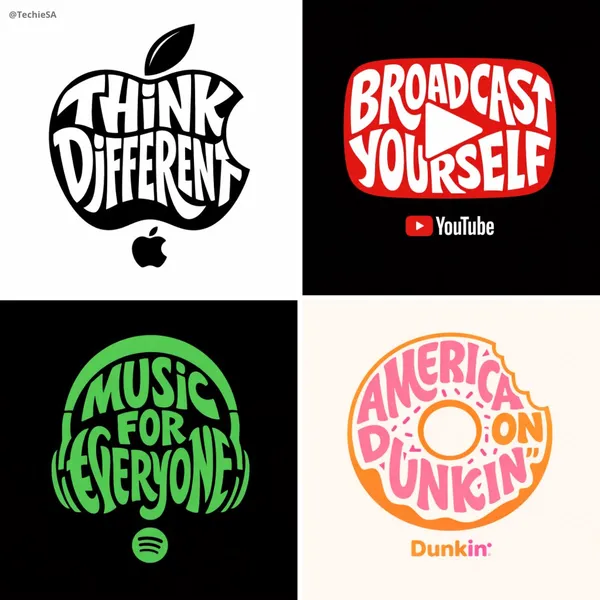
Create a typographic illustration shaped like a [OBJECT], where the text [BRAND SLOGAN] forms the shape — bold and playful lettering style that fills the entire silhouette — letters adapt fluidly to the curves and contours of the [OBJECT] — [COLOR DESCRIPTION] with [BACKGROUND COLOR] background that enhances the focus on the main shape — include [BRAND] logo positioned below the [OBJECT] — vector-style, clean, high resolution, 1080x1080 pixels, square format.
핀테크 투자 인포그래픽 포스터
GPT 이미지 2· 이미지
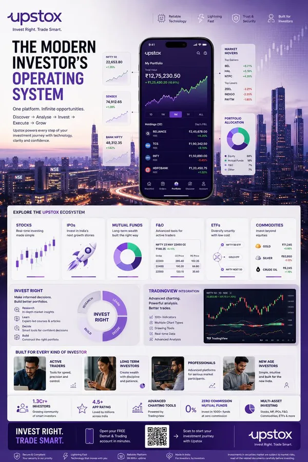
TOPIC: UPSTOX
Create an ultra-premium vertical SMM infographic poster for Upstox, designed as a next-generation fintech editorial infographic focused on high-performance investing, intelligent execution, and modern wealth creation.
The final design should feel like a fusion of:
- Apple Pro Display aesthetics
- TradingView interface design
- Bloomberg editorial systems
- Formula 1 telemetry dashboards
- modern Indian investing culture
- premium startup branding
The design should visually communicate:
"INVEST RIGHT. TRADE SMART."
CORE CONCEPT:
"THE MODERN INVESTOR'S OPERATING SYSTEM"
The entire composition should visualize Upstox as the central financial platform powering every stage of investing.
The visual narrative should show:
DISCOVERY
→ ANALYSIS
→ INVESTMENT
→ EXECUTION
→ GROWTH
Instead of showing random charts and holograms,
show a highly structured financial workflow.
Everything should feel:
- fast
- clean
- capable
- intelligent
- efficient
- trustworthy
NOT chaotic.
LAYOUT STYLE:
Create a premium modular fintech editorial layout.
Use:
- floating investment modules
- elegant information architecture
- structured dashboard systems
- large whitespace
- asymmetrical composition
- premium visual hierarchy
The layout should resemble:
a luxury financial operating system expanded into a collectible infographic poster.
HERO VISUAL:
Large central Upstox mobile ecosystem.
NOT just a phone mockup.
Instead:
Create a layered financial command center.
At center:
large Upstox mobile interface
surrounded by:
- portfolio systems
- investment cards
- watchlists
- market movers
- growth indicators
Everything connected through:
clean directional pathways
representing:
the investing journey.
BACKGROUND ENVIRONMENT:
Beautiful Mumbai financial district atmosphere.
Blue-hour cityscape.
Subtle references to:
- BKC
- NSE energy
- Indian capital markets
Use:
soft financial grid overlays
thin trajectory lines
minimal market architecture
NO hologram overload.
UPSTOX ECOSYSTEM MODULES:
Create premium information cards:
STOCKS
Real-time investing
Visual:
clean chart interface
IPOs
Invest in India's next growth stories
Visual:
launch trajectory card
MUTUAL FUNDS
Long-term wealth building
Visual:
circular diversified portfolio system
F&O
Advanced trading
Visual:
structured options matrix
ETFs
Smart passive investing
Visual:
connected allocation system
COMMODITIES
Gold, energy, multi-asset exposure
Visual:
minimal commodity dashboard
THE INVEST RIGHT SYSTEM
Large premium section:
INVEST RIGHT
Visualize:
- research
- education
- decision-making
- portfolio building
Show:
investment clarity
NOT gambling energy.
TRADINGVIEW POWER MODULE
Premium feature card:
TradingView Integration
Visual:
- advanced charting
- indicators
- drawing tools
- market analysis
Use sophisticated chart aesthetics.
MODERN INVESTOR SECTION
Show:
young Indian professionals
builders
creators
investors
market participants
Use:
realistic premium lifestyle photography
NOT smiling stock-photo energy.
The people should feel:
ambitious,
focused,
future-oriented.
QUICK STATS SYSTEM
Elegant floating metric cards:
1.3Cr+ Investors
4.5+ App Rating
Advanced Charting Tools
Zero Commission Mutual Funds
Multi-Asset Investing
Present as:
Apple-style information modules
NOT corporate blocks.
VISUAL KNOWLEDGE ELEMENTS
Include:
- portfolio allocation wheels
- watchlists
- market heatmaps
- clean candlestick systems
- growth trajectories
- SIP growth curves
- investment timelines
- execution indicators
Everything should feel:
premium,
minimal,
professional.
TYPOGRAPHY SYSTEM
Use:
large editorial sans-serif
strong hierarchy
minimal labels
clean spacing
Typography should resemble:
Apple
TradingView
Stripe
Bloomberg Weekend
Avoid:
techno fonts
startup clichés
crypto aesthetics
COLOR SYSTEM
Use actual Upstox-inspired identity:
Primary:
Deep Upstox Purple
인플레이터블 제품 광고
GPT 이미지 2· 이미지
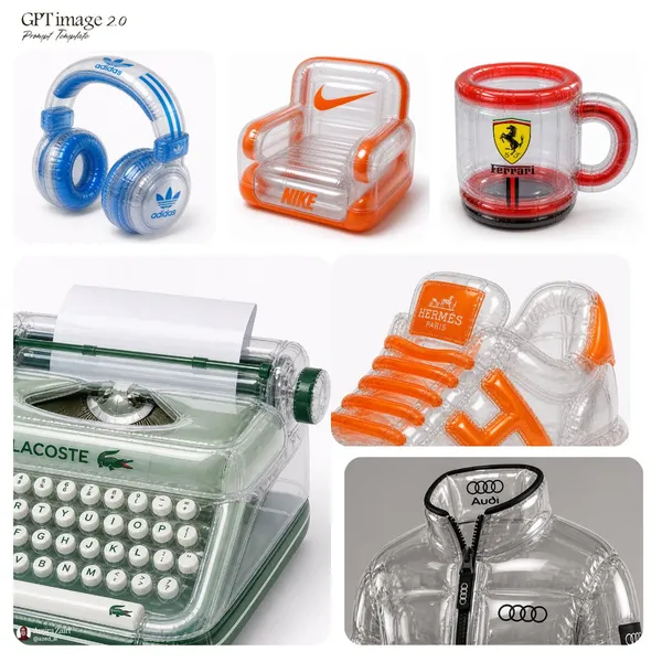
inflatable [product], transparent plastic material, high-gloss reflective surface, visible seams, air chambers, soft inflated structure, bold [brand] logo placement, vibrant accent colors, retro-futuristic aesthetic, clean product photography, studio lighting, sharp focus, white background, 1:1 aspect ratio
산토리니 여행 포스터
GPT 이미지 2· 이미지
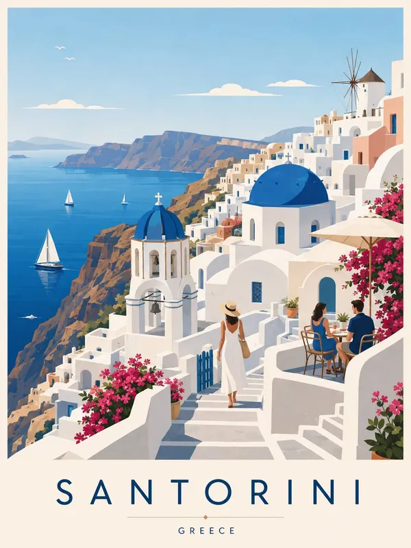
Create a premium editorial travel poster illustration of Santorini, Greece. Style: flat vector illustration, ultra clean minimalism, mid-century modern aesthetic, editorial travel poster style inspired by Scandinavian graphic design and vintage Mediterranean tourism prints, no photorealism, no textures, no noise, no gradients Composition: vertical 3:4 poster layout, foreground: peaceful cliffside terraces with whitewashed pathways, minimal stone steps, elegant bougainvillea plants, and calm reflective Aegean Sea views, midground: iconic white cubic houses with blue domes and clean geometric architecture cascading down the volcanic cliffs, include subtle silhouettes of visitors, café seating, and sailing boats integrated naturally into the scene, background: layered caldera cliffs with panoramic sea horizon and soft island silhouettes fading into the distance, add iconic landmarks subtly, including blue-domed churches, traditional windmills, and terraced cliffside villages inspired by Oia and Fira Architecture: simplified geometric Cycladic architecture, clean edges and balanced symmetry, flat color blocking, harmonious tones in white stone, cobalt blue, warm sand, soft turquoise, and deep navy Color palette: soft cohesive Mediterranean-inspired tones, bright white, pastel sky blue, muted turquoise, warm cream, dusty terracotta, sunlit beige, deep Aegean navy accents, bright yet restrained saturation Lighting: bright sunlit afternoon with soft shadows, fresh coastal island atmosphere, peaceful refined mood with subtle sea breeze ambiance Typography: add text at bottom center: “SANTORINI” (large modern sans-serif with spaced lettering) “GREECE” (small subtitle below) Mood: calm, elegant, premium travel magazine aesthetic, slightly dreamy and culturally refined, quiet timeless Mediterranean atmosphere with sophisticated island charm Quality: ultra clean vector edges, perfect alignment and composition, high resolution, print-ready premium poster design.
월별 아이콘 세트
나노바나나 프로· 이미지
Create a collection of icons representing [Month] through objects, symbols, and moods.
They belong together as a single cohesive theme.
The background is pure white.
Place the month name “[MONTH]” at the top center of the image as a minimal, balanced title, aligned symmetrically above the grid and visually integrated with the overall design.
Icons are rendered in a colorful yet calm 3D style, with season-appropriate textures and atmospheric lighting that reflect the essence of [MONTH].
Maintain consistent proportions, materials, and visual language across all icons and the title.
빈티지 우표 일러스트
나노바나나 프로· 이미지
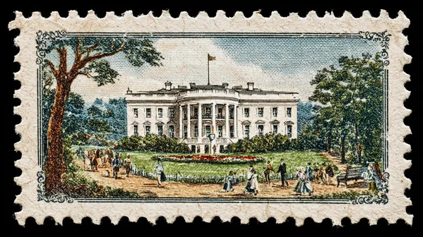
a vintage postage stamp depicting [iconic monument of a capital with people interacting in the scene].
Pastel colors, extremely thin black border all around it, simple background, paper texture, high details
흑백 얼굴 그리드 24
GPT 이미지 2· 이미지
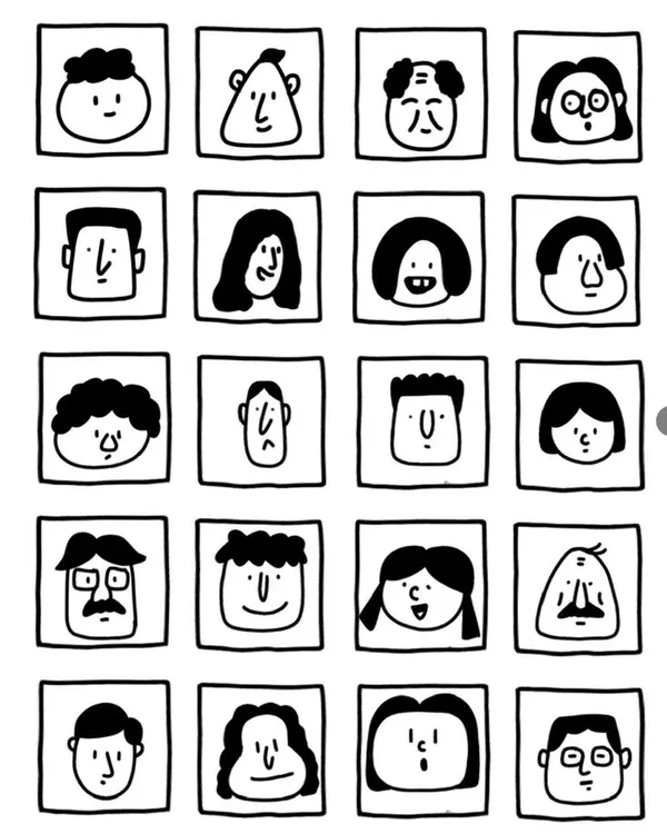
一张黑白极简手绘人物头像网格图,严格 6 行 4 列,一共 24 个头像,均匀排列在白色背景上。关键结构:每个头像都被一个正方形格子框住,正方形的四条边本身就是人物脸部的轮廓边界。脸部紧贴方格四边,没有额外边距。风格特征:纯黑白线条插画,无填充色块,无阴影,无渐变
手绘质感,线条略带不规则,天真怪趣的编辑插画风格
极简五官:圆点眼睛、小圆圈眼睛、短线眉毛、小点鼻子、直线嘴巴、小微笑、小难过嘴、困倦眼、惊讶O型嘴、面无表情
发型以线条勾勒:波浪线刘海、卷曲线条发、中分帘子发、平头短线、斜刘海、漩涡卷发、条纹发、扇贝状刘海
部分人物有圆眼镜、方眼镜、胡子、雀斑、闭眼、X形眼
人物表情各异:开心、难过、困惑、困倦、惊讶、面无表情
整体风格接近手绘人物图鉴,几何、克制、天真但不松散,平面化,高对比度,无颜色,无背景装饰,无写实细节。
노션풍 미니멀 라인아트
GPT 이미지 2· 이미지
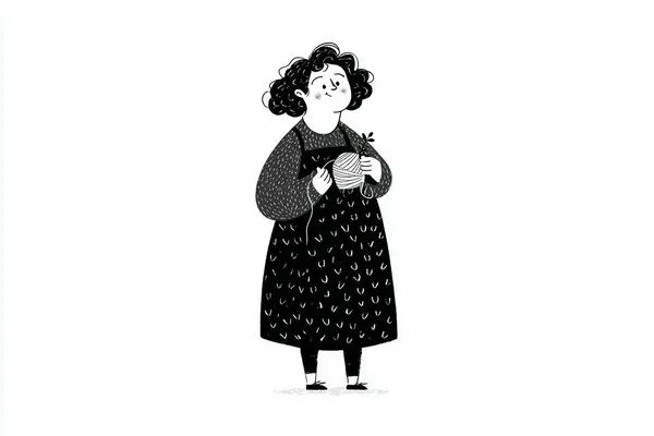
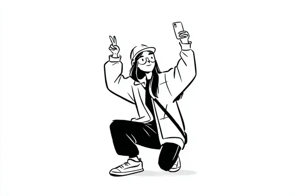
A simple black-and-white illustration of a [subject] in [outfit], [doing action], with a [facial expression] expression, in a Notion-style minimalist editorial aesthetic, clean line art, flat monochrome design, simple shapes, subtle hand-drawn feel, minimal detail, expressive posture, clean white background, neat modern layout, soft playful character style
노션풍 라인아트 캐릭터
나노바나나 프로· 이미지
A simple black-and-white illustration of a [subject] in [outfit], [doing action], with a [facial expression] expression, in a Notion-style minimalist editorial aesthetic, clean line art, flat monochrome design, simple shapes, subtle hand-drawn feel, minimal detail, expressive posture, clean white background, neat modern layout, soft playful character style
텍스처 임파스토 추상화
나노바나나 프로· 이미지
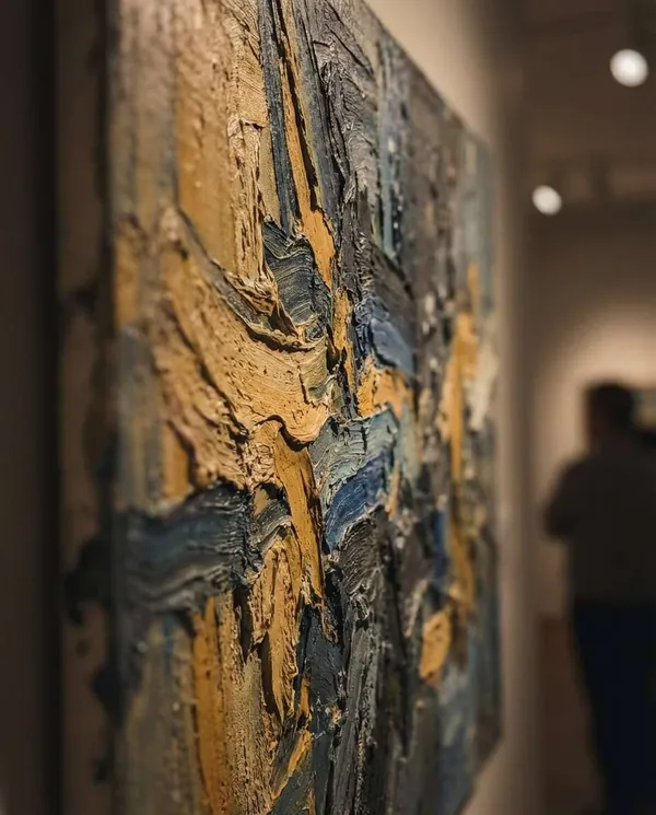
Abstract expressionist painting with thick impasto brushstrokes, layered color fields of ochre, ultramarine, and deep charcoal, visible paint ridges, tactile canvas texture, dramatic movement, gallery masterpiece quality, bold and emotional, 85mm lens, shallow depth of field, soft cinematic lighting --ar 4:5
미니멀 라인 포스터 추상화
나노바나나 프로· 이미지
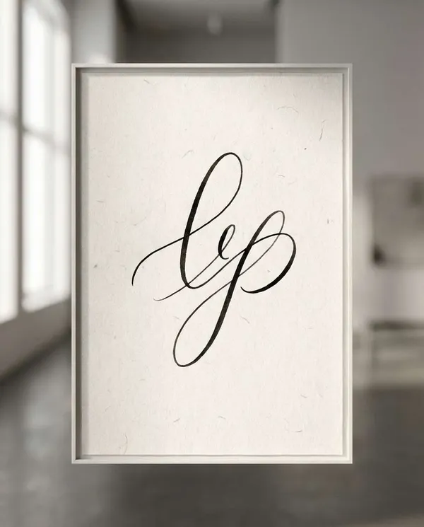
Minimal abstract line art with a single continuous black ink stroke forming elegant loops across off-white textured paper, lots of negative space, calm gallery aesthetic, subtle shadowing, contemporary museum wall vibe, refined and serene composition, 85mm lens, shallow depth of field, soft cinematic lighting --ar 4:5